Sacred Waters
Sacred Waters is a tea brand centered on the experience of tea: a transformative and magical moment that relaxes the mind, transports you to your favorite places, and creates the feeling of an oasis.
A complete brand identity project covering naming, visual system, packaging for six products, and extensions to advertising and beyond.
Client
Sacred Waters
Role
Naming, Brand System & Packaging
Year
2024
Challenge
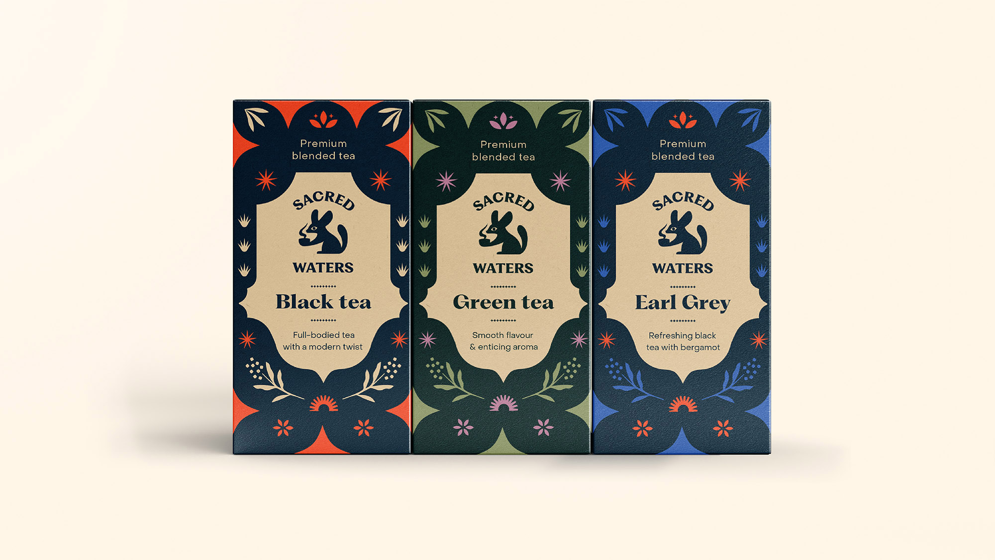
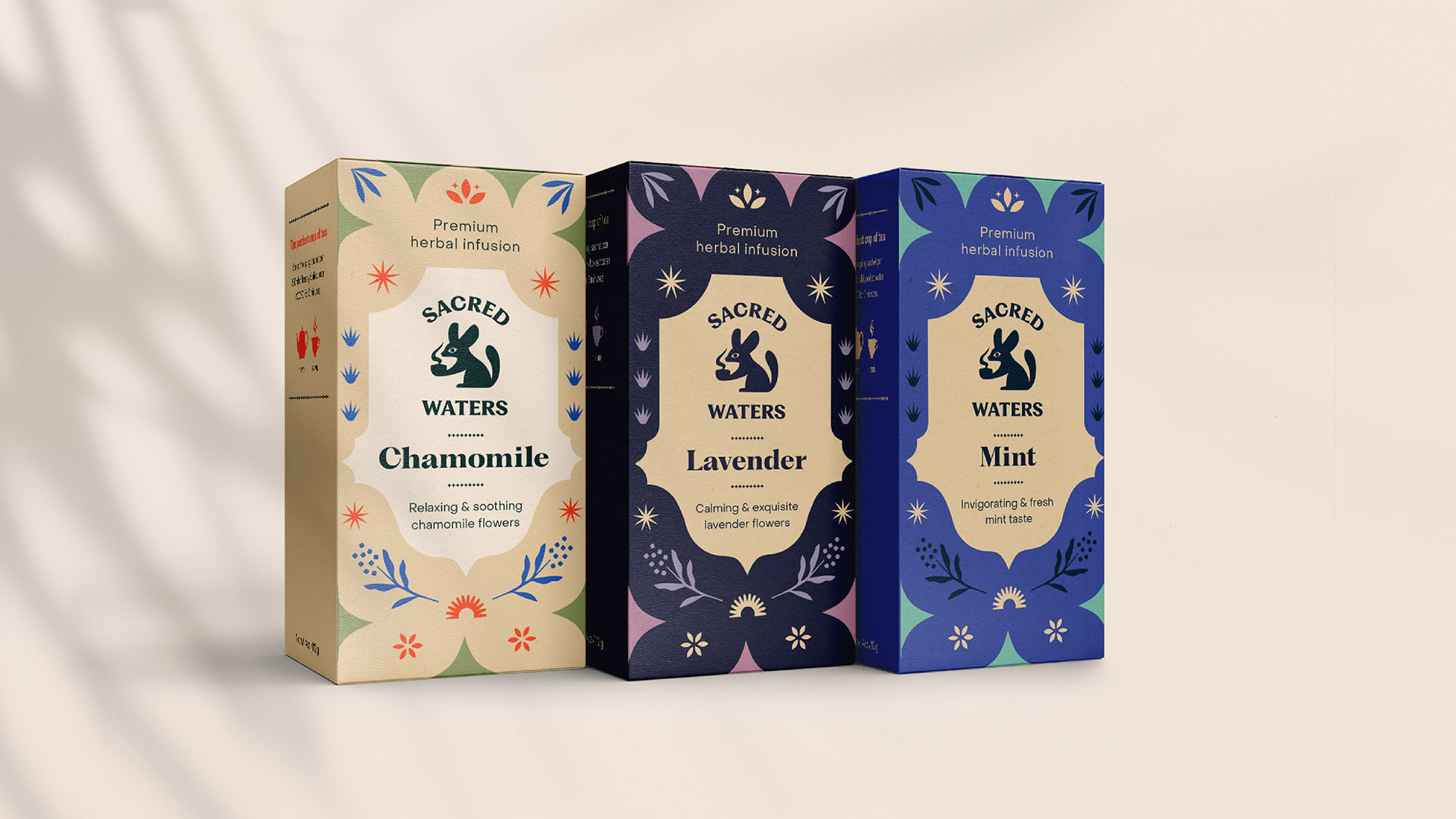
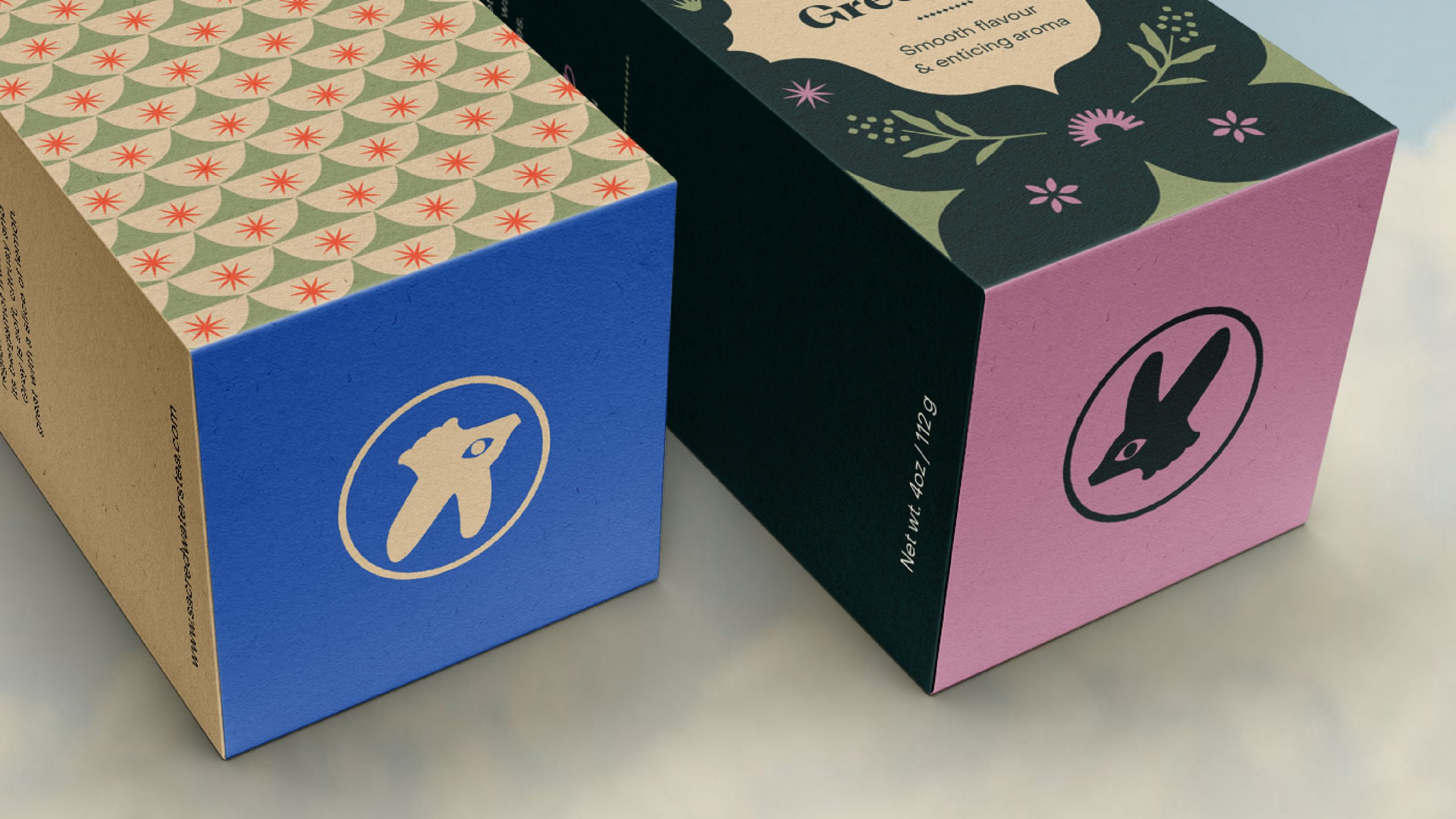
The core challenge was designing a collection of six products, three teas and three infusions, that shared a cohesive visual identity without feeling interchangeable. Each package needed to feel distinct and immediately recognizable through its flavor profile, while the collection as a whole still had to read as a unified brand.
Beyond packaging, the system also had to extend seamlessly across other touchpoints, including wall banners, advertising, photographic direction, and sachet design. Every decision, from typography and color to graphic ornament and photography, was developed as part of a scalable visual system rather than a one-off solution.
Three signature teas
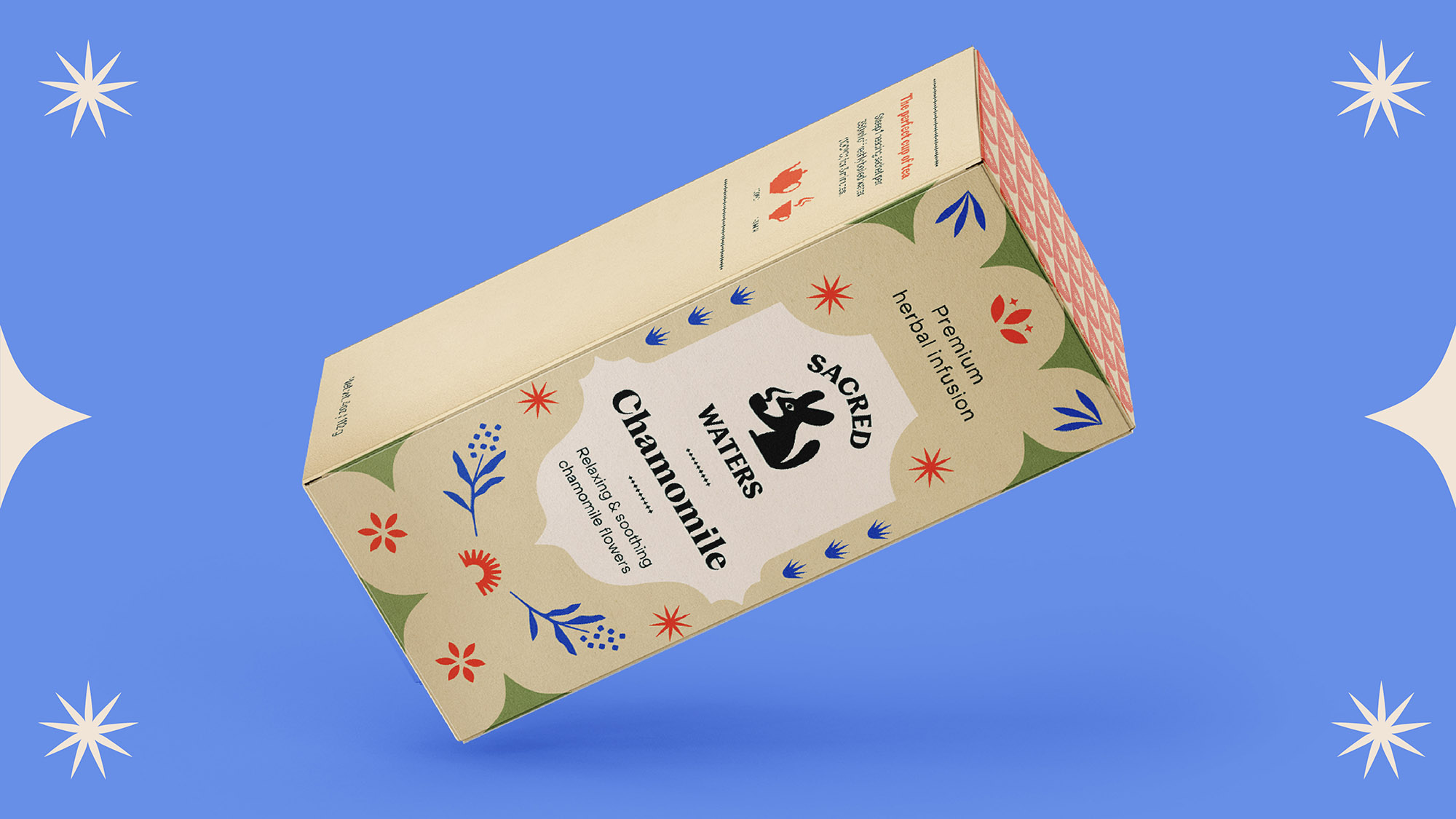
Three herbal infusions
Concept and naming
Naming was an integral part of the project. I explored around fifteen possible directions before arriving at Sacred Waters, ranging from literal descriptors of taste and ritual to more abstract ideas inspired by voyage, escape, and alchemy. Most, however, felt either too generic or already overused.
Sacred Waters stood out because it carried a narrative rather than simply describing a product: water as something precious enough to be protected, and tea as a small daily oasis. From those two words emerged the brand’s entire conceptual world, including desert landscapes, mysticism, scarcity, ritual, and transformation.
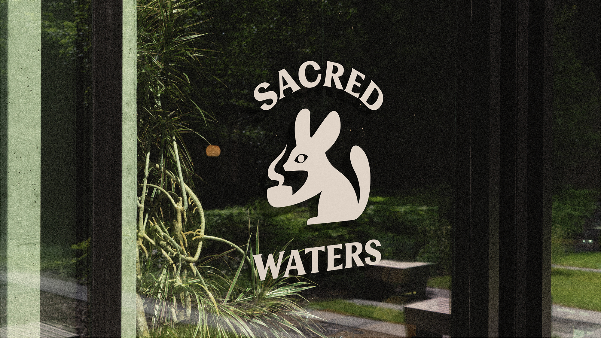
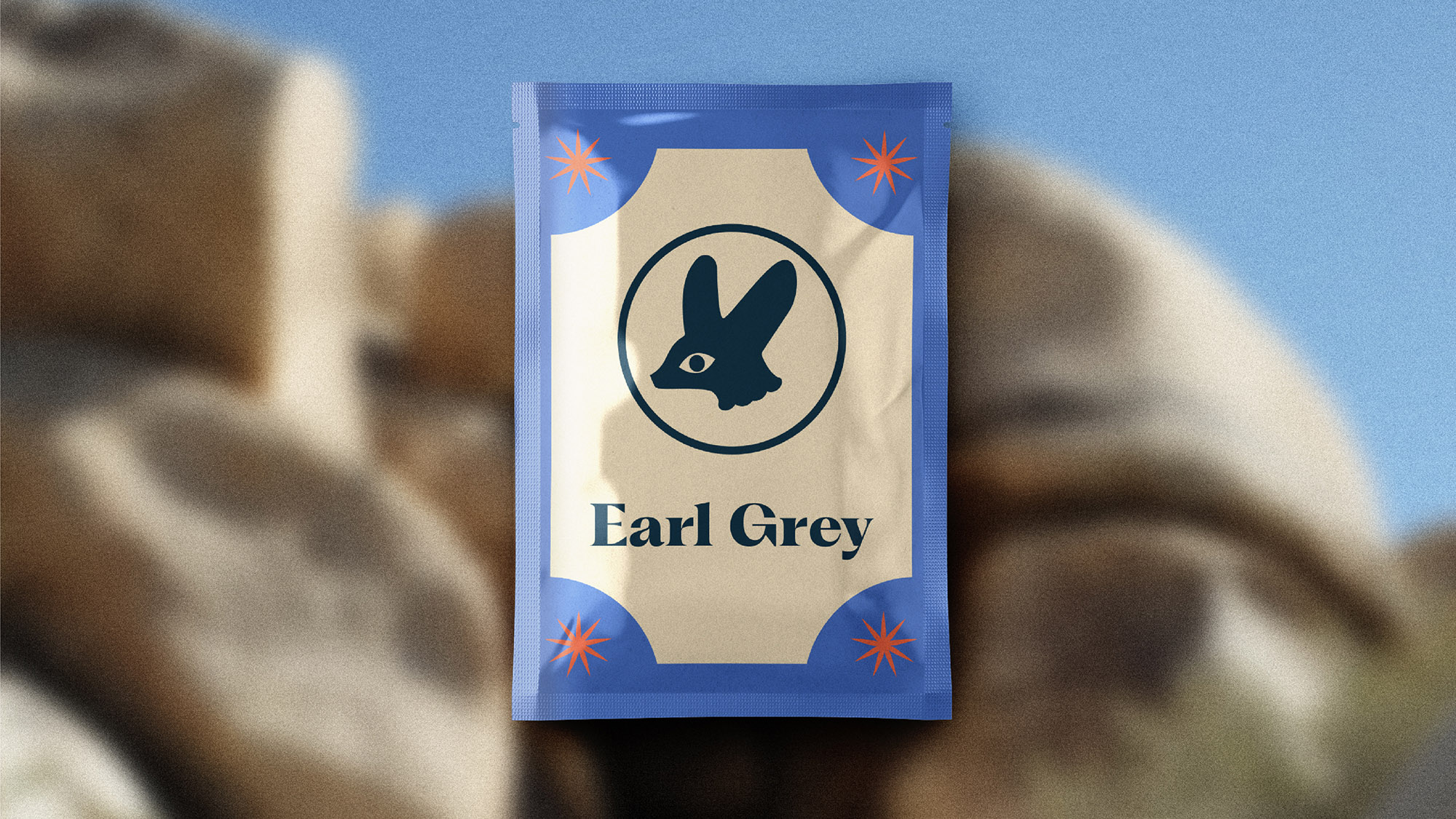
The fennec fox
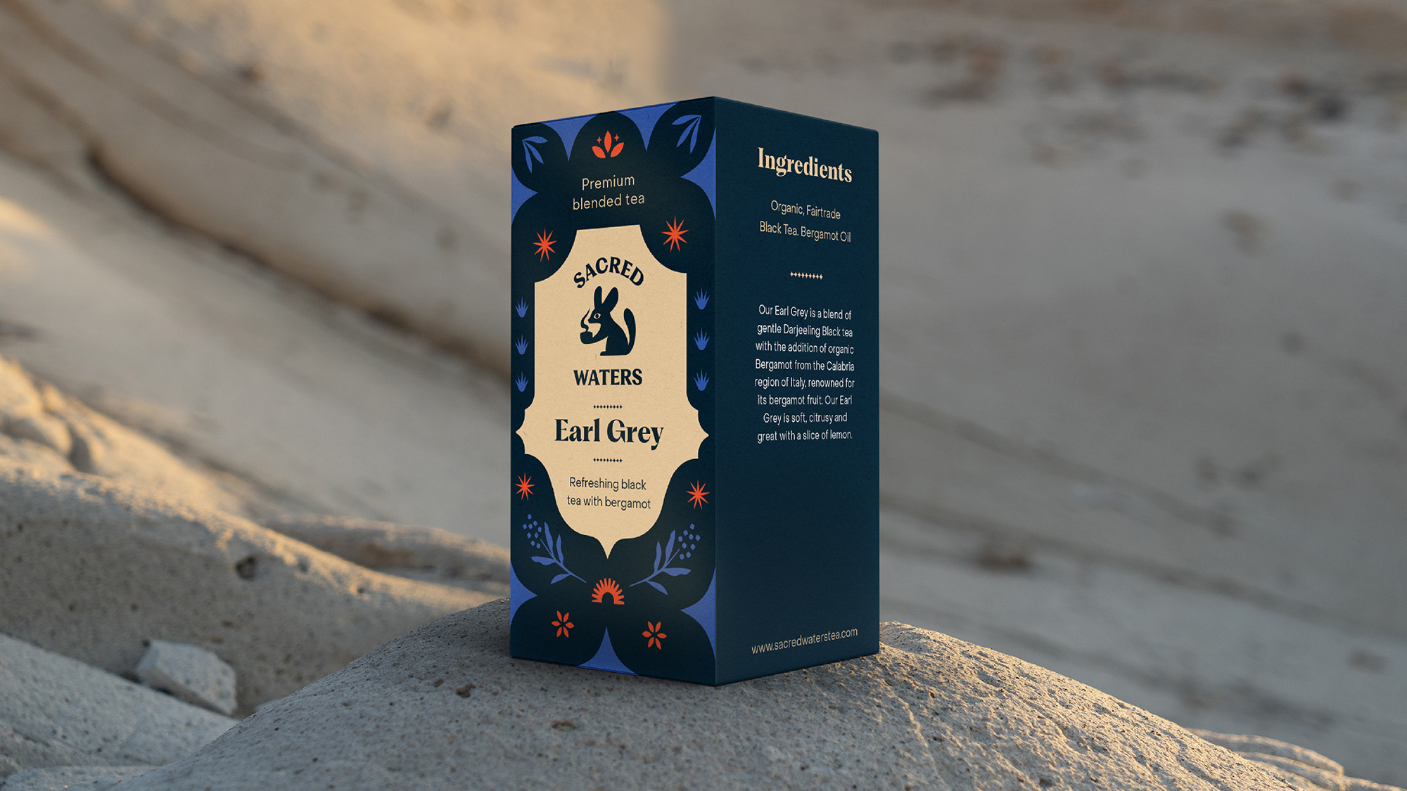
The most obvious answer for a tea brand is a cup, a leaf, a drop of water. Sacred Waters was about narrative instead. From four different desert animals, I chose the fennec fox. A small creature that thrives where water is scarce, becoming the brand's emblem.
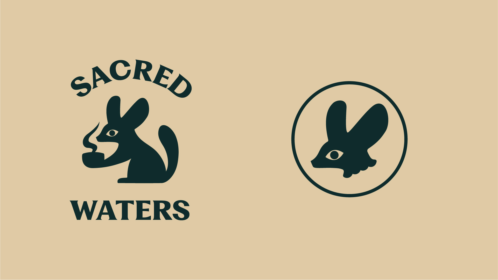
Above: primary logo and favicon
Visual elements
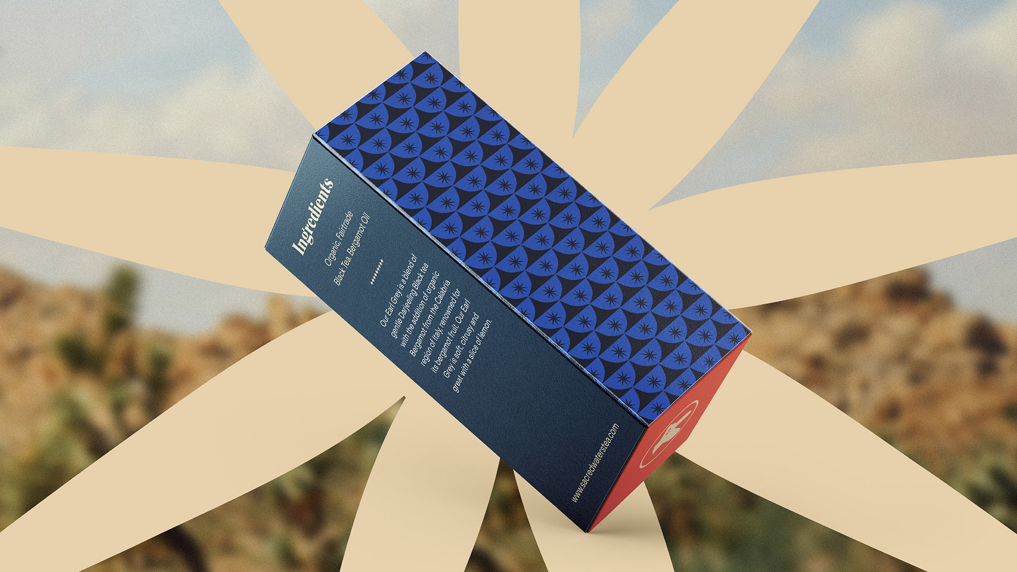
The rest of the visual system was built around the desert landscape and the botanical nature of the product. I developed a graphic vocabulary inspired by elements of the desert itself, including cactus ridges, ornamental thorns, and the rippling patterns of wind-shaped sand, alongside leaves and flowers that could enrich the packaging without competing with the brand mark.
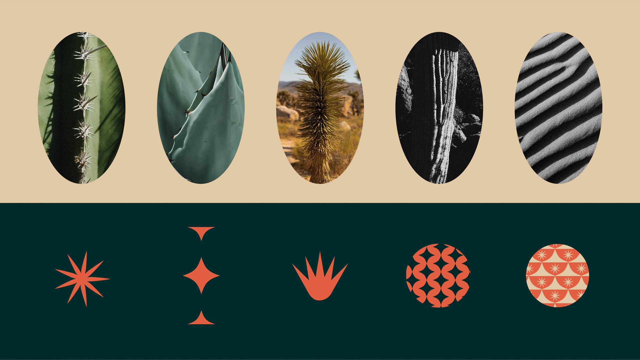
Above: details drawn from desert landscapes shaped the visual language of the identity.
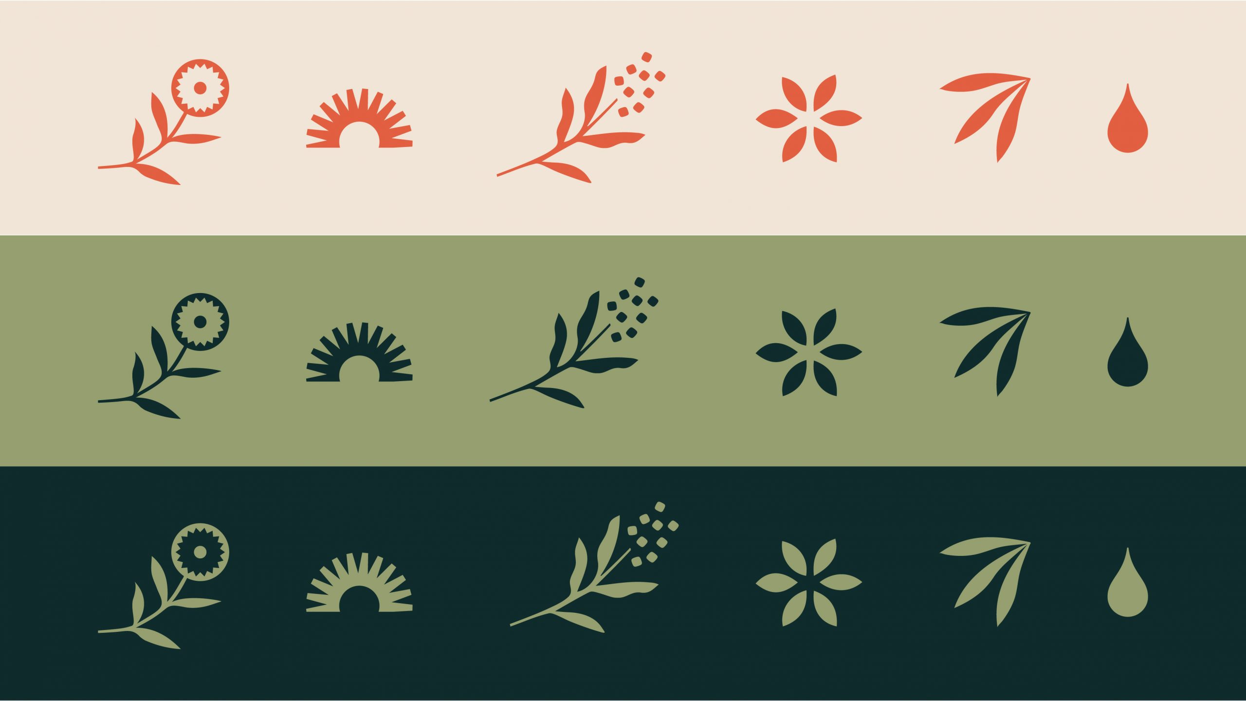
Above: botanical forms helped communicate the product’s connection to plants and herbal ingredients.
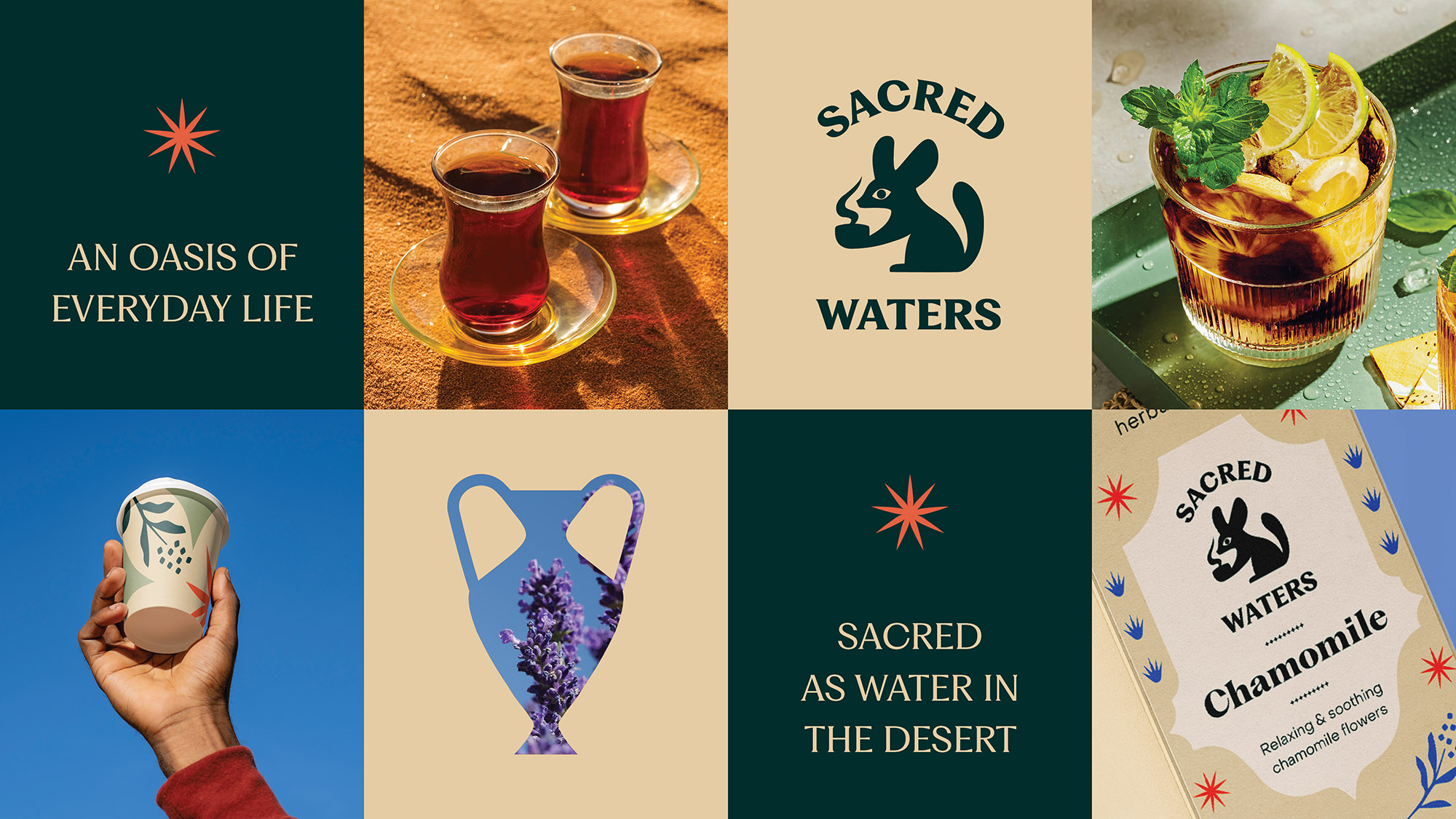
Above: a brand composition bringing together identity, photography, and product experience.
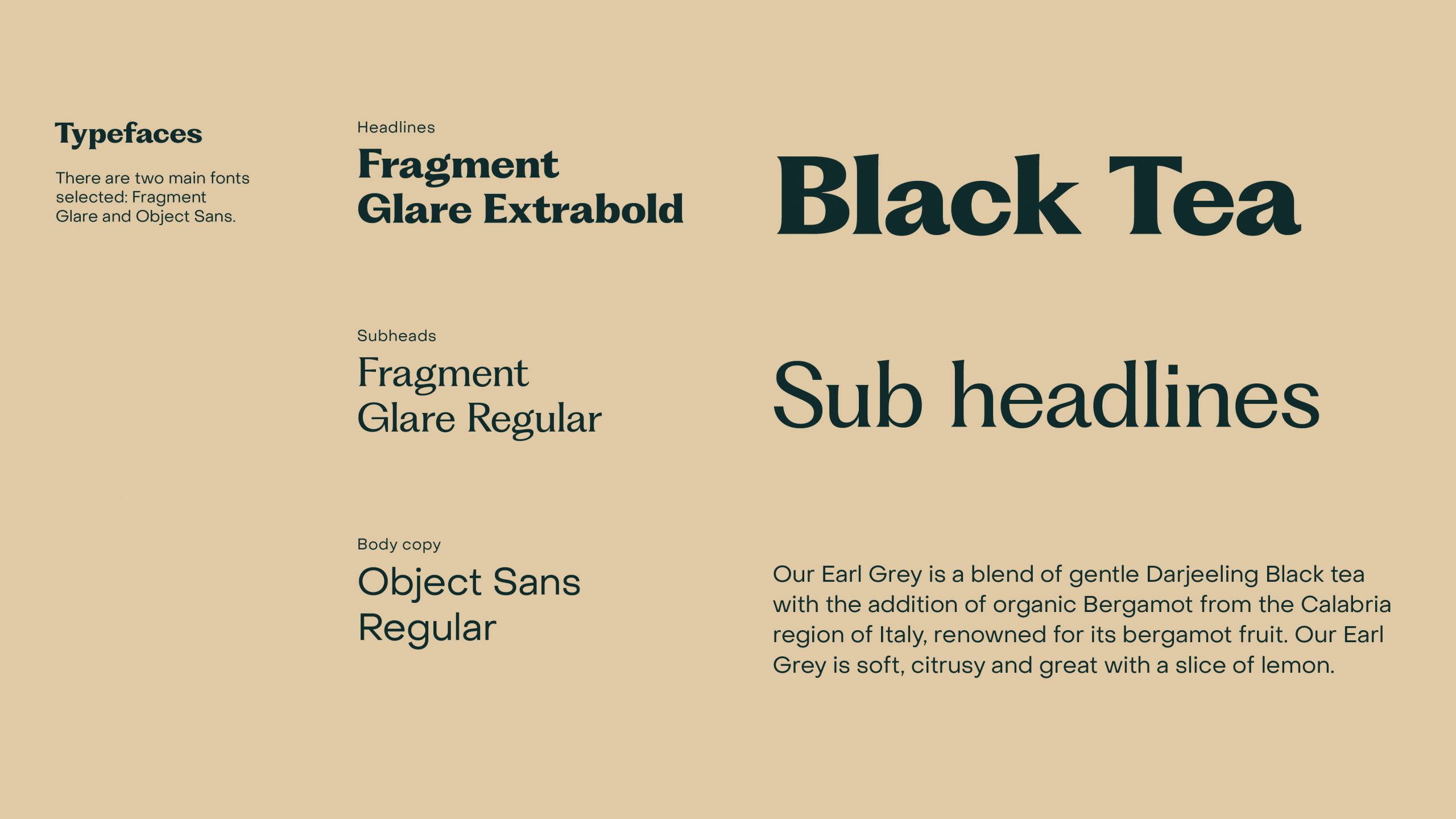
Typography
Typography paired Fragment, a serif with strong character and ornamental detail, with Object Sans, a clean geometric sans serif used for functional text. The contrast was intentional: enough personality to give the packaging a rich, expressive presence, balanced by enough restraint to keep information clear and legible.
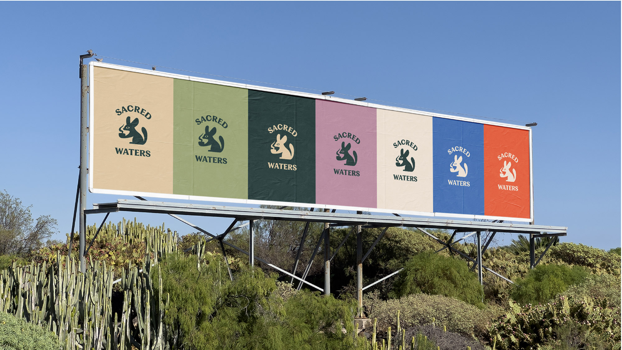
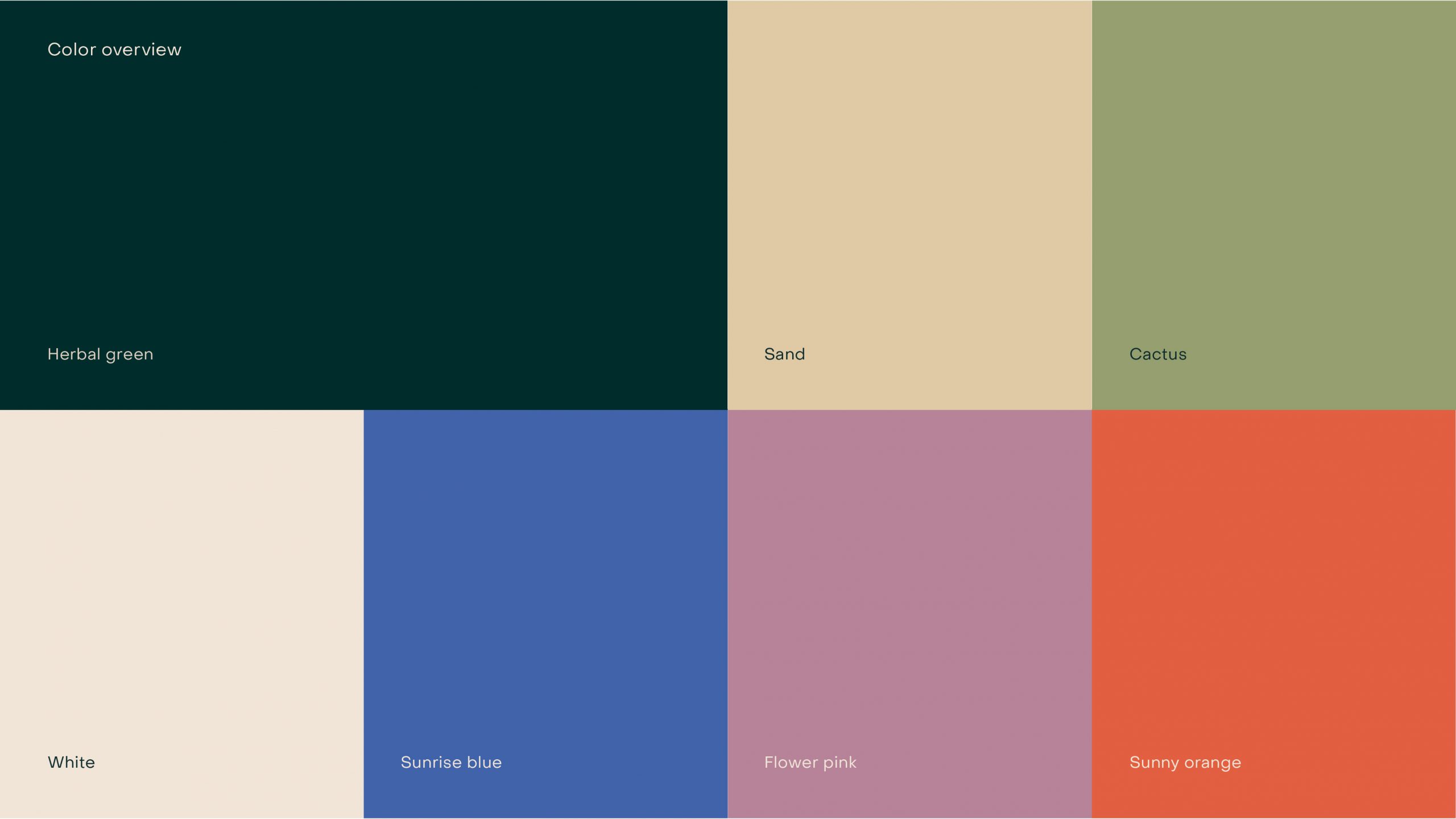
Color palette
Six products needed to share a cohesive visual language without feeling interchangeable: three teas (Earl Grey, Black Tea, and Green Tea) and three infusions (Lavender, Chamomile, and Mint). Each was assigned a dominant color tied to its flavor or ingredient, while still contributing to a unified brand system rooted in the project’s desert-inspired narrative.
The final palette evolved into a balance of creams, orange, blue, pink, and green. The real challenge was not choosing individual colors, but maintaining visual tension and harmony across all six packages simultaneously while keeping them connected to the brand’s overall identity.
Packaging
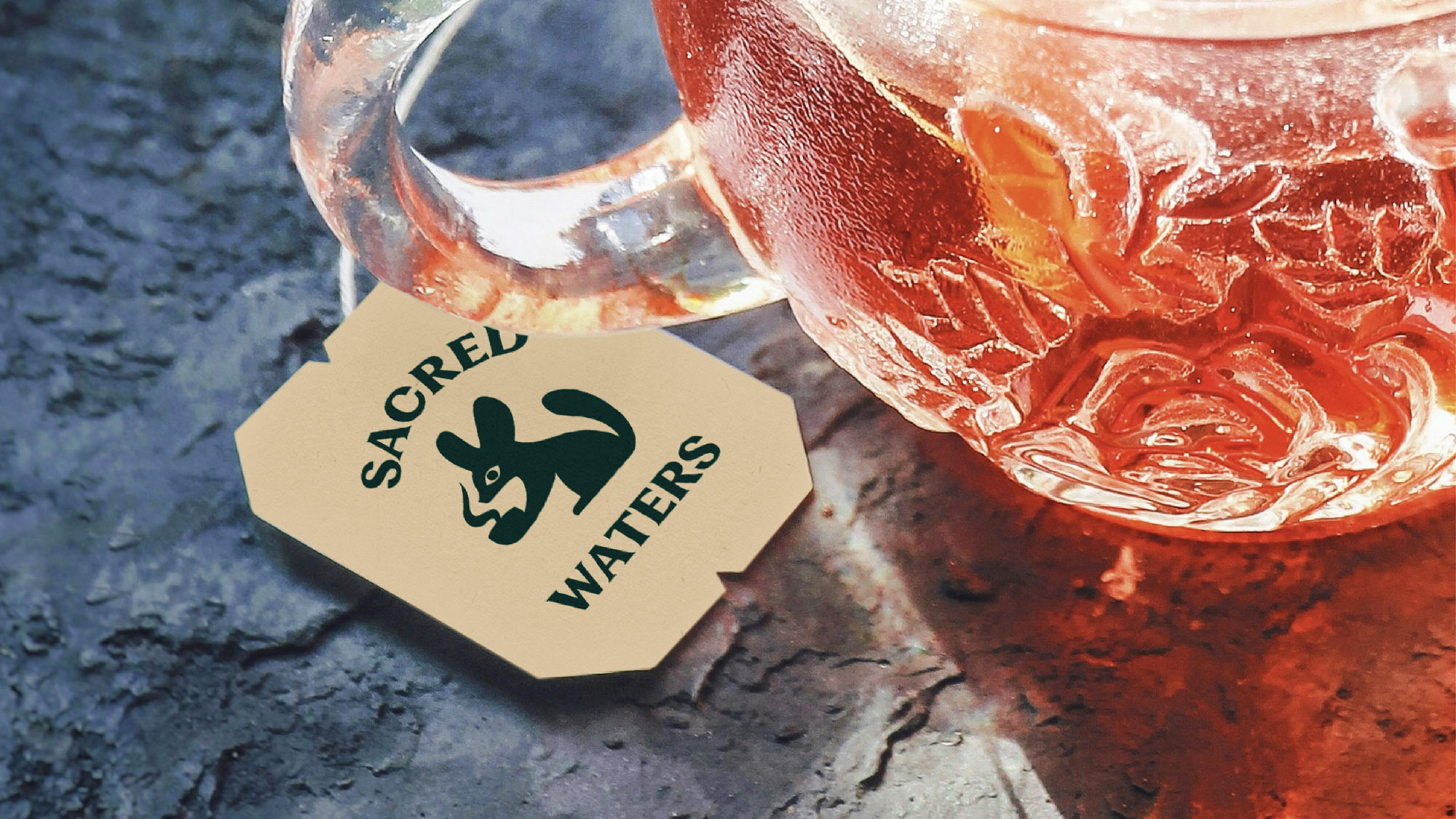
I looked at what other brands I liked were doing in terms of packaging, since there were many possible directions to take. I ultimately chose a cardboard box format. The cylindrical metal tins felt too expensive and inaccessible, while boxed packaging with individual sachets aligned more naturally with the outdoors-oriented and experience-driven concept of the brand. It also created multiple surfaces to design, which made the project visually more engaging.
Including sachets was equally intentional: the tea became something portable, meant to be taken on outings and shared with others.
Another important branding challenge was integrating the graphic elements of the visual system, such as cactus forms and sand-wave patterns, directly into the packaging photography so the compositions would feel dimensional rather than flat.
Extending the system
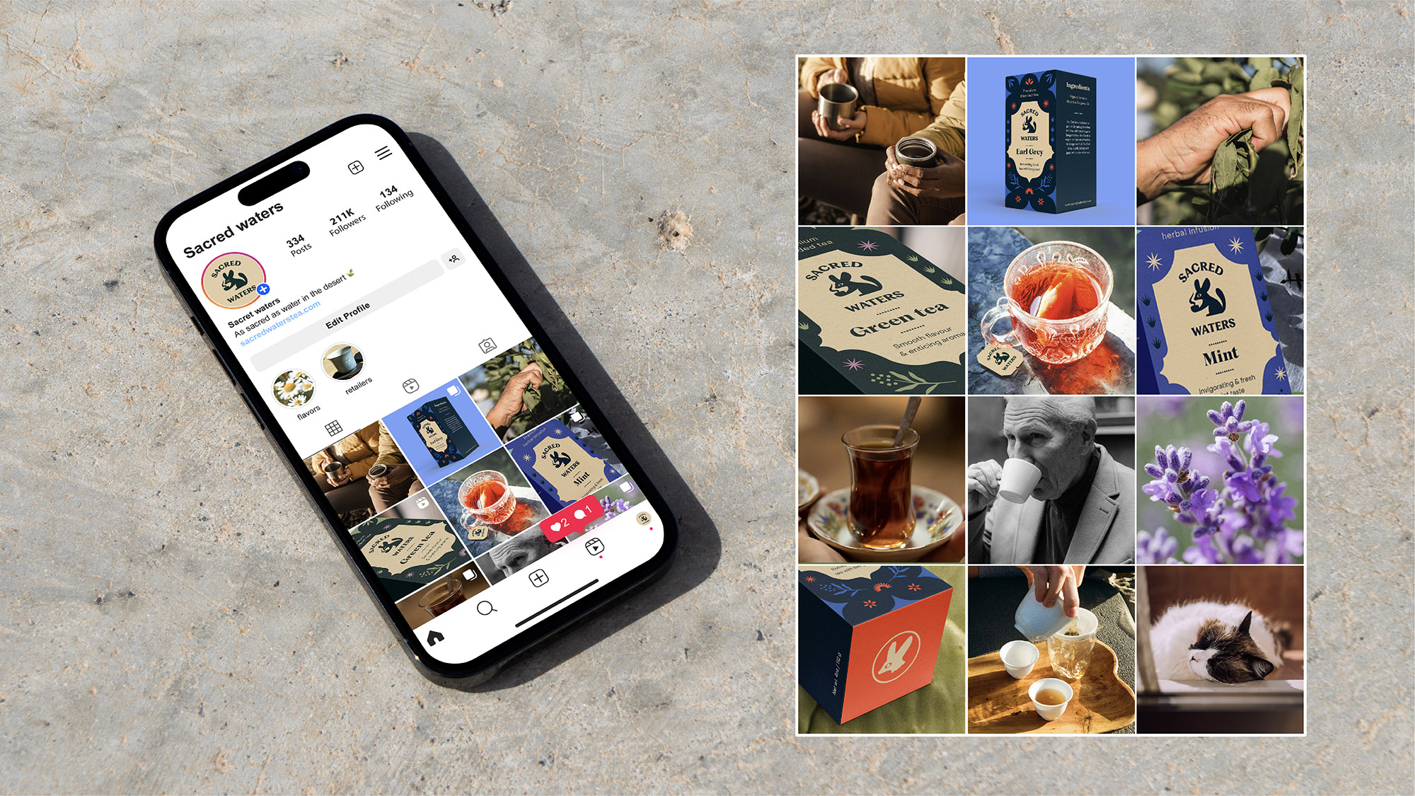
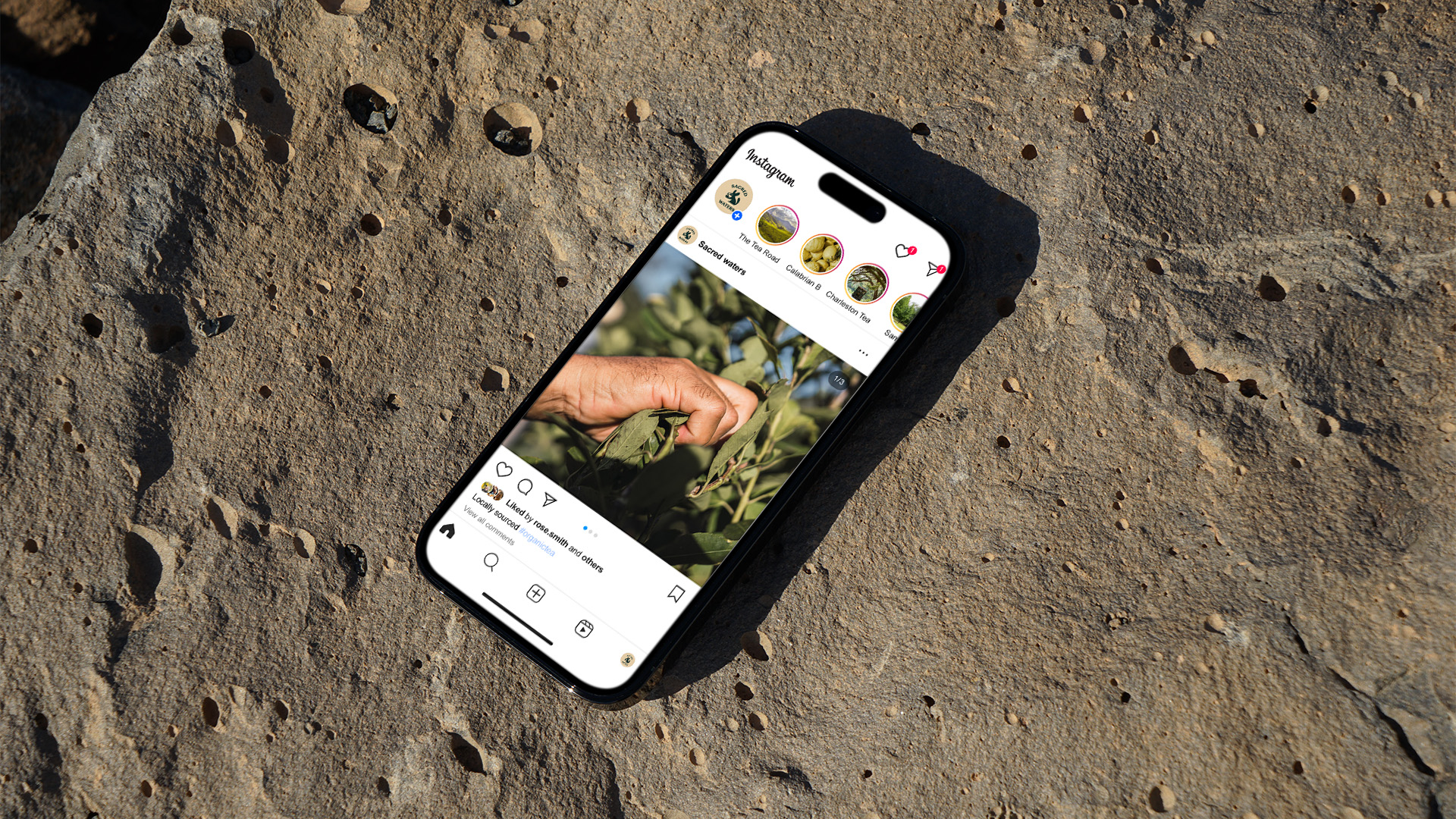
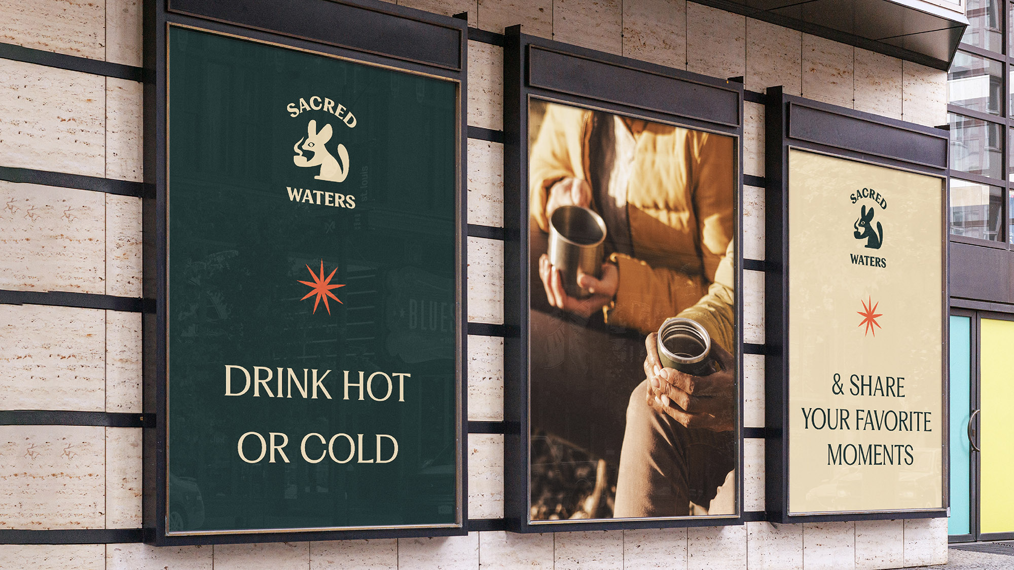
The visual system needed to extend beyond the packaging itself. I developed applications across multiple touchpoints, including outdoor advertising and social media, where photography, product experience, and graphic ornamentation were brought together within a cohesive visual framework.
The same elements that defined the packaging (the fennec fox, desert-inspired ornaments, typographic pairing, and warm color palette) were adapted across formats while maintaining a consistent brand identity.