RutaCR
End-to-end project, from naming and branding to UI design and prototyping. Public transportation in Costa Rica is fragmented, unreliable, and stressful, especially for people who rely on it every day to get to work. Poor route connectivity, inconsistent schedules, and the lack of real-time information force commuters to leave home two to three hours early just to arrive on time.
Role
UX Research, Interaction Design, Information Architecture, Naming
Collaboration
Jose Valverde, Milena Somogyi
Year
2026
Research
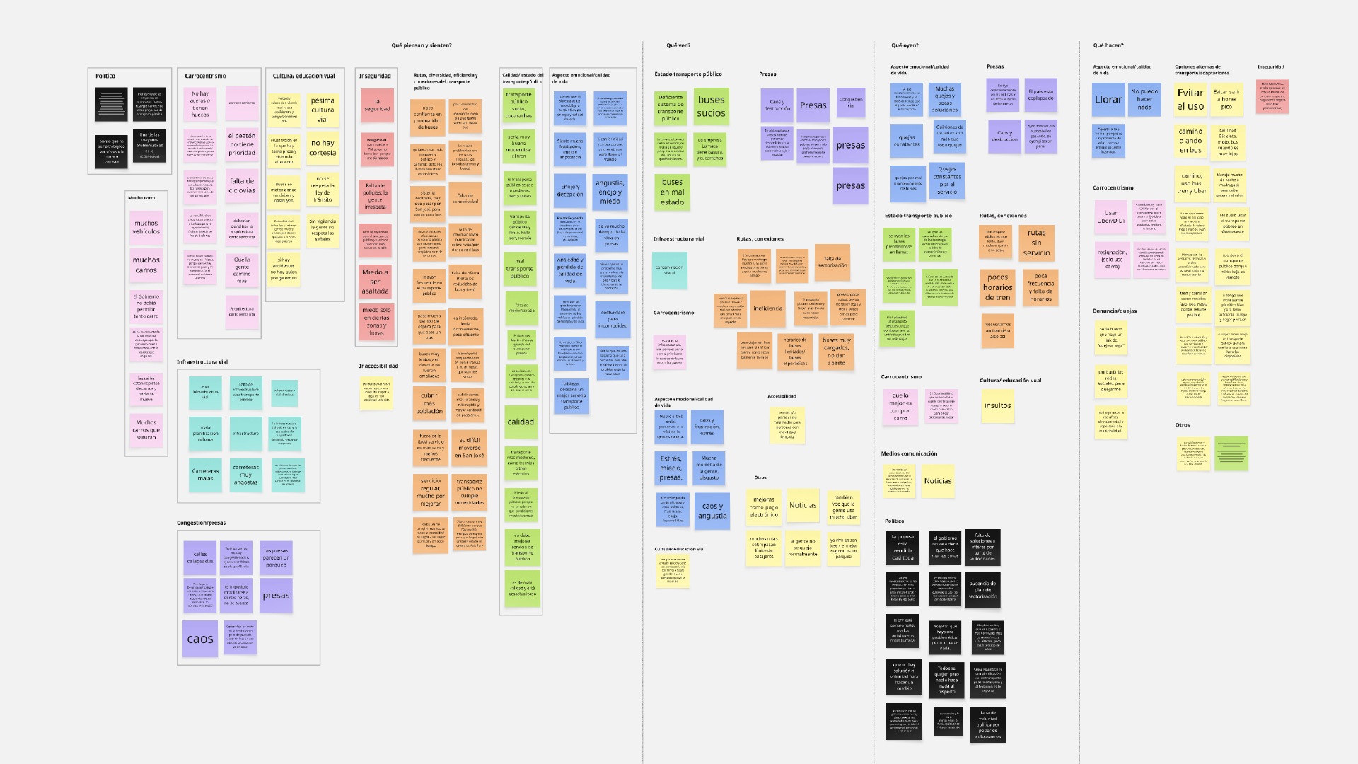
To better understand transportation and mobility in Costa Rica, we conducted open-ended interviews with approximately 15 participants across different age groups, locations, and transportation habits, including both public transit users and people who relied primarily on private vehicles. Rather than starting with a predefined problem, we explored how people think, feel, observe, hear, and act in relation to transportation and mobility in their daily lives.
We organized the responses using an empathy-mapping framework and analyzed recurring patterns across participants. Nine themes consistently emerged: car dependency, political priorities, road culture, safety, infrastructure, accessibility, emotional well-being, public transit conditions, and route connectivity.
➠ Among these themes, public transportation stood out as the area where frustrations, barriers, and quality-of-life impacts converged most clearly, ultimately defining the focus of the project.
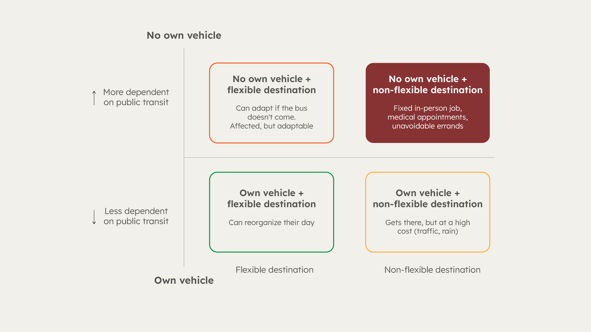
We then synthesized the research through a user-centered lens, mapping goals, needs, pain points, skills, limitations, tools, fears, mental models, and prior experiences to develop a clearer understanding of who we were designing for.
➠ Insight: The most critical user group was the one with the least flexibility: in-person workers without access to a private vehicle, commuting to a fixed destination on a fixed schedule during peak hours. Their dependence on the system made them especially vulnerable to delays, uncertainty, and poor route coordination.
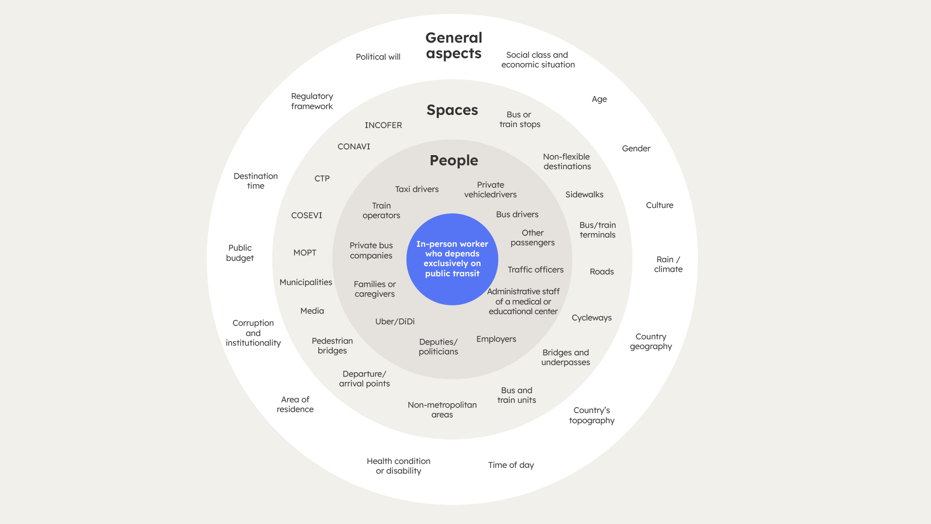
From there, we mapped the full stakeholder ecosystem: bus operators, drivers, government entities (MOPT, COSEVI, CTP), employers, other passengers, and the physical infrastructure itself.
Defining the user
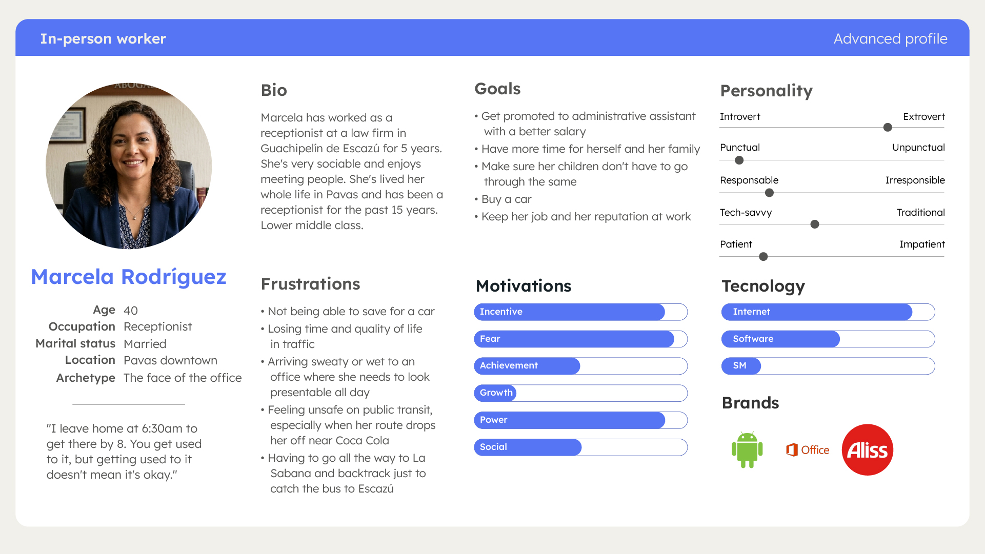
We identified three primary profiles: in-person workers (beginner and advanced), university students with fixed schedules, and older adults. We created four detailed personas based on real interview data.
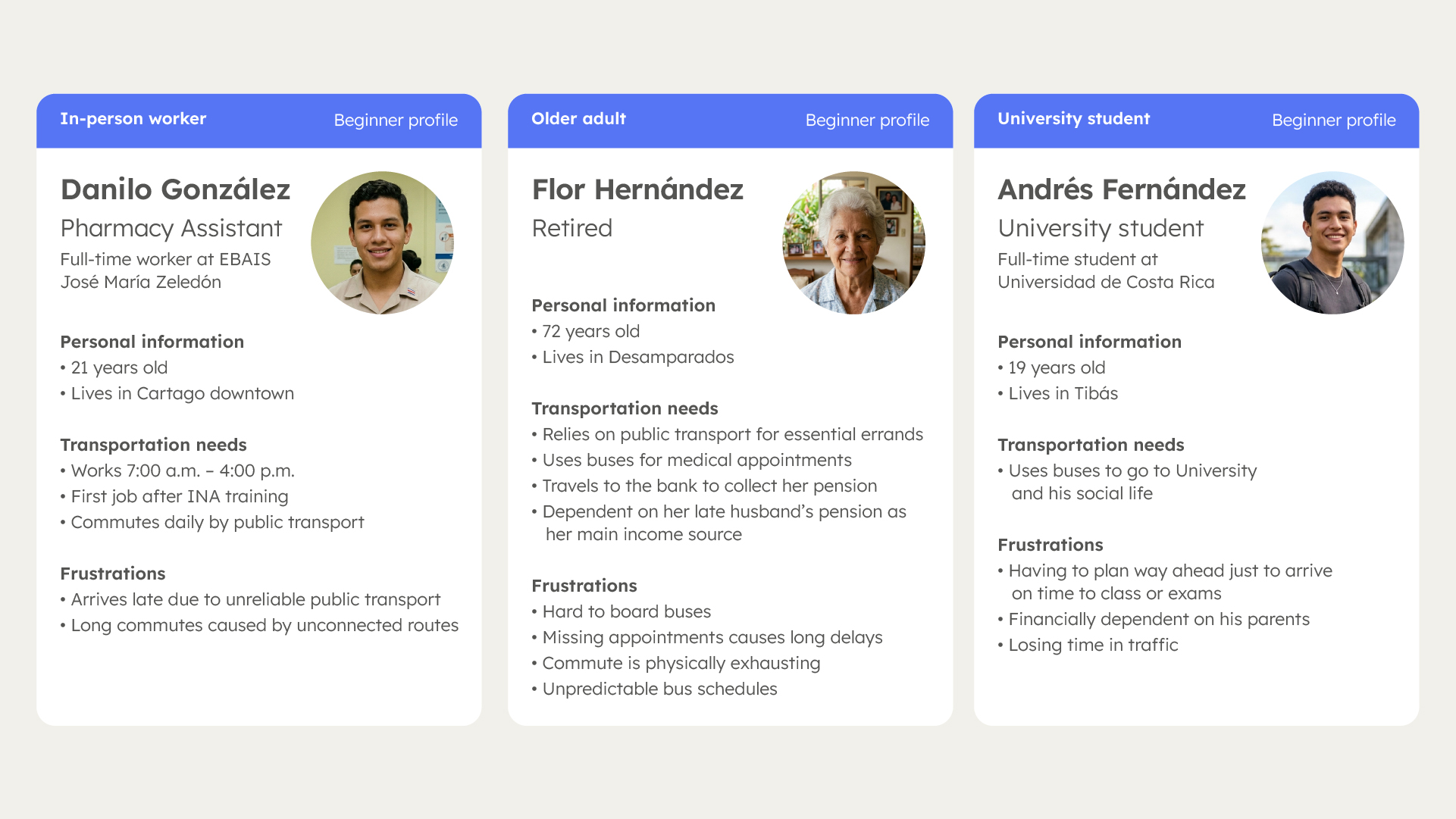
➠ The most important insight emerged at this stage: women carry a disproportionate share of public transit friction. They're more exposed to safety risks, tend to earn less (making car ownership harder to reach), and handle more of the caregiving trips: school pickups, medical appointments, errands. The user who needs reliable transport the most, and suffers the most when it fails, is predominantly female.
➠ We identified the in-person worker as the most critical user, as they rely on public transportation daily and are most affected by traffic delays. We created Marcela, a receptionist commuting from Pavas to Escazú, as the primary persona for our journey mapping.
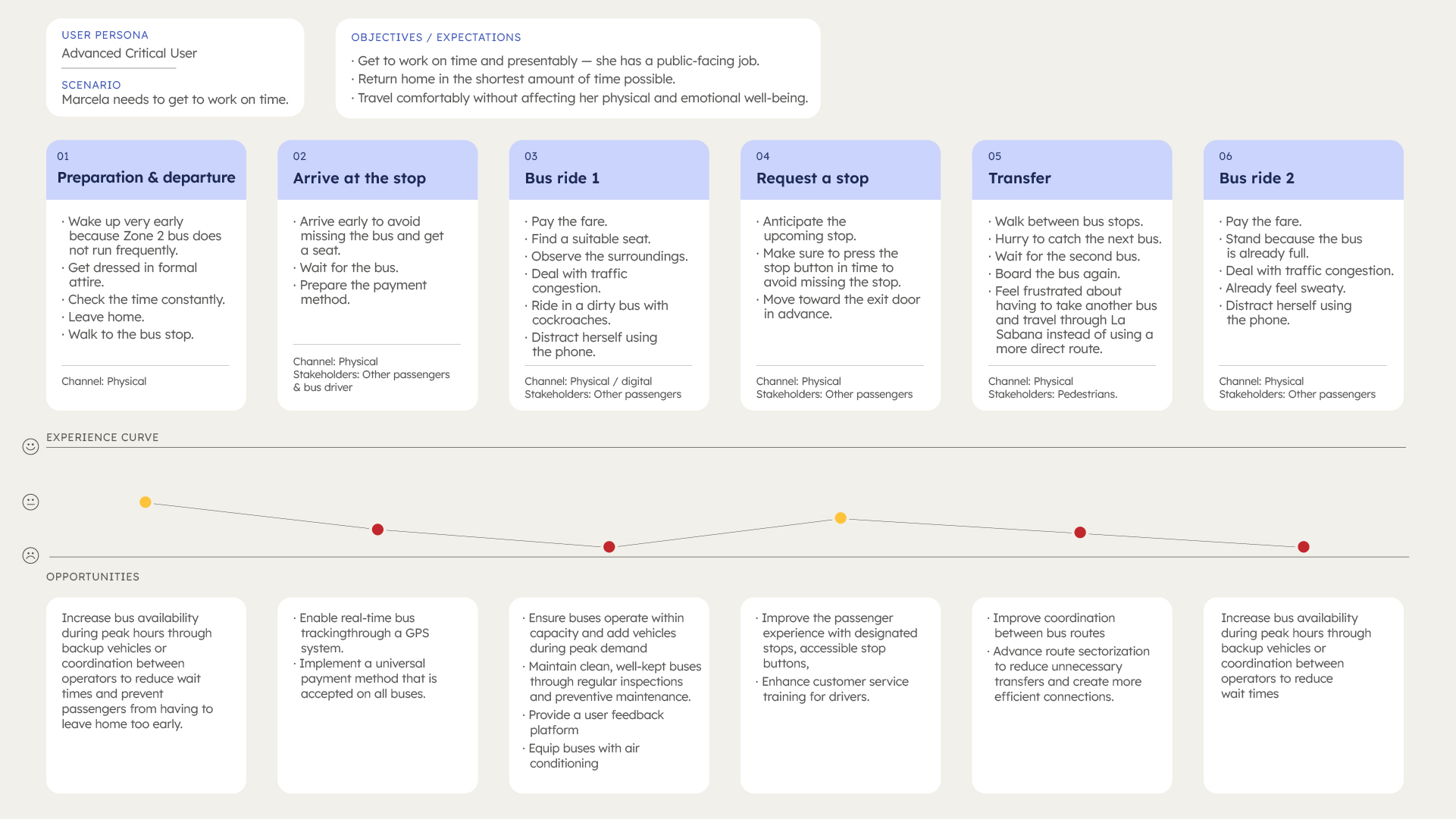
Journey mapping
Mapping Marcela's full day surfaced multiple friction points: unpredictable wait times, physical exhaustion from transfers, and no information when routes change.
➠ Insight: We realized that the ride home comes with a different set of challenges. Afternoon rain in Costa Rica causes heavier traffic, longer wait times, and overcrowded buses, making an already exhausting commute even more difficult. That's why we mapped both directions of Marcela's journey, not just the morning trip.
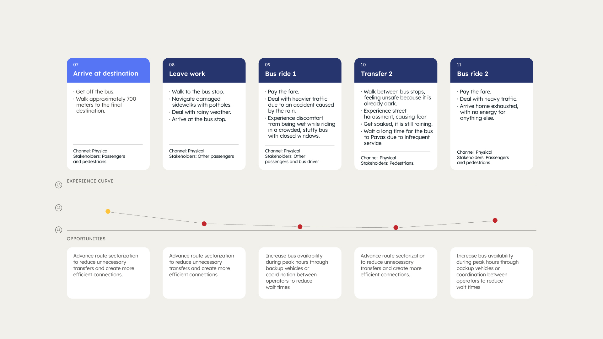
Swipe right to see the full journey
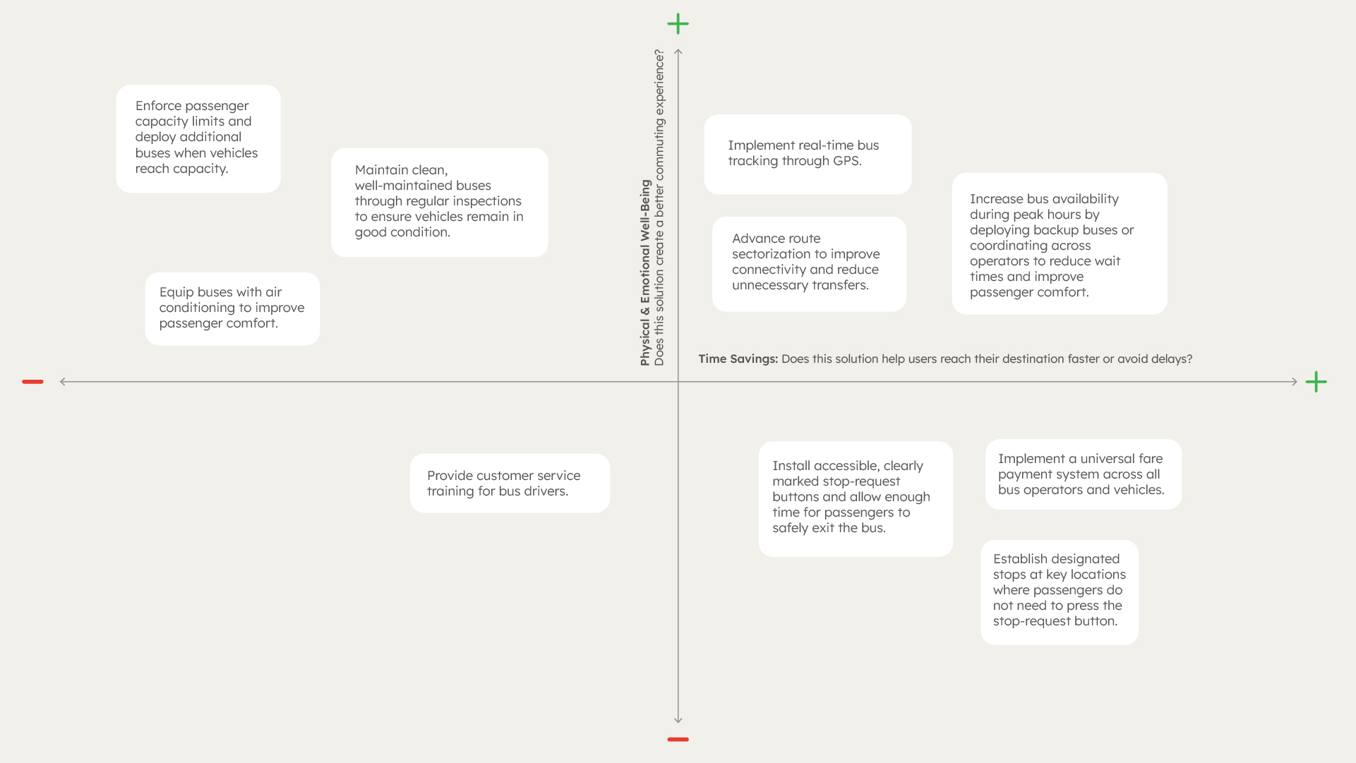
We prioritized improvement opportunities along two dimensions:
- Reducing travel time and improving physical and
- Emotional well-being.
When evaluated against those criteria, two opportunities consistently emerged as the most impactful: real-time bus tracking via GPS and increased service frequency.
Validation
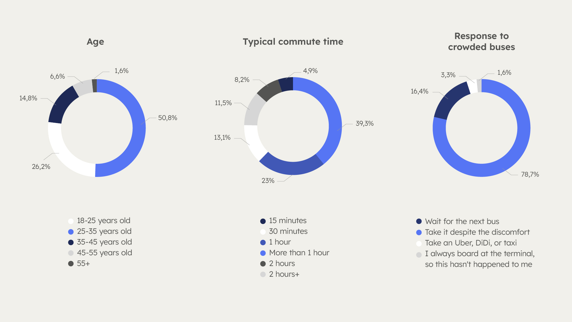
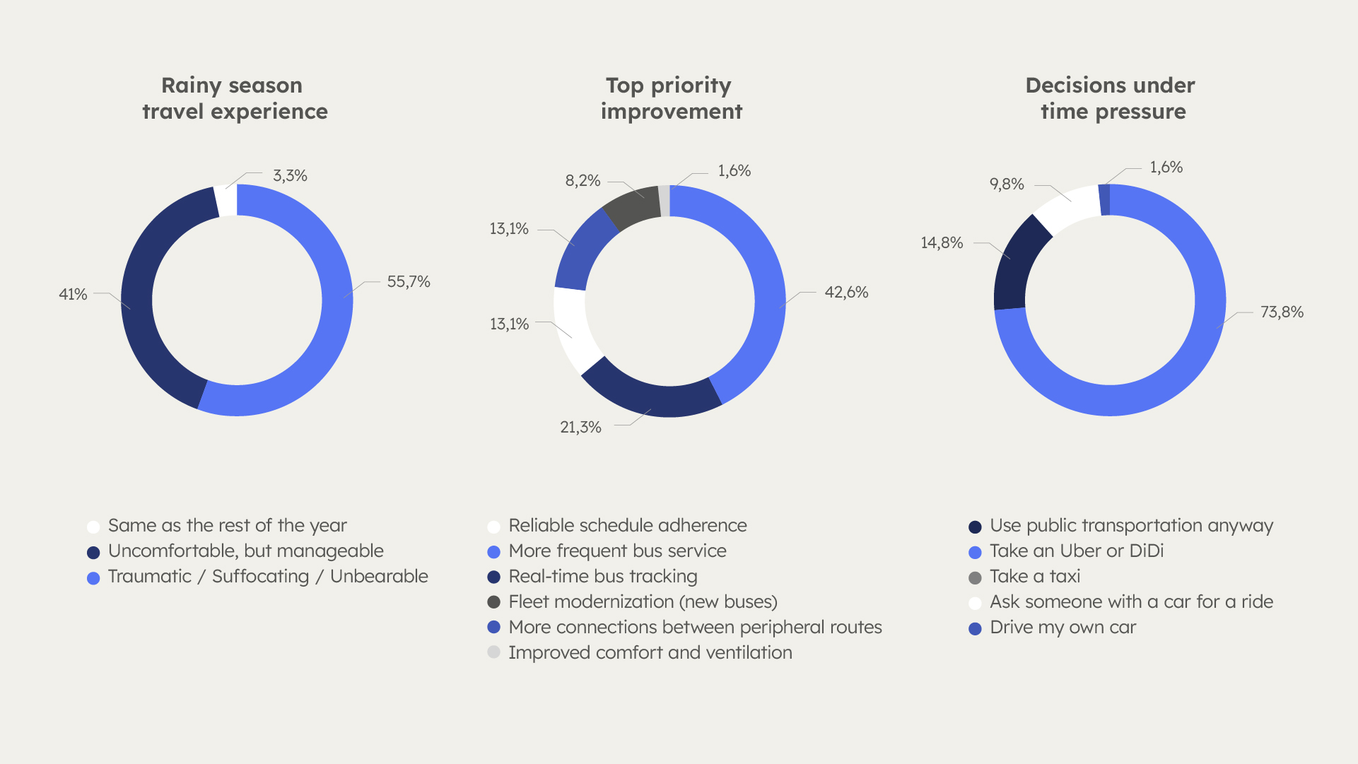
We ran 7 in-depth interviews with in-person workers, followed by a survey of 61 participants to validate and quantify the patterns we observed.
➠ One insight emerged consistently throughout the validation process: public transit users experience a profound loss of control over their time. Unpredictable schedules, limited access to reliable information, overcrowding, lengthy transfers, and poor bus conditions create a system that is not only inefficient but emotionally taxing. To compensate, commuters often plan their journeys hours in advance, sacrificing time, comfort, and peace of mind simply to ensure they arrive at work on time.
The survey confirmed the scale of these issues:
- 82% spend at least one hour commuting each way on a typical day.
- 79% regularly board overcrowded buses despite the discomfort.
- 72% wake up 2–3 hours earlier to compensate for unreliable schedules.
- 74% incur unexpected transportation costs when buses fail to arrive and they need to take an Uber or DiDi.
- 72% report losing valuable rest time as a direct consequence of their commute.
- 49% report chronic stress and anxiety linked to transit uncertainty.
- 43% identified real-time bus tracking as the single improvement they would value most.
Identifying possible solutions
Following the research stage, one opportunity consistently stood out: increasing bus frequency. It addressed two of the most significant user concerns at once: overcrowding and uncertainty. Shorter intervals between buses reduced both the practical and emotional impact of delays, missed buses, and service disruptions.
Final solution
The final proposal was an integrated transit platform combining increased bus frequency, route synchronization, and real-time communication. As the concept evolved, it became clear that improving reliability required coordination across the entire transit network, not just better information for riders.
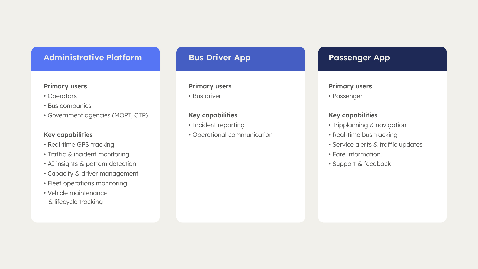
The solution expanded into an integrated platform composed of three interconnected products:
- Passenger App: designed to give riders back a sense of control over their commute.
- Bus Driver App: a lightweight interface focused on incident reporting and operational communication, designed to minimize distractions while driving.
- Administrative Platform: the network’s control center, consolidating real-time data on vehicles, drivers, traffic, incidents, and demand to help operators monitor performance, manage resources, anticipate disruptions, and optimize routes and service frequency.
Wireframes
Before moving into wireframes, we benchmarked established mobility products such as Google Maps, Moovit, Uber, and public transit apps from other countries. Rather than focusing on visual design, the goal was to understand how complex transit information is structured and prioritized, how users navigate between tasks, and where they expect to find key features.
We then focused the wireframing phase on the passenger app, where the impact of uncertainty was most visible. The wireframes centered on helping users plan, track, and adapt their journeys through features such as route search, stop information, transfer coordination, real-time bus tracking, and incident notifications. This user-facing product was developed under the name RutaCR.
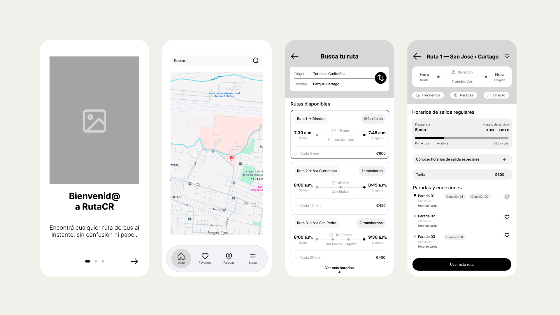
Usability testing
To evaluate the effectiveness of the initial wireframes, we conducted a first round of usability testing focused on the app's primary user journeys. Participants were asked to complete a series of tasks covering onboarding, route planning, navigation, personalization, and incident reporting:
- Create an account.
- Search for a route to a destination.
- Identify available transfer connections.
- Add a route or stop to favorites.
- Check a route schedule.
- Report an incident.
- Browse routes without entering a destination.
- Review previously reported incidents.
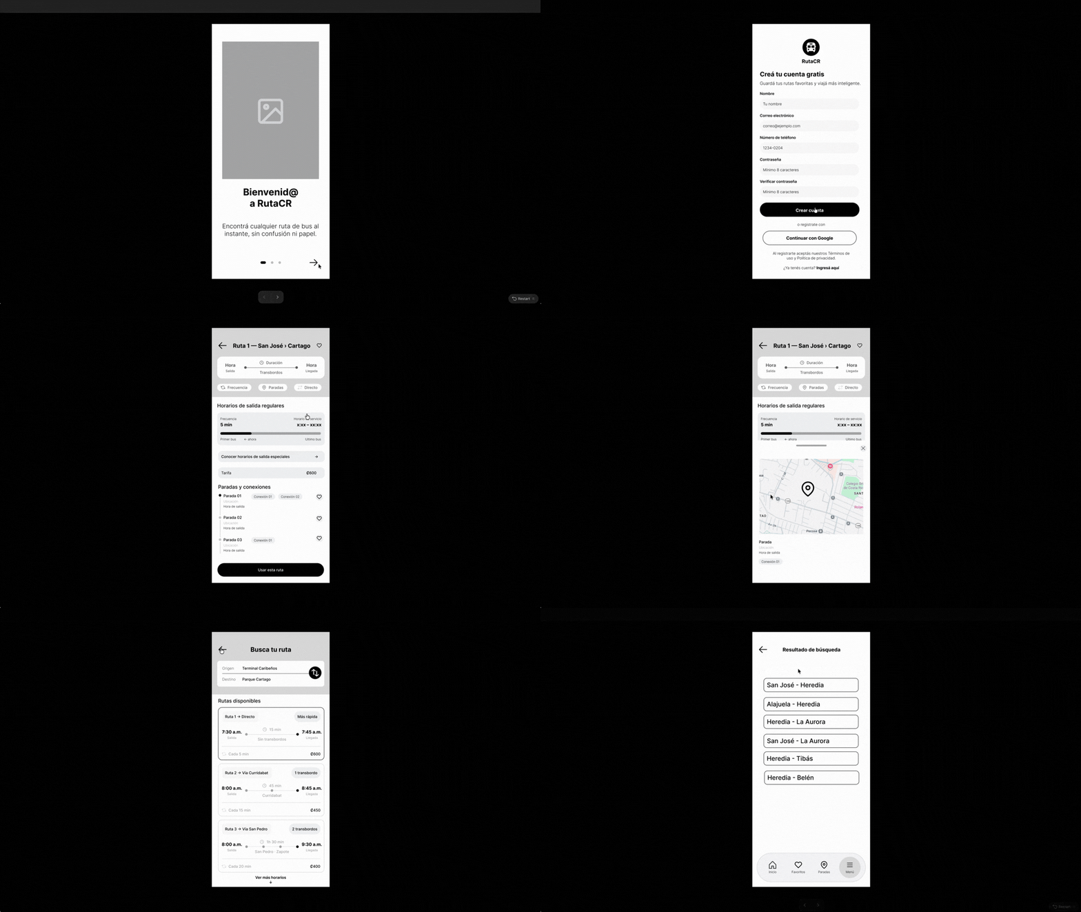
Interactive wireframe showcasing the app’s core features.
Feedback
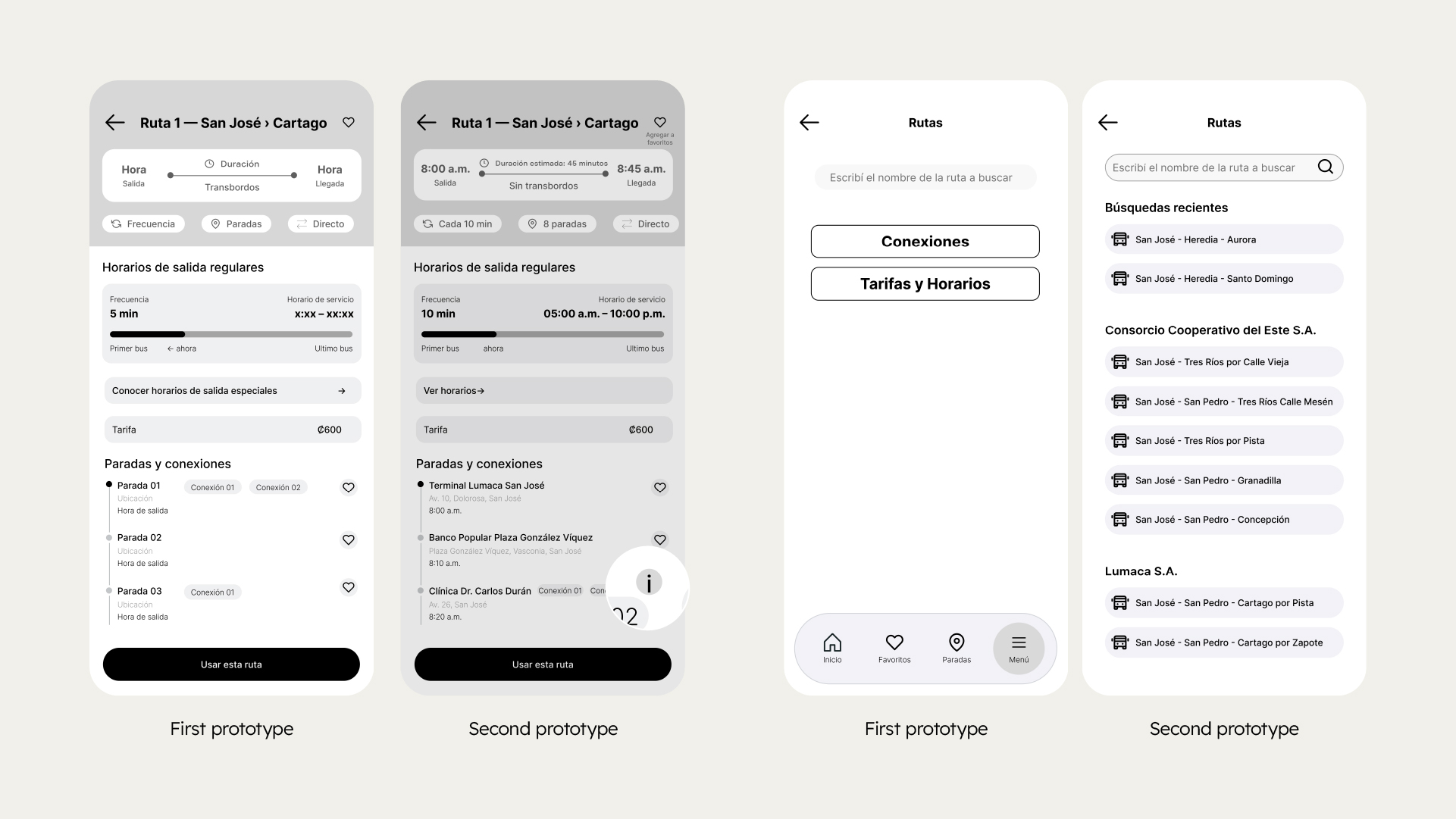
During usability testing, we identified key opportunities to improve Ruta CR’s clarity and navigation. The main challenges were related to the “Connections” feature, the discoverability of favorites, route and schedule search, and some visual hierarchy issues. Based on these insights, we refined the information architecture, simplified the search experience, improved favorites visibility, redesigned route, schedule, and fare screens, and optimized incident reporting flows. Despite these challenges, users saw strong value in the app and highlighted its potential to reduce uncertainty around public transportation.
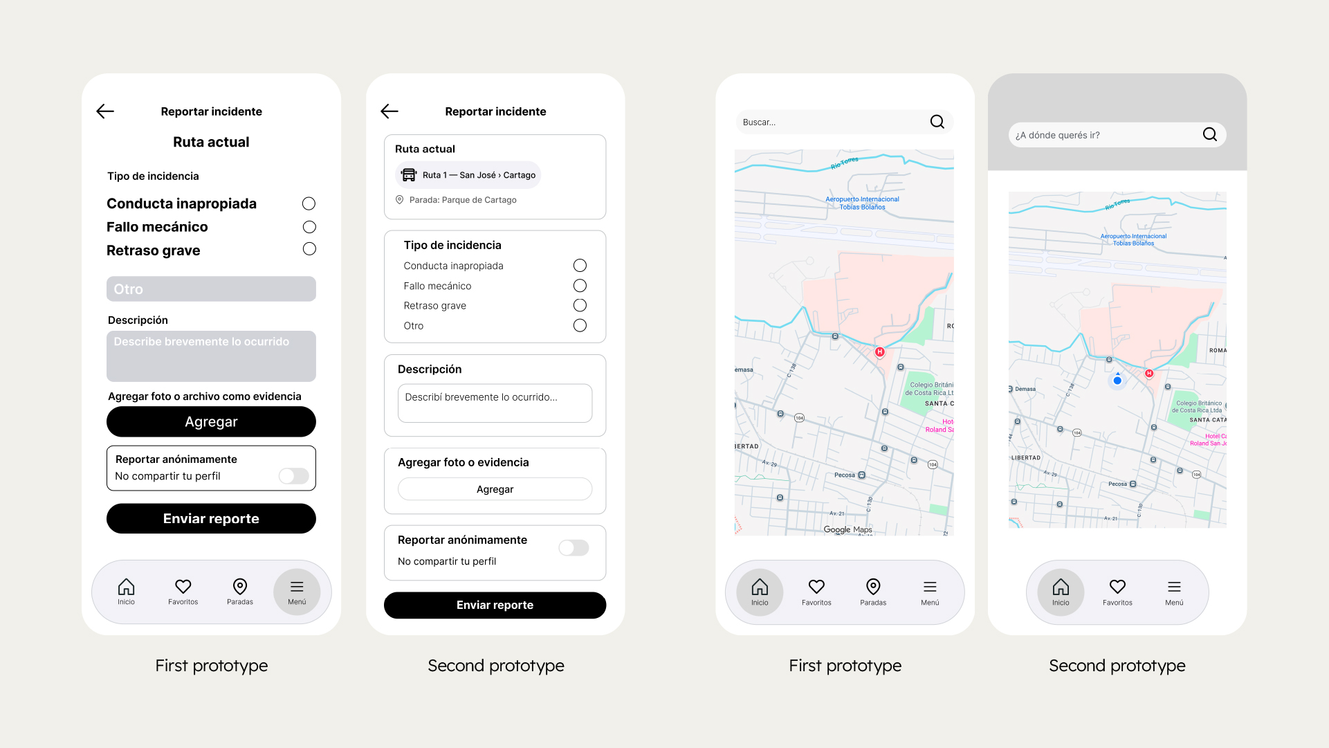
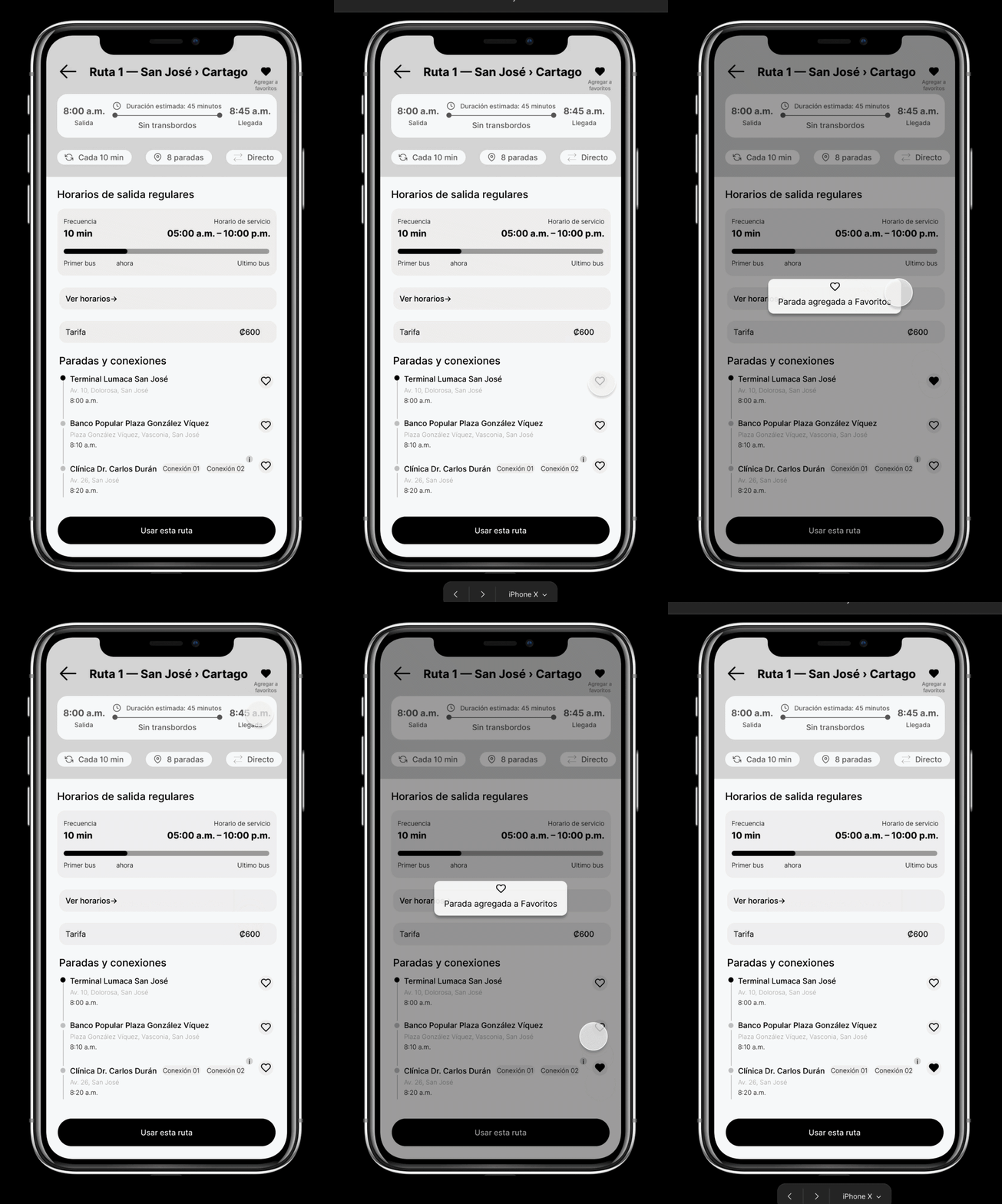
Added a confirmation message after usability testing revealed that users were unsure whether a route or stop had been saved.
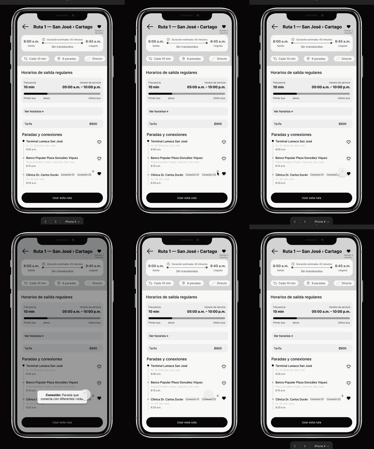
Users struggled to understand the “Connections” feature, so we added a contextual help tooltip to explain it.
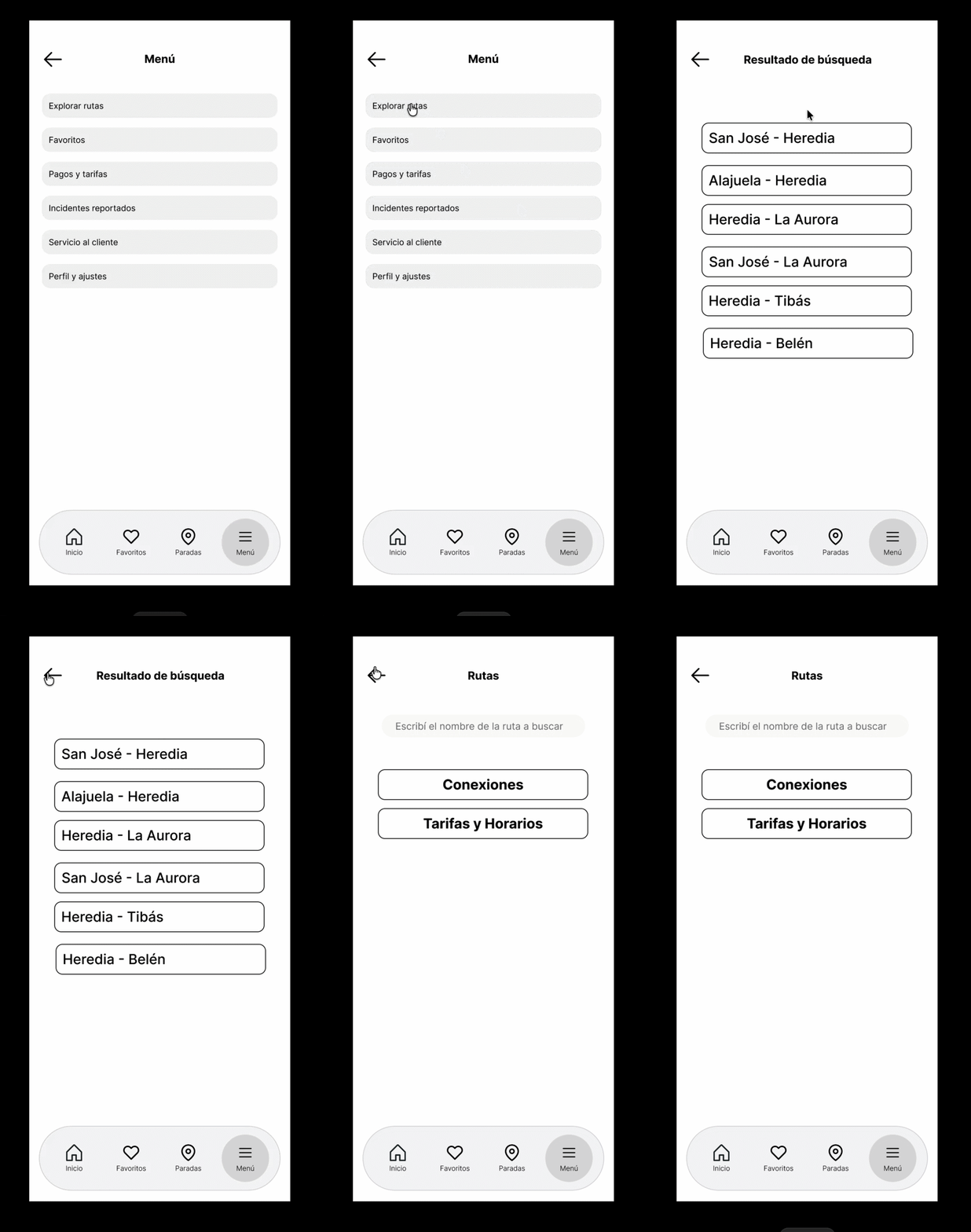
In the first prototype, the route search displayed route-related options before users had selected a route, creating unnecessary confusion.
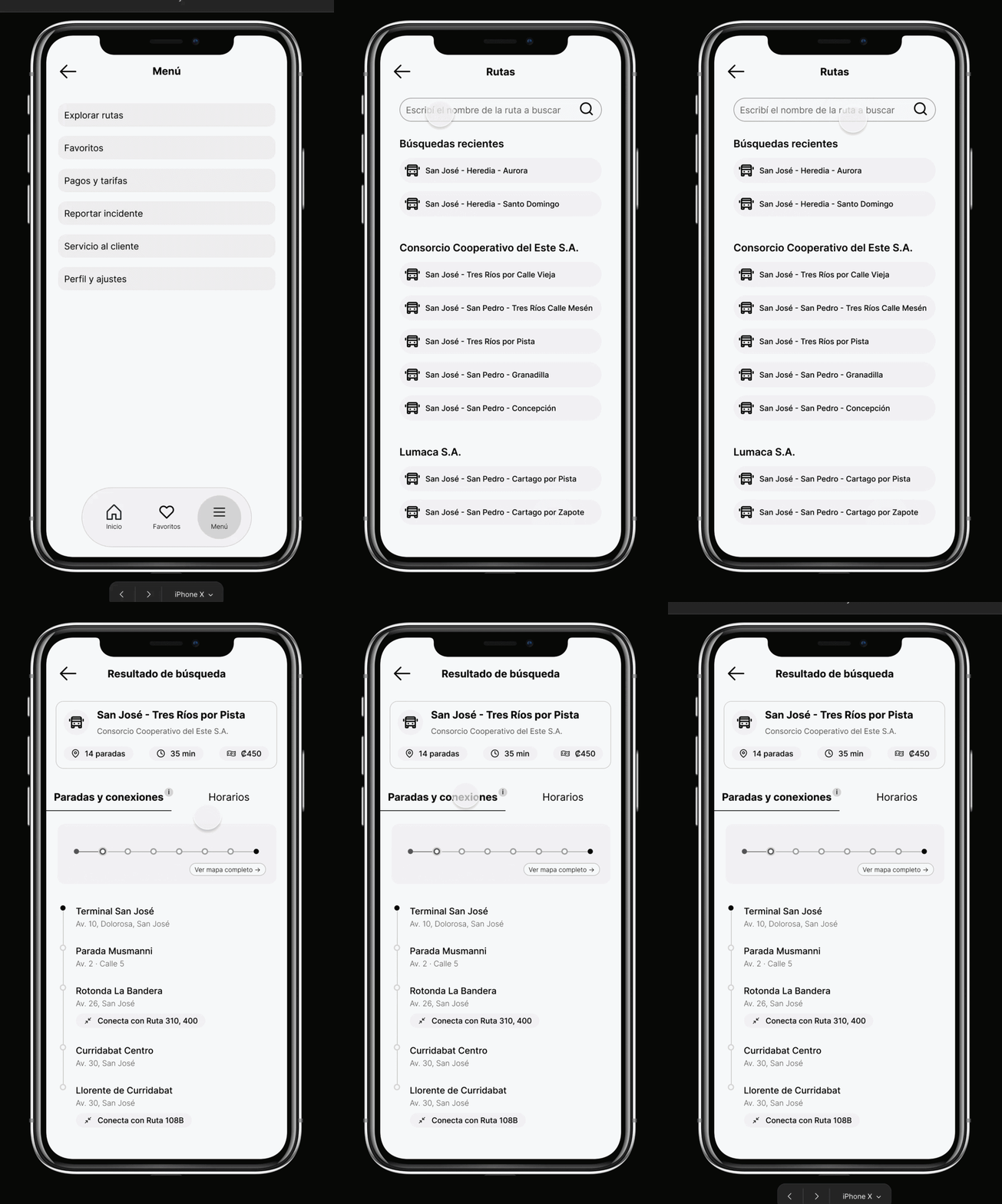
Usability testing showed that users expected to find the route first, followed by its related information, so we adjusted the search flow accordingly.