Dentons Event Design Systems
Dentons is one of the world’s largest law firms, with a highly structured corporate identity system. These event design systems are developed for conferences, webinars, and communication campaigns that require multiple collateral pieces. Each system is tailored to the event’s theme, audience, and geographic context while remaining unmistakably aligned with the Dentons brand.
Client
Dentons
Role
Brand Design, Brand Systems
Year
2024-2026
Dentons brand guidelines
Dentons' brand guidelines require the use of organic or nature-related imagery, referred to as the “standard” style. When additional visual context is needed, designers may apply the “hybrid” style, which combines an organic image with a non-organic one, such as architecture, roads, or machinery.
For both approaches, the guidepost shape and overlay treatment are mandatory elements of the system. In all compositions, one image is always presented in black and white while the other remains in full color. Although purple is Dentons’ primary brand color, the identity system also includes a broader supporting palette, such as the colors shown below.

Challenge
Each design system had to respond to several constraints at the same time:
- First, it needed to remain unmistakably aligned with the Dentons brand by following its visual guidelines and using either the standard or hybrid imagery style, both of which require the inclusion of organic imagery and, consequently, a layer of metaphor rooted in nature.
- Second, every event came with its own objectives, audience, and theme, meaning the visual direction needed to reflect a distinct narrative rather than feeling generic.
- Third, the imagery also had to respond to the event’s geographic context, ensuring that the organic elements felt locally relevant and culturally appropriate to the region in which the event was taking place.
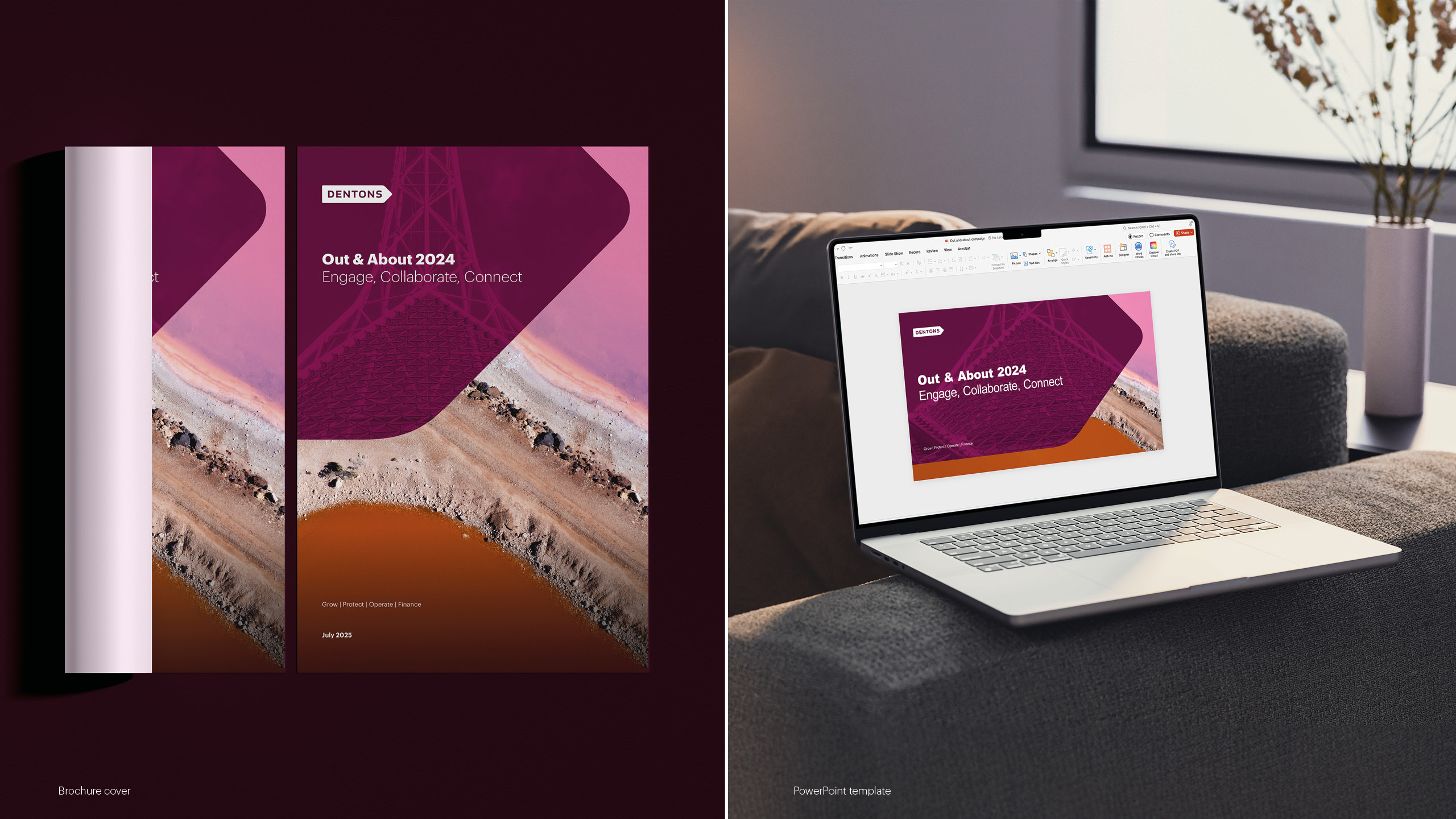
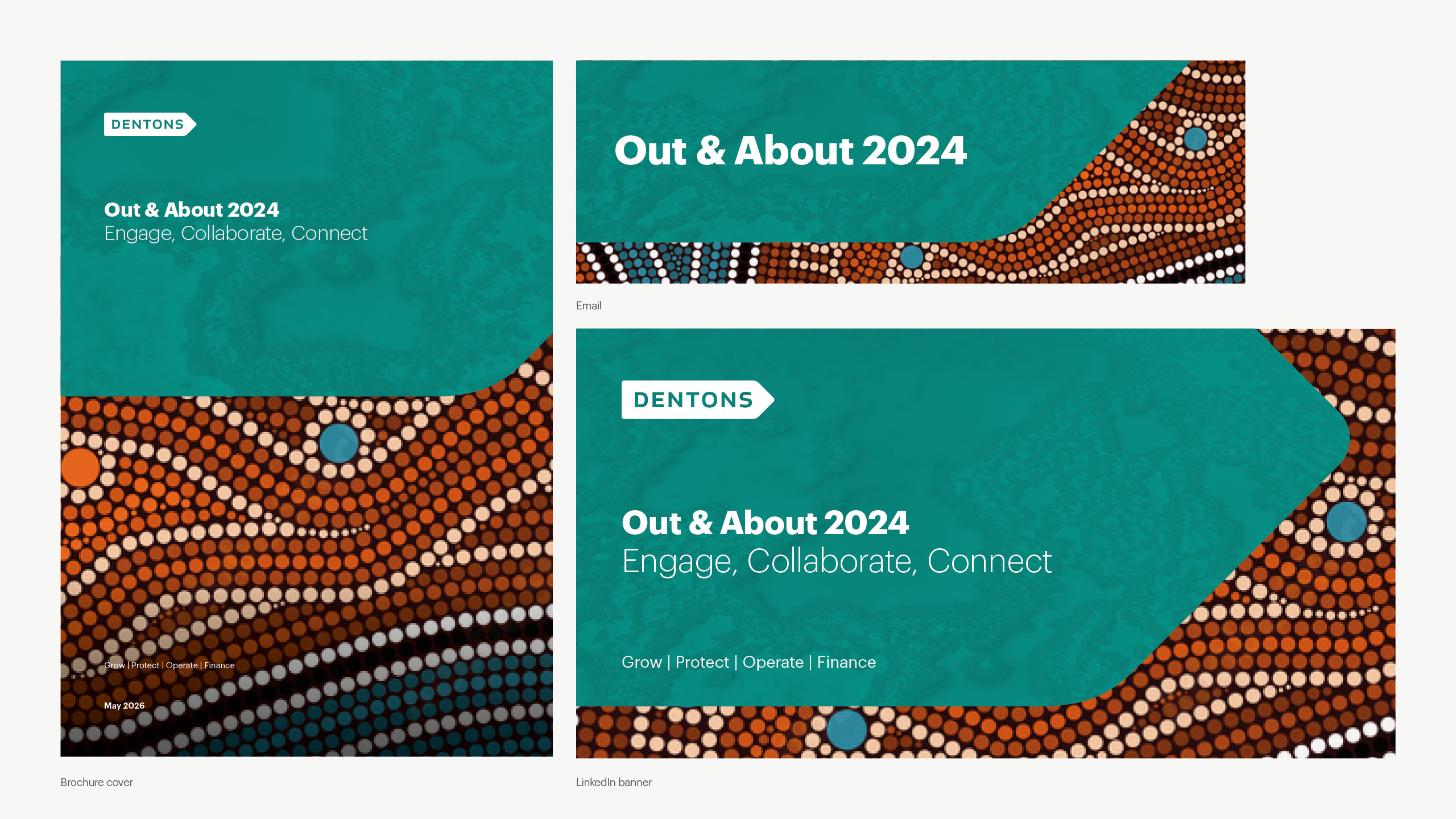
Out & About 2024: Engage, Collaborate, Connect
Out & About is Dentons' annual internal campaign encouraging fee earners to drive business development activity across the firm. This edition was in Australia and asked teams to compete by recording client engagement over a month-long period, with connection as the central theme.
An important objective of this design system was to incorporate Australian landmarks and iconic natural elements to ground the event within its geographic context. References such as Hutt Lagoon, the native Mottlecah flower, and the Great Barrier Reef helped tailor the visual language specifically to Australia and reinforce a sense of place. I explored and presented several visual directions using this approach.
Vibrant connections
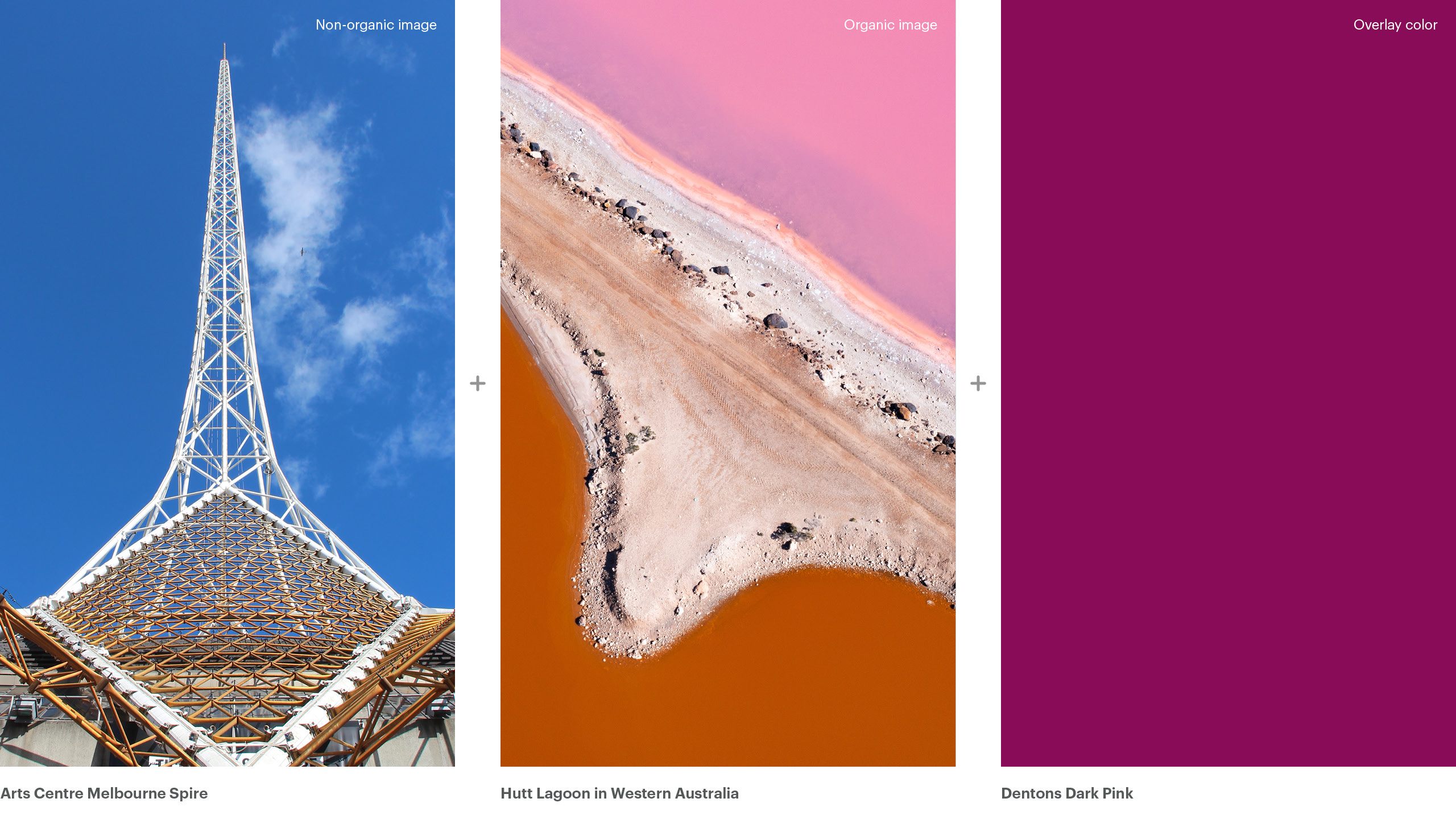
For this version, I developed a hybrid visual approach combining two iconic Australian landmarks: Hutt Lagoon in Western Australia and the Arts Centre Melbourne Spire. The design aimed to convey engagement, collaboration, and connection through the spire’s dynamic structure and intersecting lines, which symbolize the relationships between business units, clients, and sector teams.
To align with Dentons’ brand guidelines, which emphasize the use of organic imagery, I paired the architectural element with the vibrant landscape of Hutt Lagoon. Its distinctive pink tones reflect the diversity and uniqueness of the Australian environment while complementing the brand’s visual identity. Dentons Dark Pink was used to reinforce the lagoon’s striking color and create a stronger connection between the natural imagery and the brand.
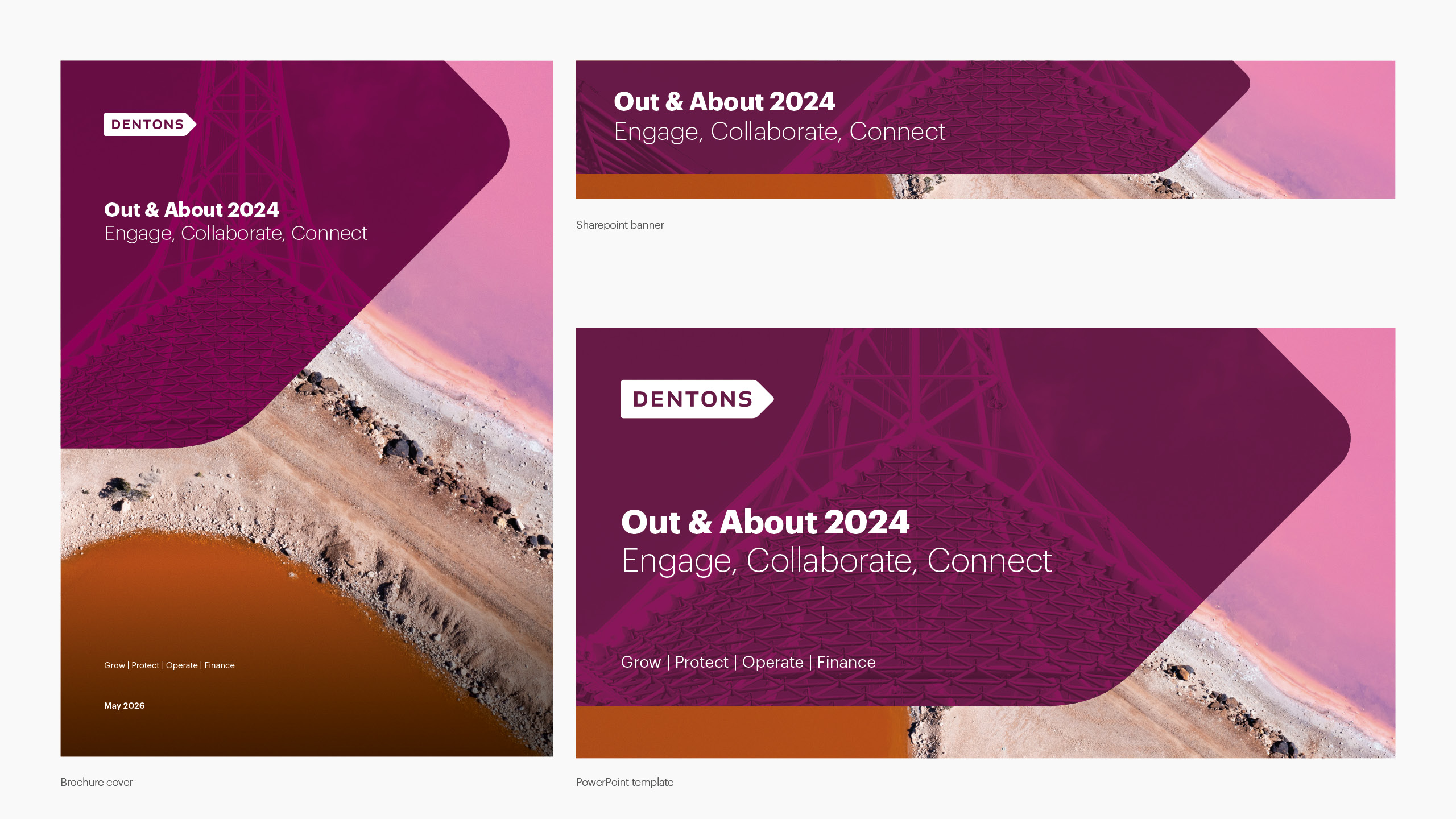
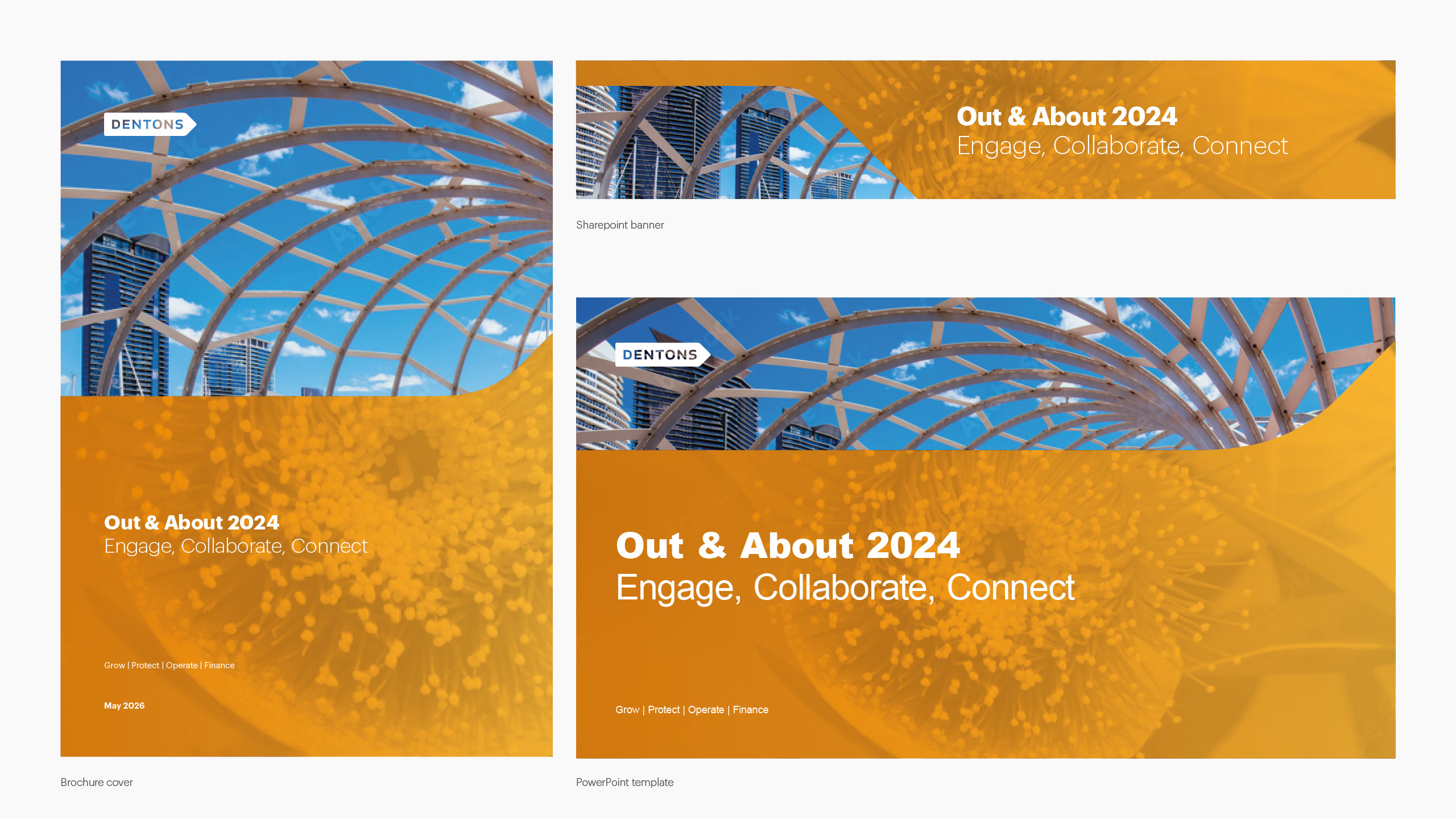
Images of three collateral pieces. For this version, I chose to keep the organic image in color while presenting the secondary image in black and white. To create a stronger sense of harmony, both images were intentionally selected to align visually in the guidepost intersection, creating a feeling of continuity between them.
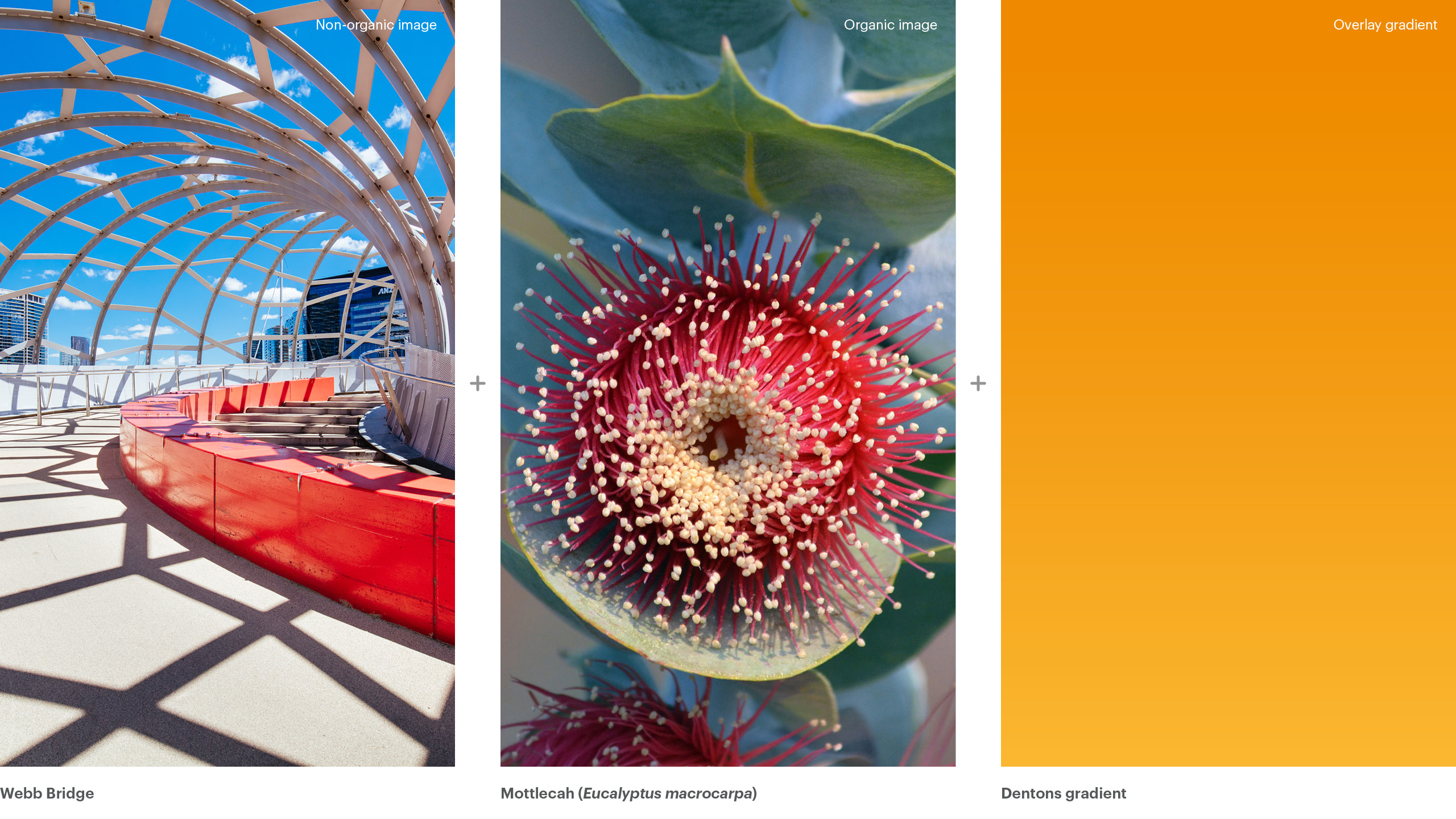
Bridging sectors
This hybrid design layout features Webb Bridge in Melbourne alongside the Australian native flower Mottlecah (Eucalyptus macrocarpa). I chose Webb Bridge to represent the event’s themes of collaboration and interaction, using the symbolism of a bridge as a structure that connects people and places.
For the organic imagery, I selected the Mottlecah, a species endemic to the southwest of Western Australia. Beyond aligning with Dentons brand guidelines, the flower also reinforced the campaign’s central message of fostering meaningful connections through its ecological role as a source of nectar for pollinators.
I used a gradient of Dentons Orange and Dentons Gold to balance the blue sky in the photograph while reinforcing the yellow tones present in the Mottlecah, creating a stronger visual connection between the image and the color treatment.
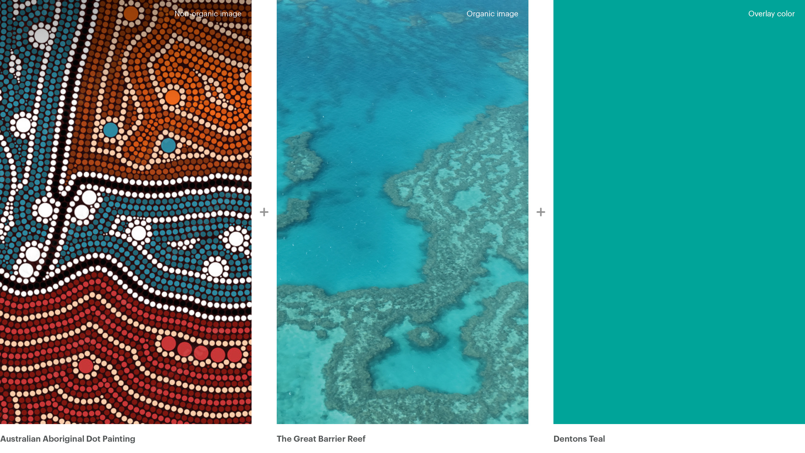
Waves of collaboration
This hybrid design approach showcases the Great Barrier Reef and Australian Aboriginal Dot Painting. The Great Barrier Reef, the world’s largest coral reef system located in northeastern Australia, supports an incredible diversity of life and is recognized as a UNESCO World Heritage Site. Australian Aboriginal Dot Painting, a distinctive style of Indigenous art, represents diversity, pathways, and collaboration, making it a fitting symbol for this campaign’s core values.
I chose Dentons Teal to highlight the blue elements inspired by Australian Aboriginal dot painting while also referencing the waters of the Great Barrier Reef.
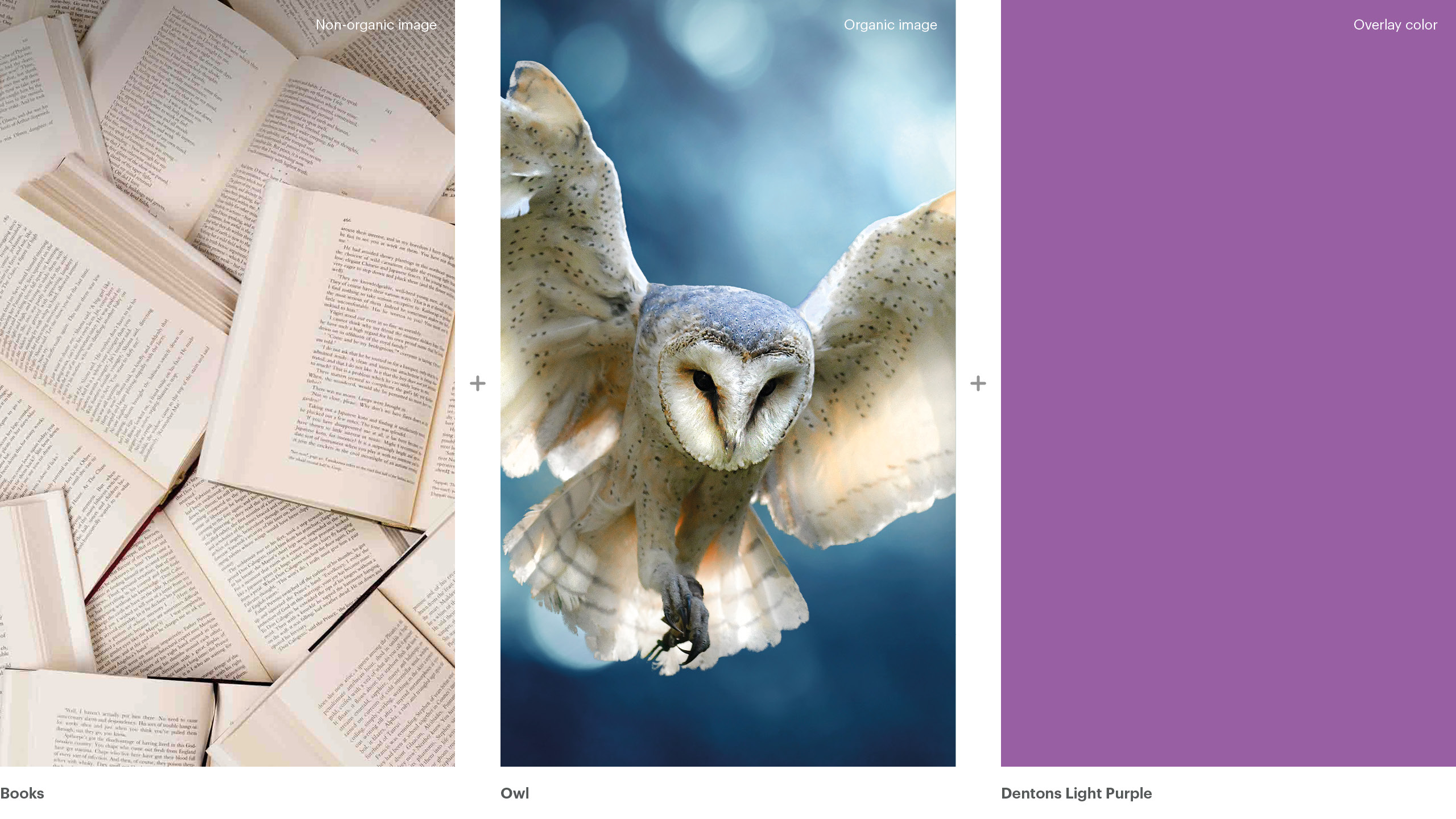
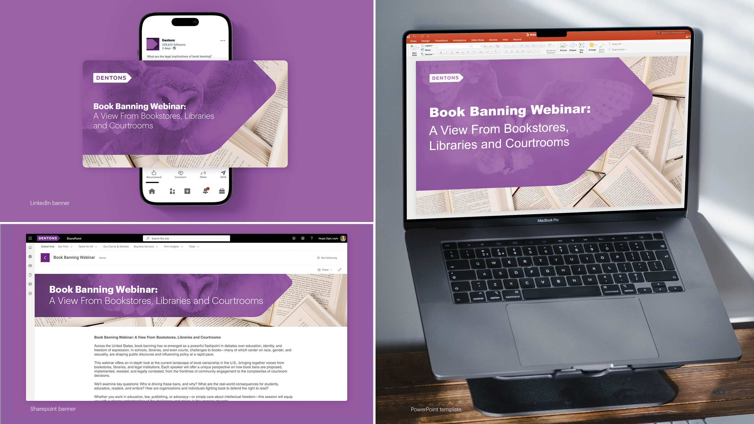
Webinar on book banning
Developed for a Dentons webinar addressing book-banning legislation in the United States, this identity needed to engage with a sensitive and politically charged topic without resorting to obvious visual clichés, prohibition symbols, warning colors, or imagery that could feel alarmist or one-sided.
The chosen direction draws instead from the world of literature itself.
The owl, long associated with wisdom and intellectual life, paired with a collection of books, creates a visual language rooted in knowledge and discovery rather than conflict. They frame the conversation around the value of what is at stake, not the politics of the debate, reflecting the tone of an audience of legal and business professionals who engage with ideas critically and thoughtfully. For this version, I used Dentons Light Purple to incorporate Dentons’ primary brand color while offering an alternative to the standard purple. It also provides contrast against the yellowish tones of the books, as purple is complementary to yellow, helping the subject stand out more effectively.
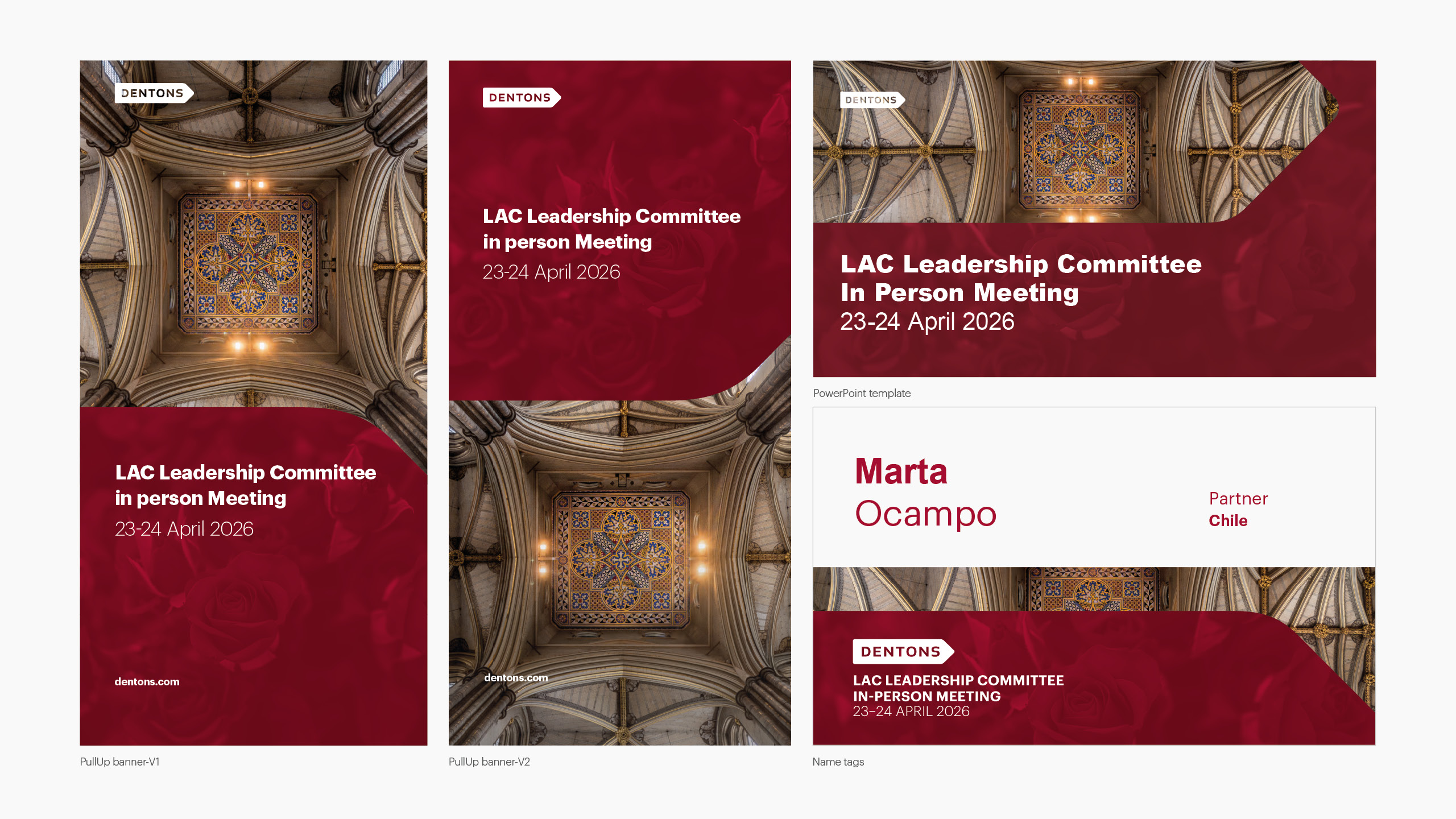
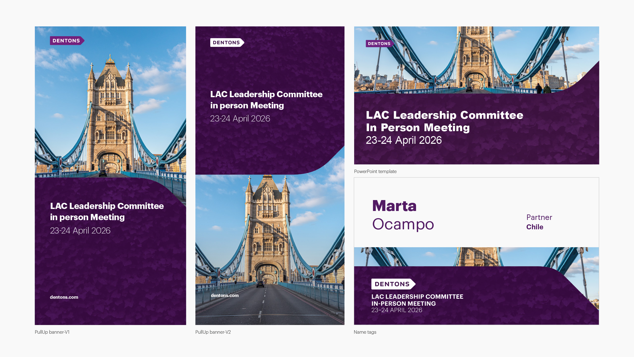
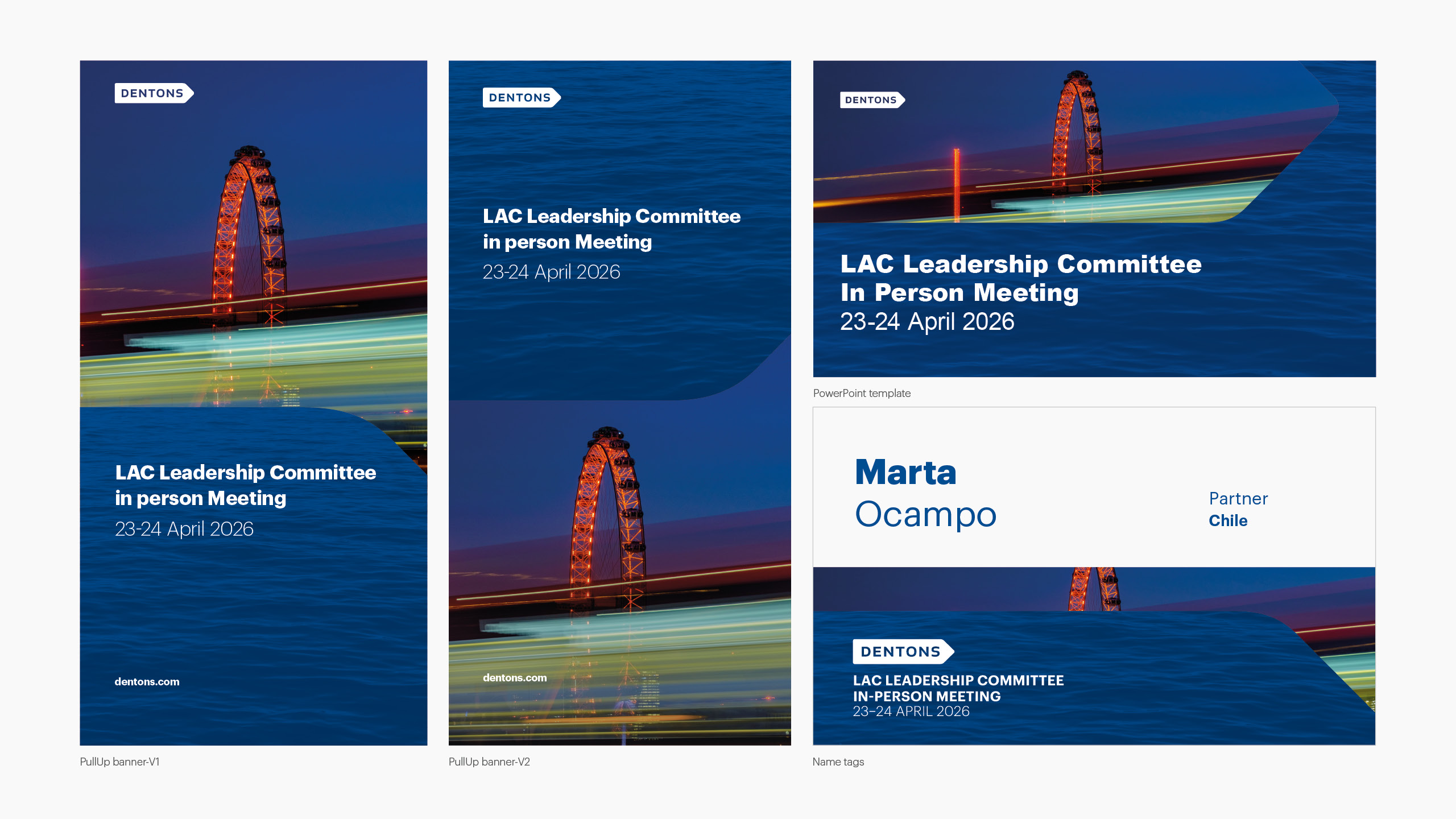
LAC Leadership Committe in person meeting
The challenge was to create a visual concept for the 2026 LAC Leadership Committee meeting in London that translated two business priorities into a compelling visual narrative: profitable growth through client-centric relationships and global integration under the “One Firm” model. The solution also needed to incorporate iconic London imagery while remaining aligned with Dentons’ brand guidelines and event communication standards. I presented three different visual directions, explained below.
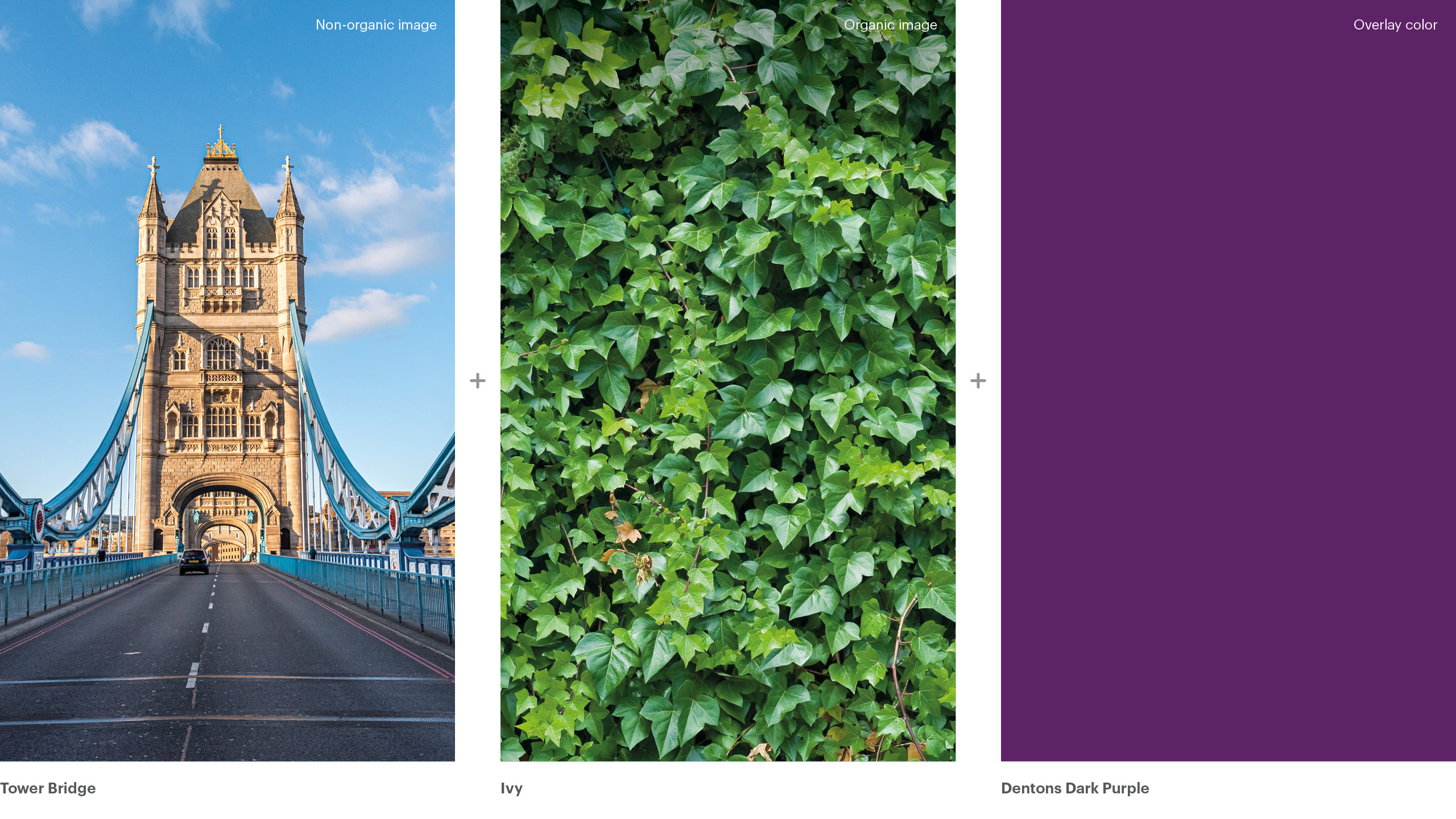
Integration and coordination
Ivy grows by connecting and strengthening the structures it embraces, creating continuity over time. When paired with Tower Bridge (one of London’s most iconic connectors), the image becomes a powerful metaphor for integration and coordination across regions and markets. This combination illustrates how seamless integration presents a unified, confident presence in the market. I chose Dentons Dark Purple as a brand-consistent option, leveraging a darker shade from the existing Dentons color palette.
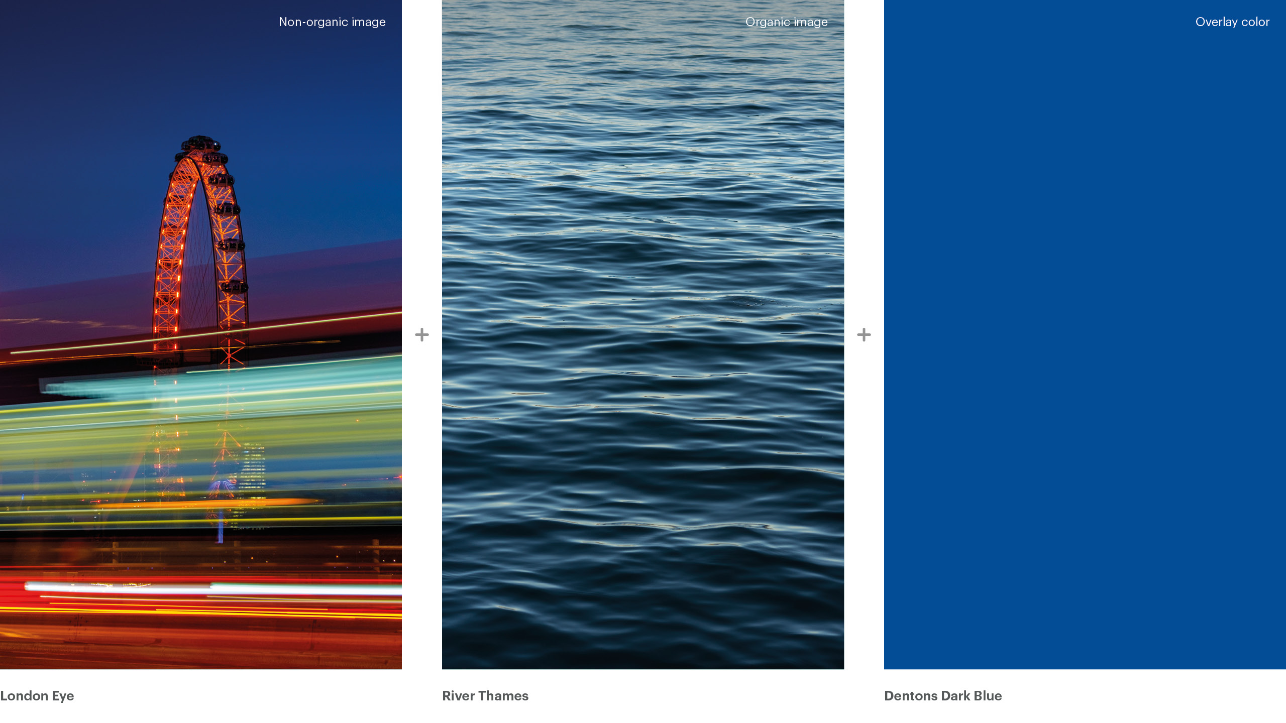
One firm: Together in motion
The River Thames, one of London’s defining landmarks, symbolizes movement, connection, and opportunity. Paired with the London Eye, a globally recognized icon of perspective and vision, the composition reflects how we operate as one firm: locally grounded, globally connected, and aligned in the delivery of our services.
Together, these elements express the value of shared vision and integrated execution. Dentons Dark Blue was selected to reference both the sky and the River Thames, maintaining a visual connection to the original image while reinforcing the brand palette through the monochromatic overlay.
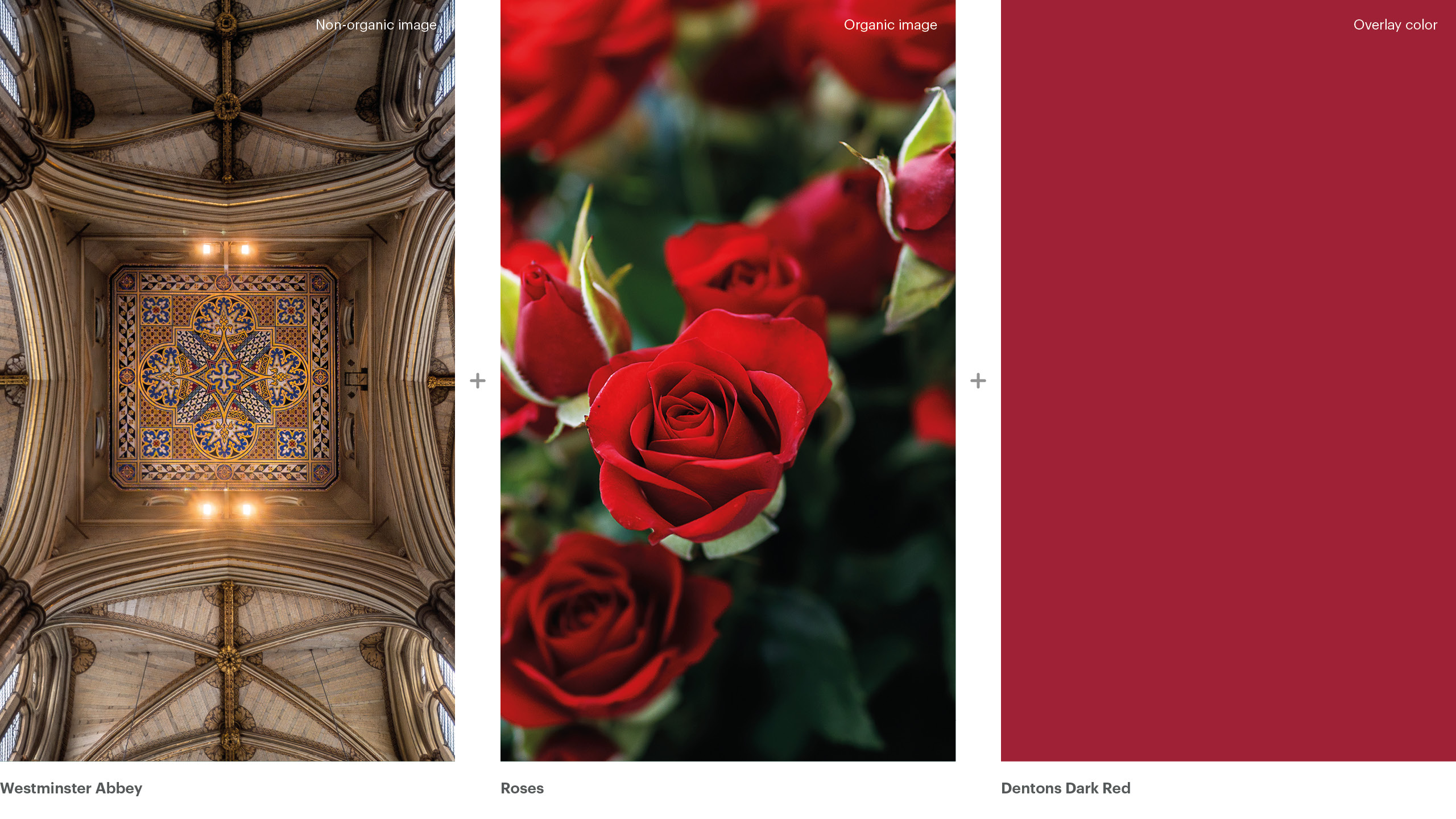
Growth rooted in what endures
This option symbolizes client-centric growth that is sustainable, deliberate, and built to last. The rose, a symbol of England, represents growth that flourishes when it is intentionally nurtured while the Westminster Abbey expresses enduring precision, and long-term vision. Just as these elements grow over time, profitable growth comes from focusing on the sustain of clients and key accounts. I chose Dentons Dark Red to retain a visual connection to the original red rose, even though it was ultimately presented as a black‑and‑white image beneath the overlay.