DiDi Communication Design
A set of two interconnected design systems developed for DiDi's digital communications across 8 Latin American markets. Each system was built to ensure visual consistency and brand credibility at scale, while adapting to the diverse audiences, channels, and cultural contexts of the region.
Client
DiDi
Role
Design Systems, Product Design, Brand, Illustration
Year
2020-2022
Context
DiDi is a Chinese ride-hailing app operating in more than 8 Latin American markets, competing with multiple ride-hailing apps, unlike China, where it has no competition. The visual illustration system inherited from headquarters was too generic to build brand credibility in the region and didn’t reflect its diversity.
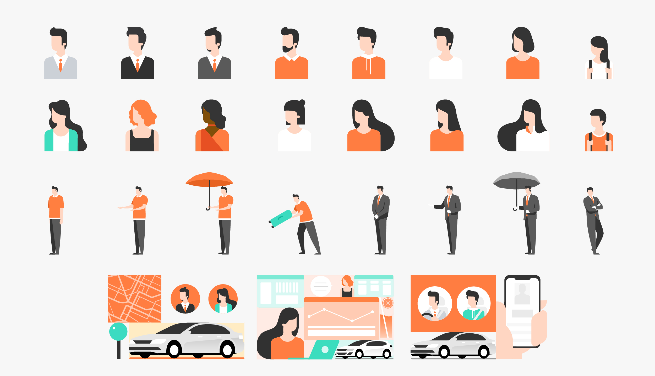
Illustration System inherited from headquarters.
The situation was fragmented due to the existence of separate design teams within Spanish-speaking Latin America. The Mexico team used a different visual approach from the team supporting the other eight countries, leading to further inconsistencies in imagery, style, and overall brand expression across the region.
Example of the adapted illustration system used by the Mexico Design team.
Example of the adapted illustration system used by the rest of the region (Central and South America).
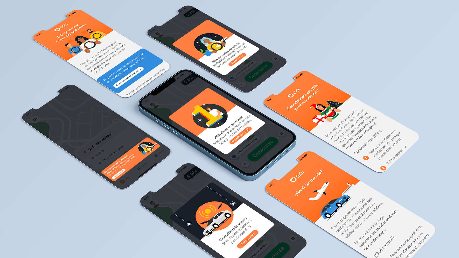
At the same time, the team was producing hundreds of digital assets monthly such as emails, landing pages, in-app banners, without the ideal design software, access to stock images, or a shared visual framework. The result was inconsistent communications that varied by designer and by country with increased delivery times since each designer had to create almost from scratch.
Digital communications from different countries like Chile, Mexico, Peru and Colombia.
Challenge
The challenge was to build a scalable visual infrastructure within significant technical constraints that allowed easy modifications and increased brand consistency. The solution was to create two interconnected systems: an Illustration System and a Digital Communication Guidelines System. As the Digital Communications Sr. Designer for Latam, I led the design, implementation, and maintenance of both systems.
Solution 01: An Illustration System
The system was designed to be modular, vectorial, and quickly adaptable to different topics, seasonality, and audiences. Vector images allowed digital communications such as emails and landing pages to be smaller in size.
First steps
The project began in January 2021 with a series of meetings between the Design team I was part of (supporting eight Latin American countries) and the Mexico Design team. During these sessions, we reviewed references, created mood boards, and developed initial sketches by early February. By March, we conducted a final review with a Marketing manager and defined two illustration directions: one more conceptual and message-driven, and another more straightforward and literal. At the end of the month, we ran an A/B test with both styles; however, the project was then paused indefinitely.
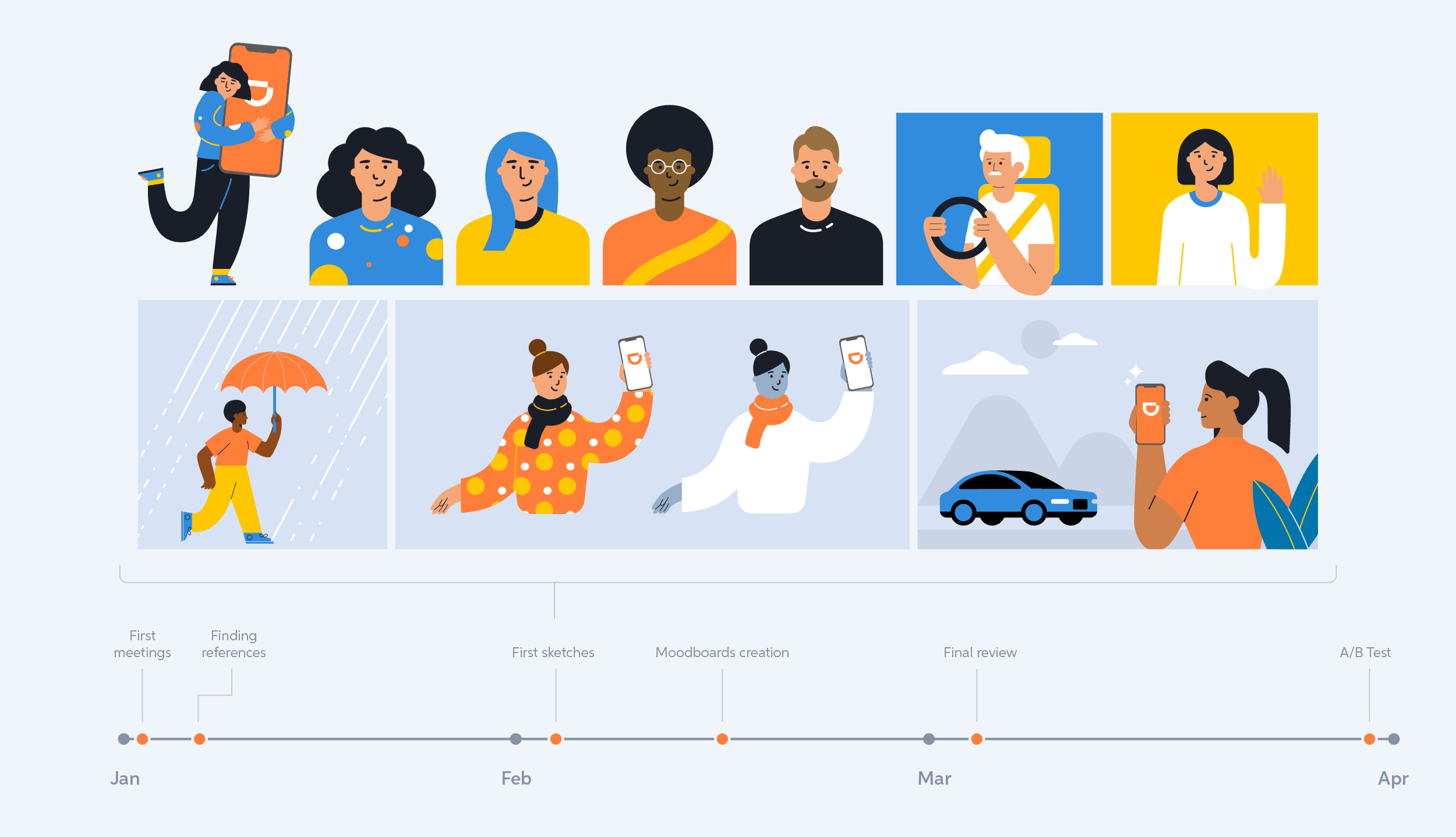
Early-stage sketches.
Building the Illustration System
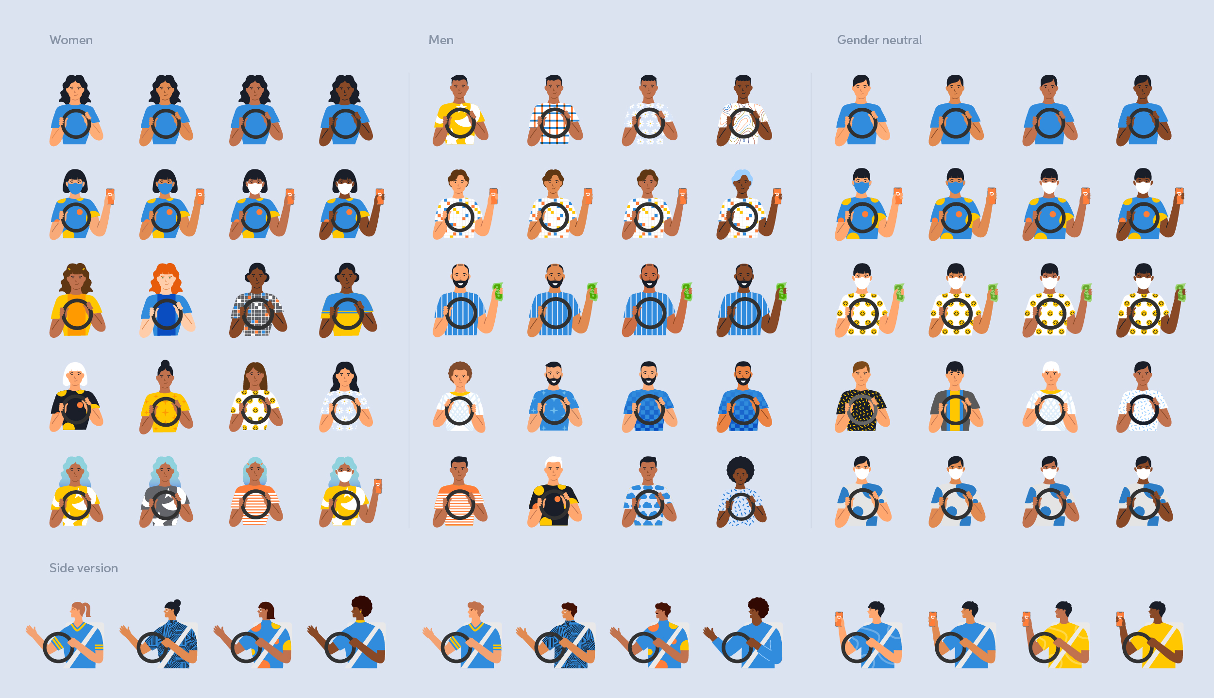
Shortly after, my manager identified the need for a structured illustration system and approved moving forward with its development in the meantime. The goal was to maintain continuity with the existing brand language and avoid unnecessary disruption, so I developed a style that remained aligned with previous work: vector-based, corporate, and visually clean. This also meant retaining the car illustration inherited from headquarters, as it represented one of the most recognizable and relevant visual elements for a ride-hailing platform.
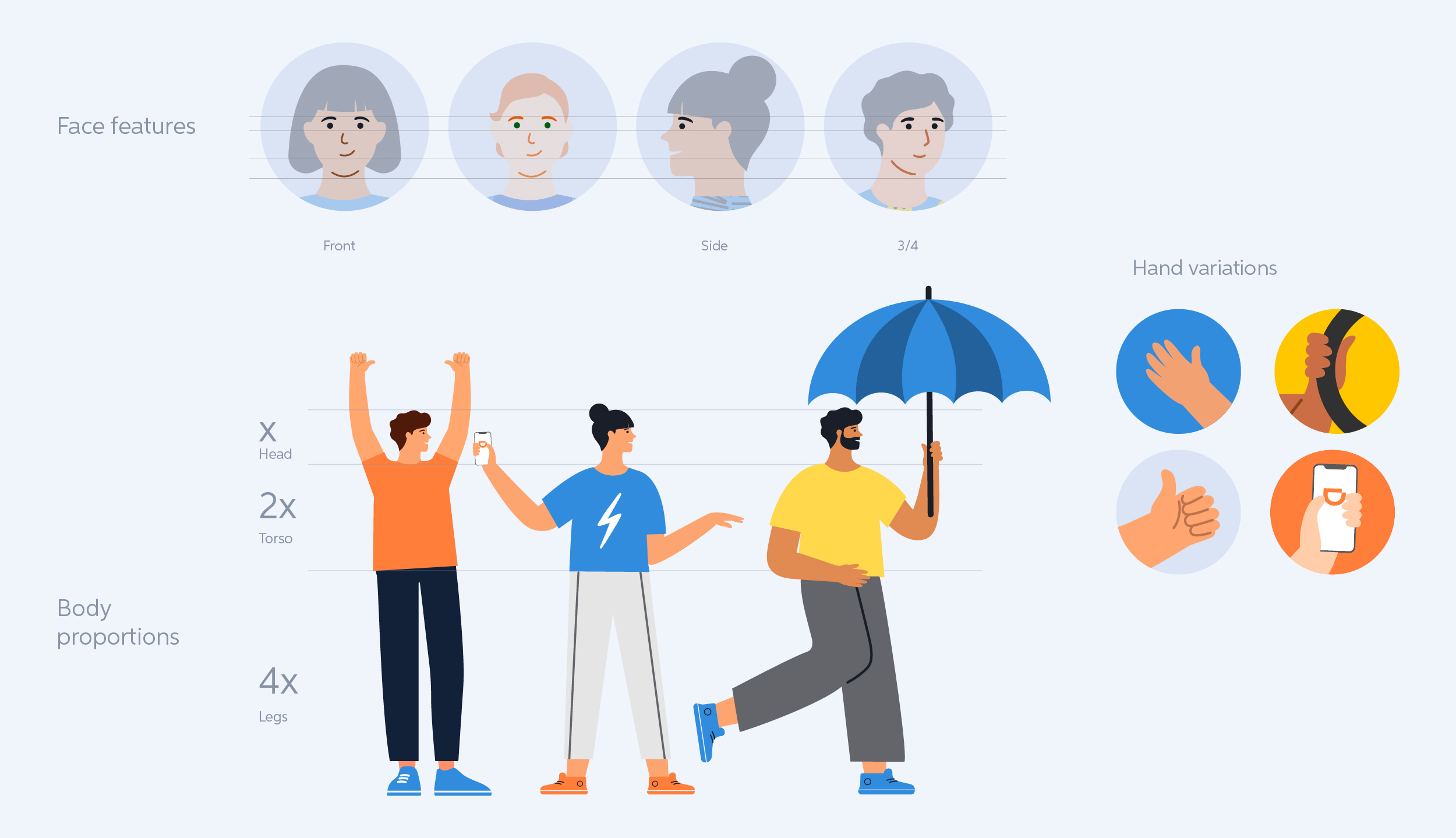
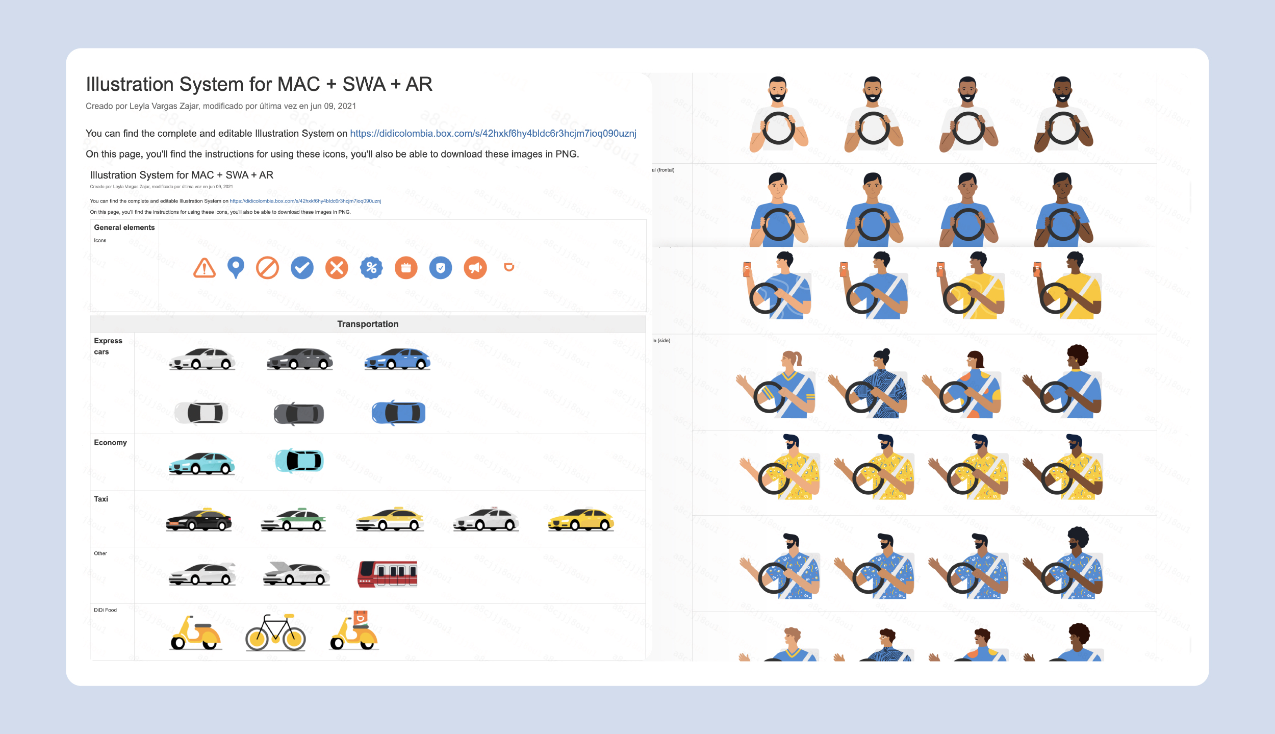
The first step was to standardize body proportions and facial features, ensuring consistency across angles. I also created a set of hand variations, as hands are frequently shown interacting with the app.

A set of different faces created from the same base mold, showing how diverse the characters can become.
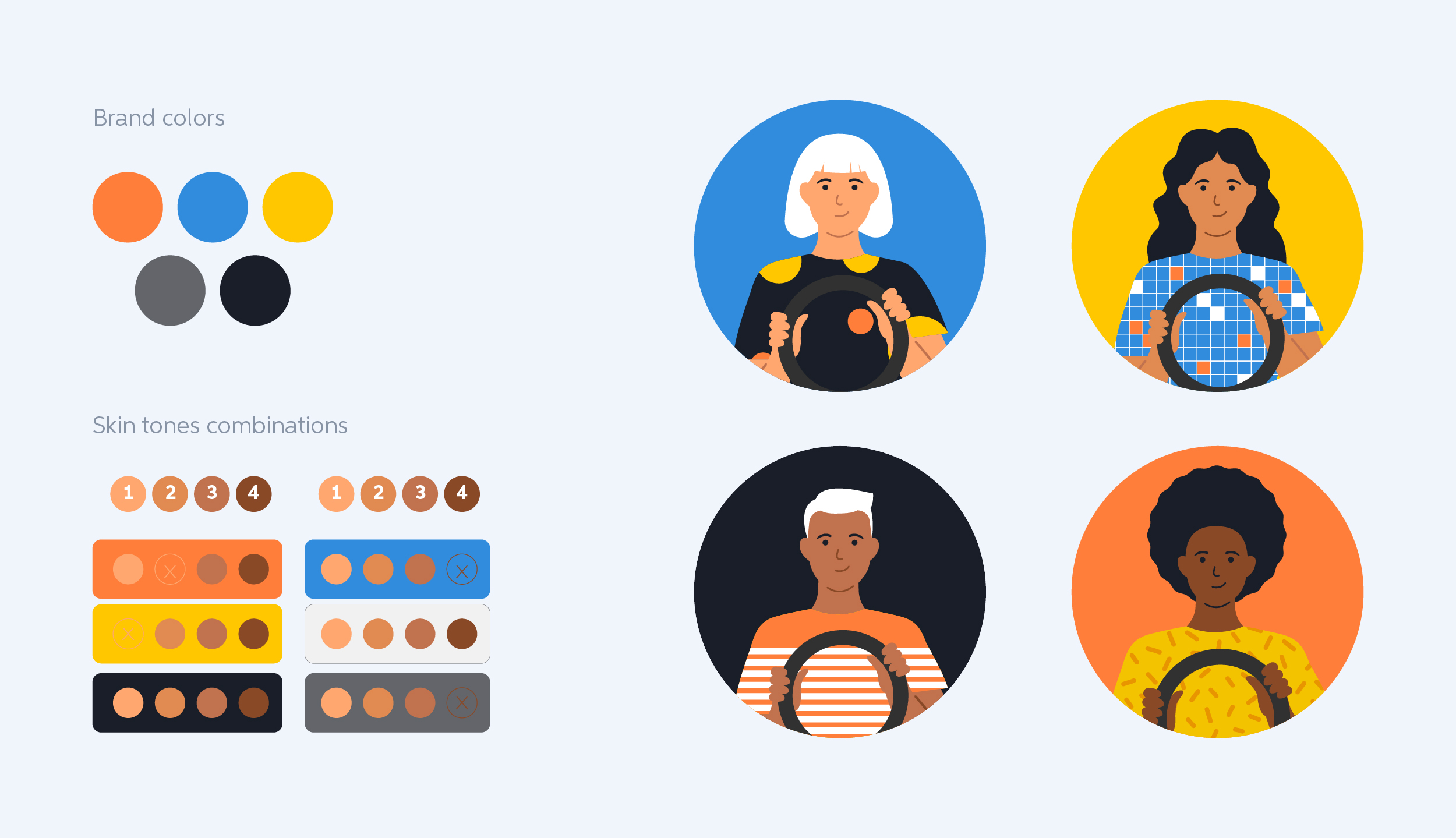
To better reflect the diversity of the region, I created a wider range of skin tones and established color combinations that ensured enough contrast with the background.
Communication needs
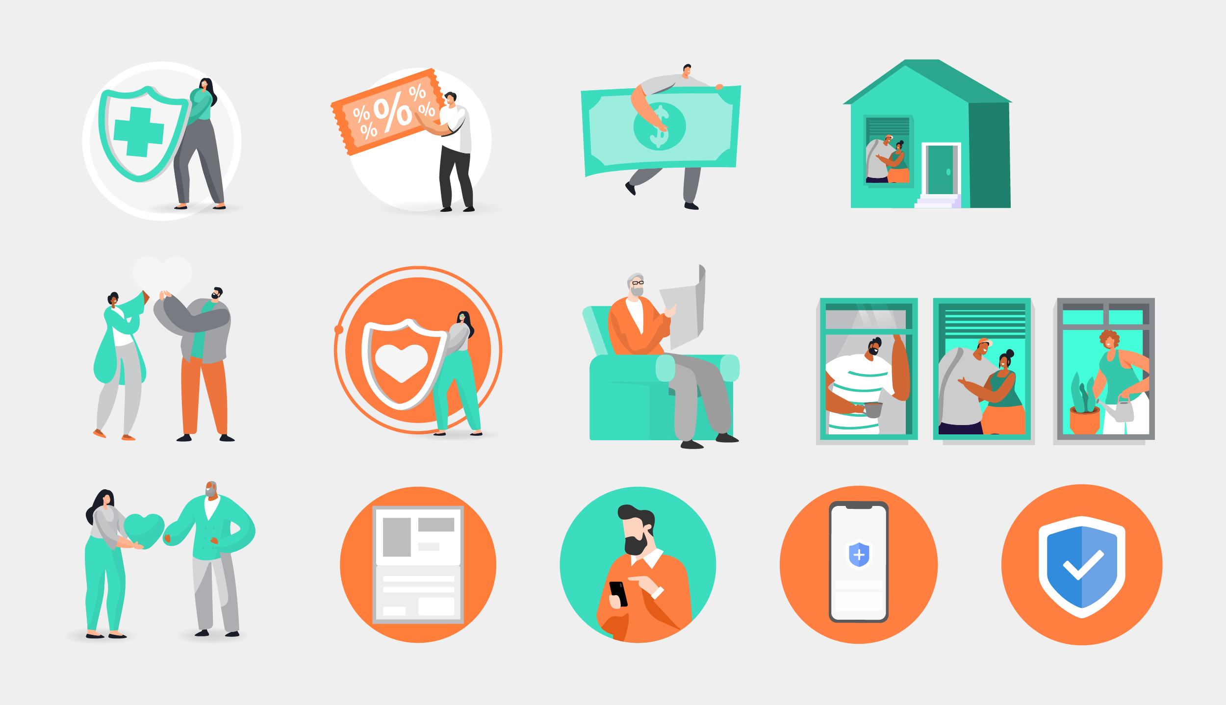
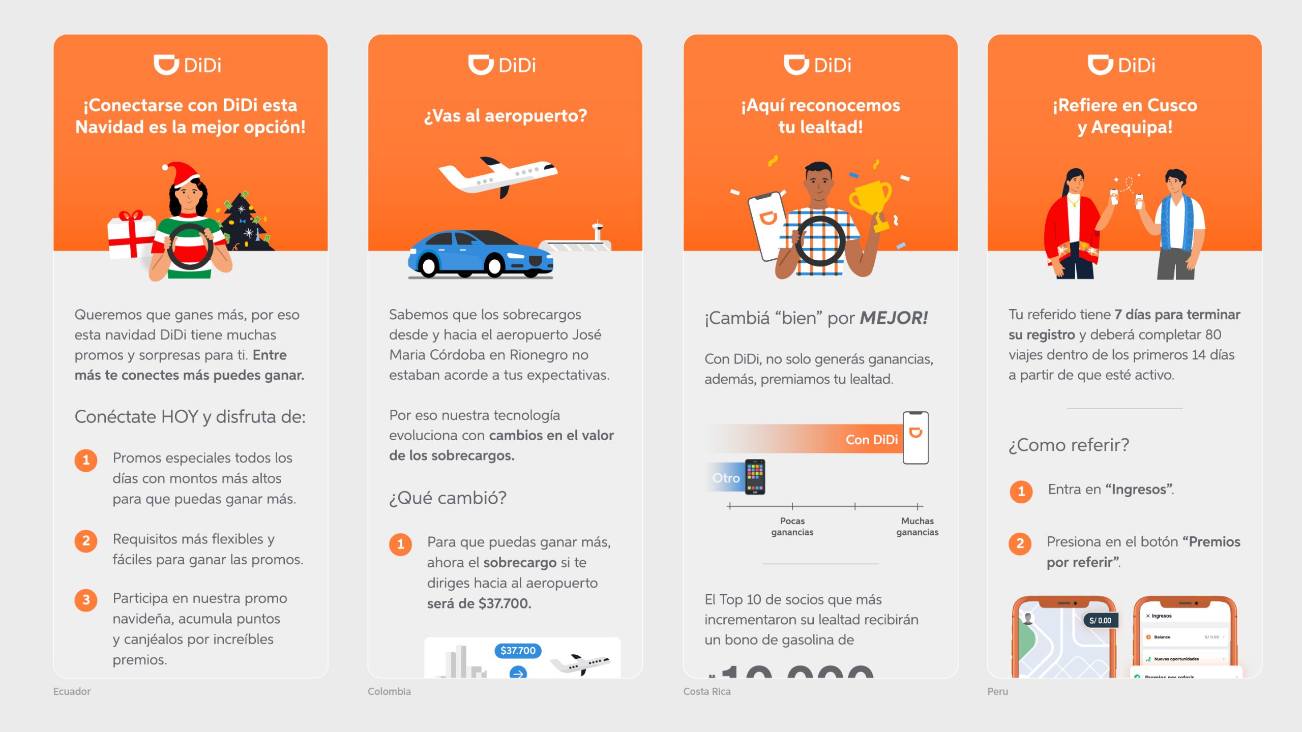
“One of the main reasons the inherited illustration system was not effective (beyond its overly generic appearance) was that it had not been designed to support the Marketing team’s communication needs. The team frequently needed to promote discounts, safety features, surge pricing, and seasonal campaigns such as Christmas or Halloween. One of my key goals was to adapt the system to support these recurring themes while maintaining visual consistency across communications.
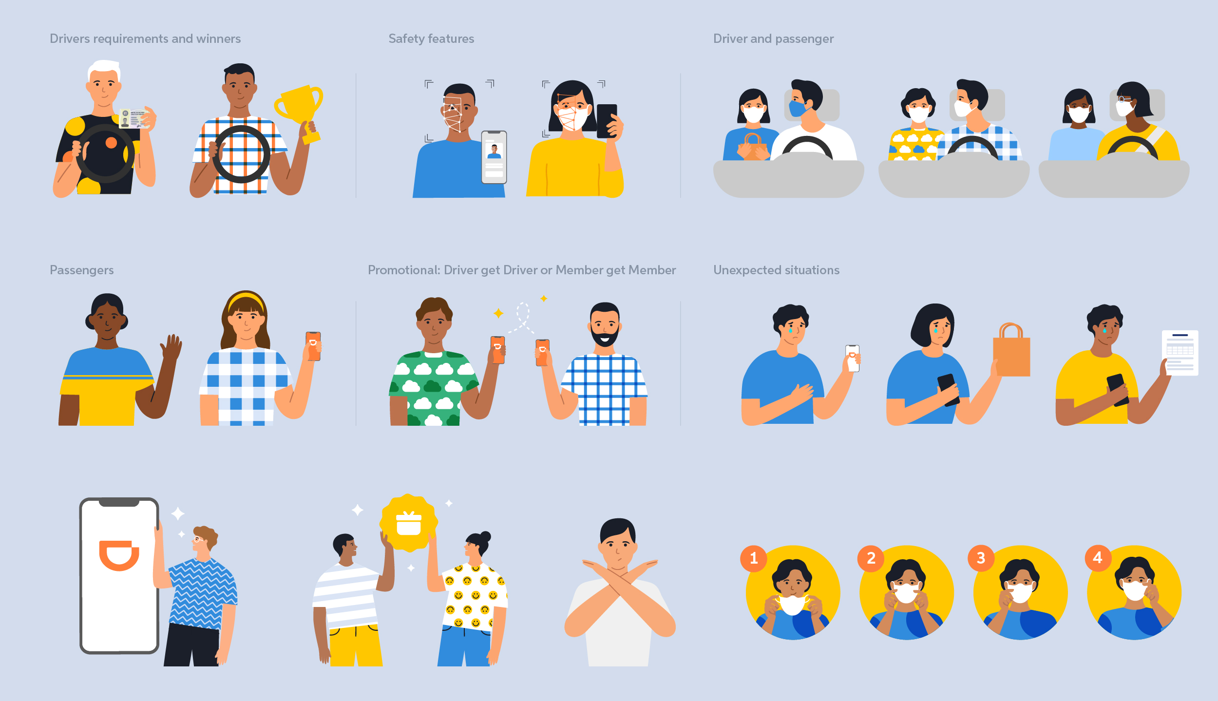
A snapshot of scenarios covering common communication topics such as driver promotions, app interactions, safety features, and face mask usage.
Since most communications were targeted at drivers, I created a variety of characters and scenarios that reflected driver-related needs, such as using the app and earning income.

I also developed seasonal characters and situations for recurring campaigns such as Halloween and Christmas.
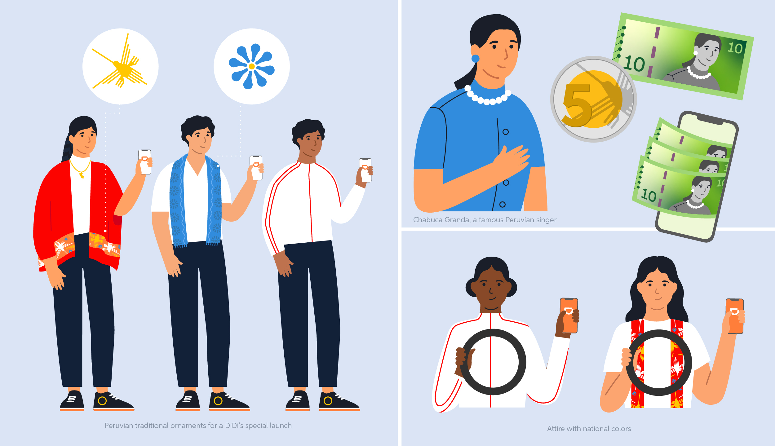
Due to the modularity of the system, I developed a set of elements for a special launch campaign in Peru, incorporating local and traditional imagery that was later reused across multiple promotional assets.
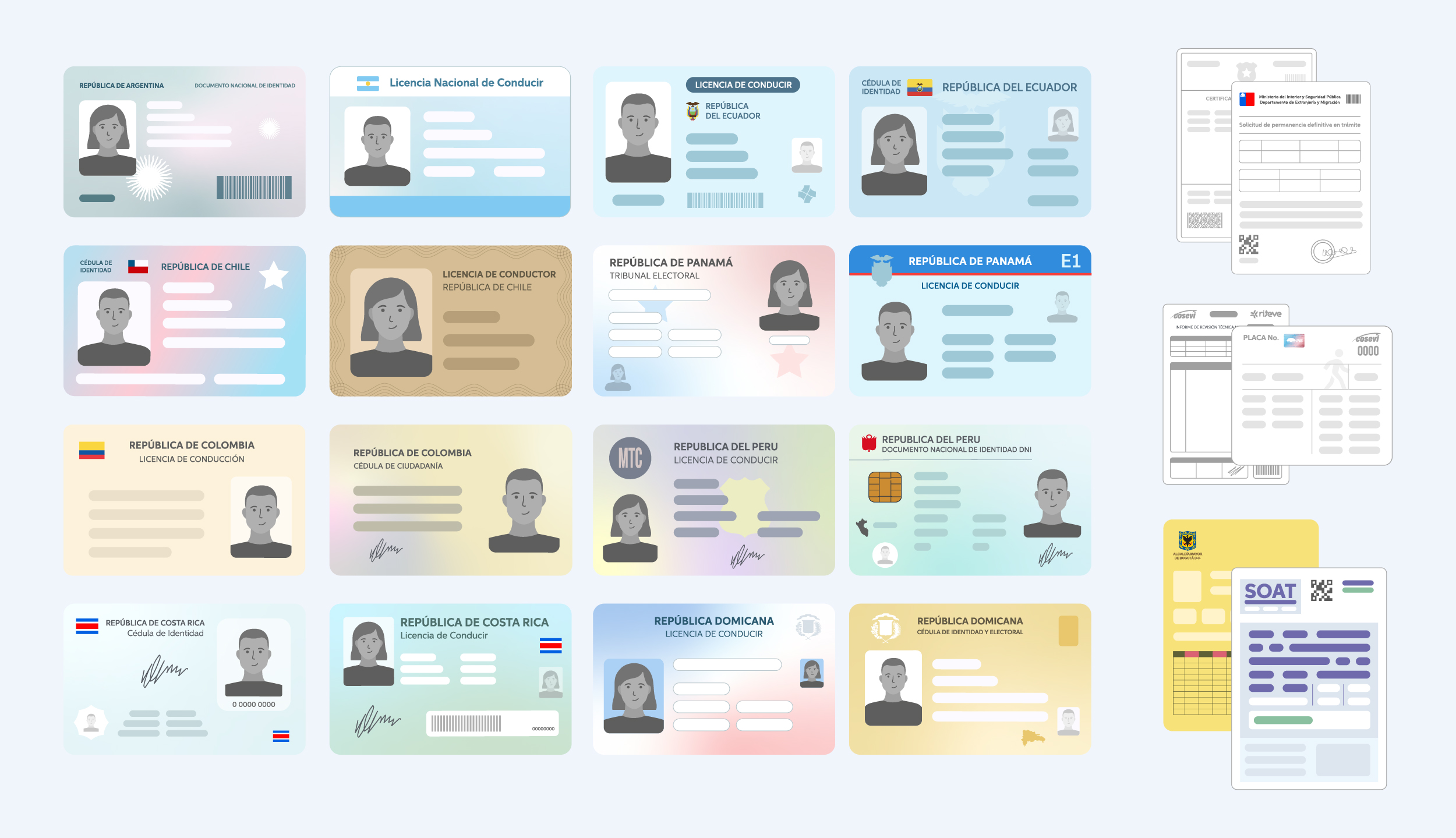
Another recurring communication need involved standardized driver documents, since many messages were related to document expiration reminders or questions about the driver registration process. To support these communications, I created generic versions of the documents that remained faithful to the originals while excluding personal information.
Modular elements
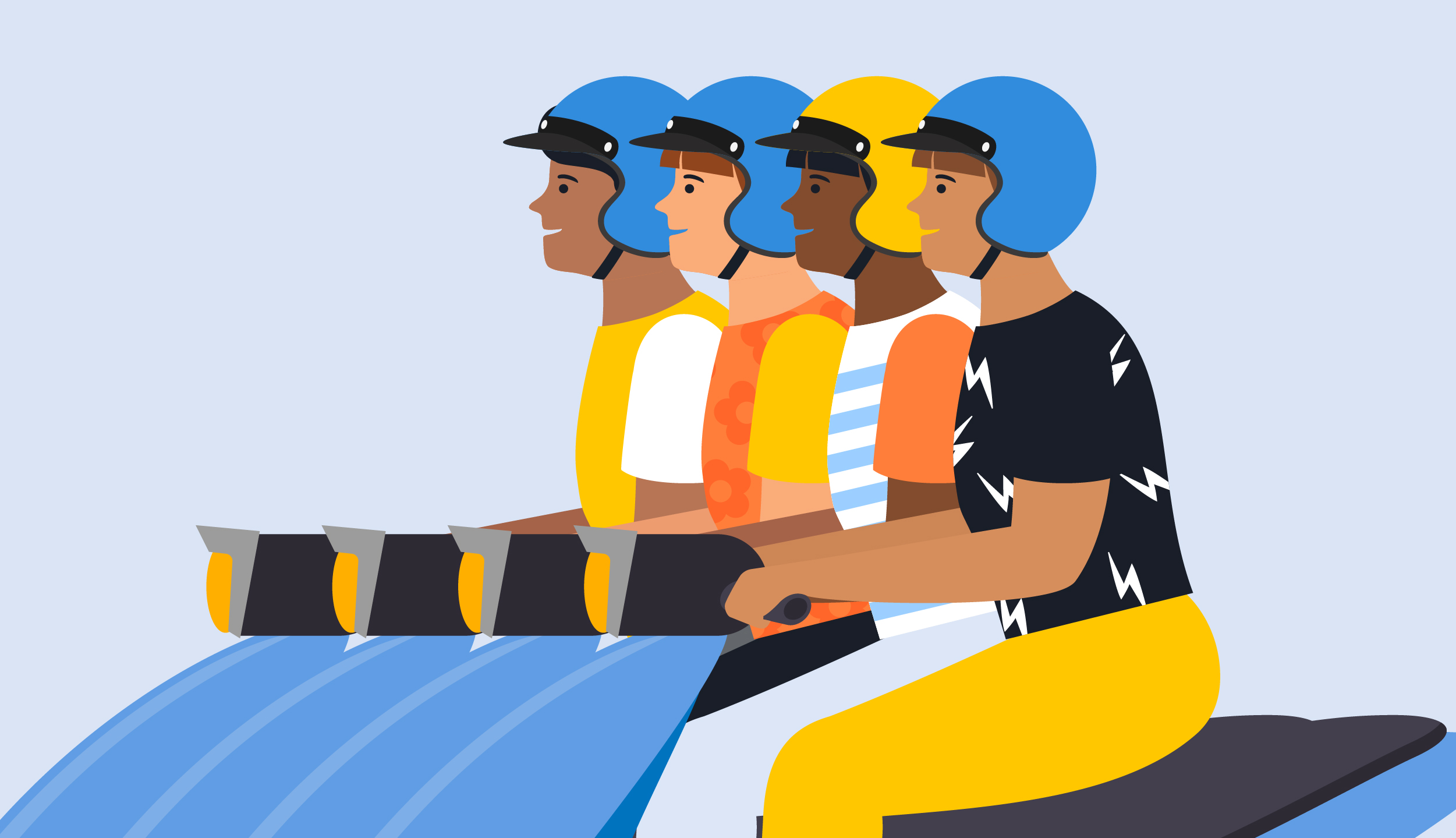
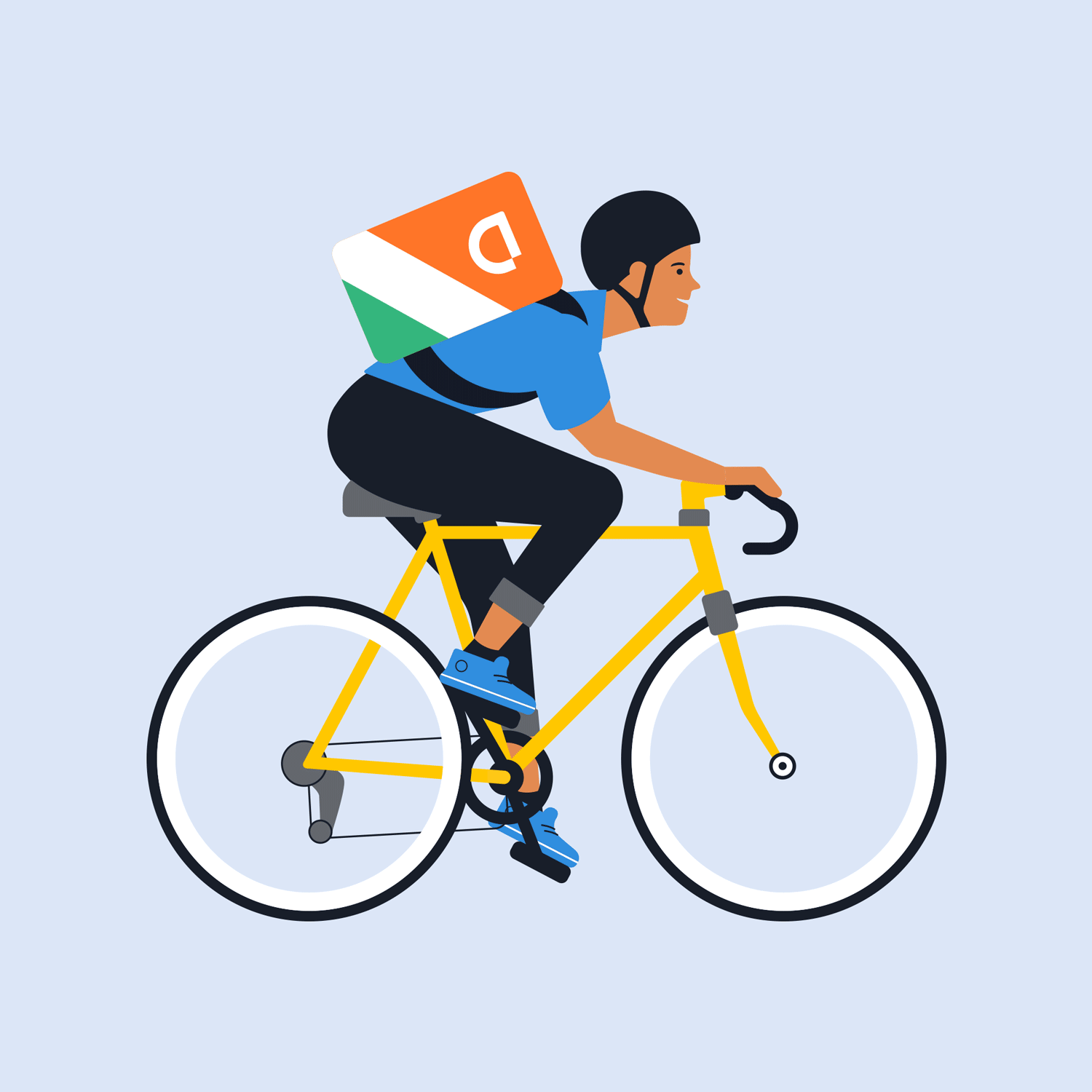
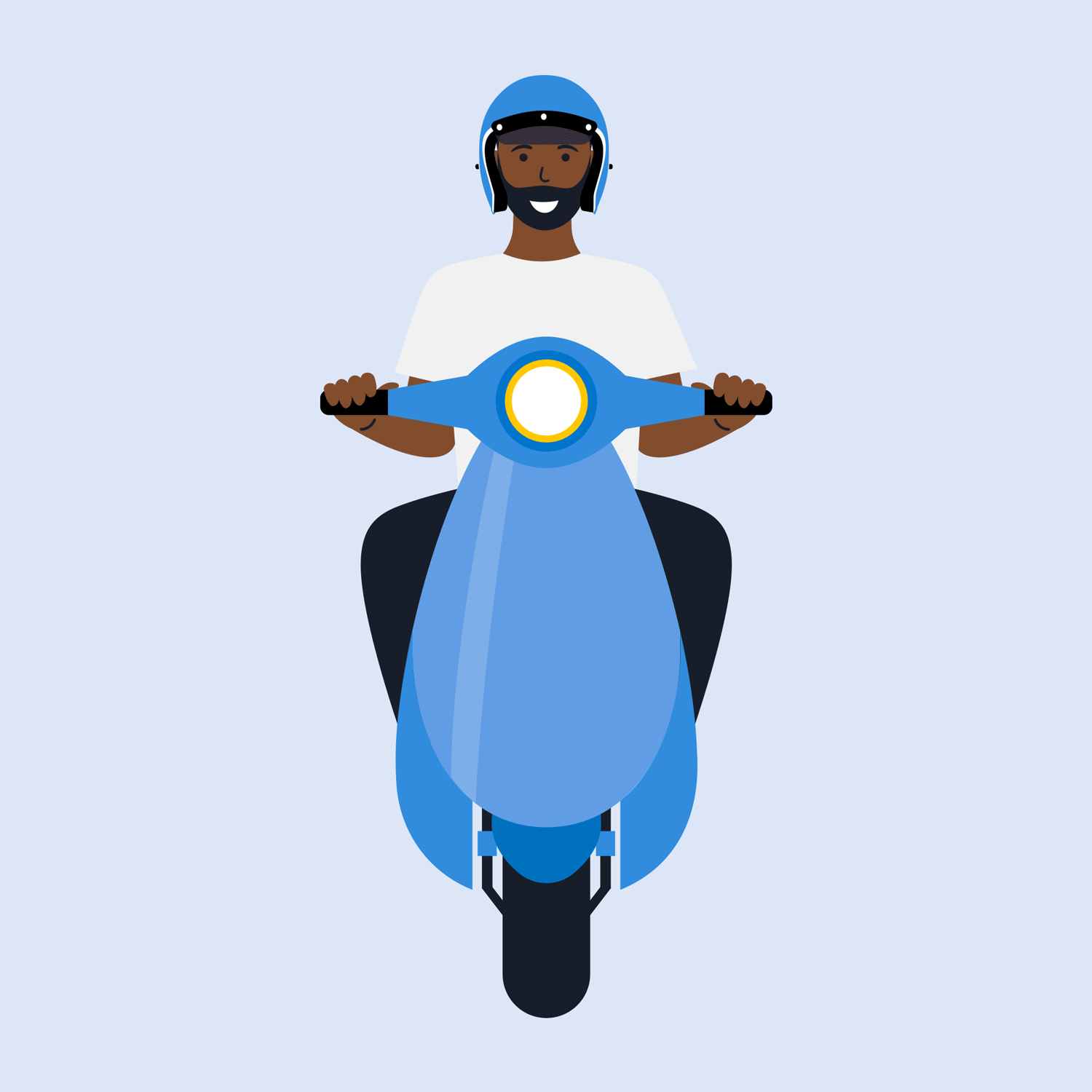
The modularity of the system made it adaptable to the broad portfolio of DiDi's new services, such as motorcycle rides and delivery.
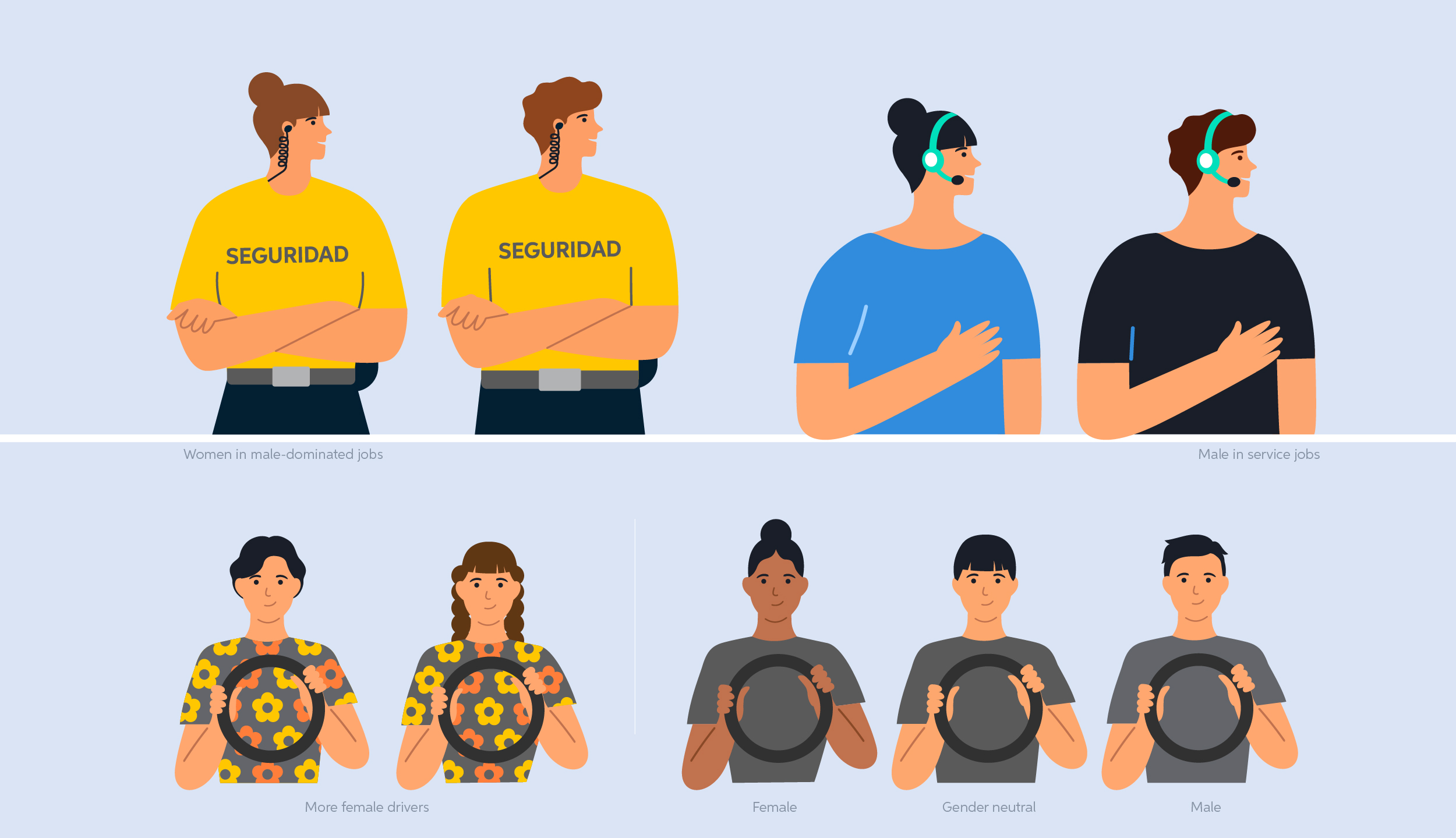
Diversity
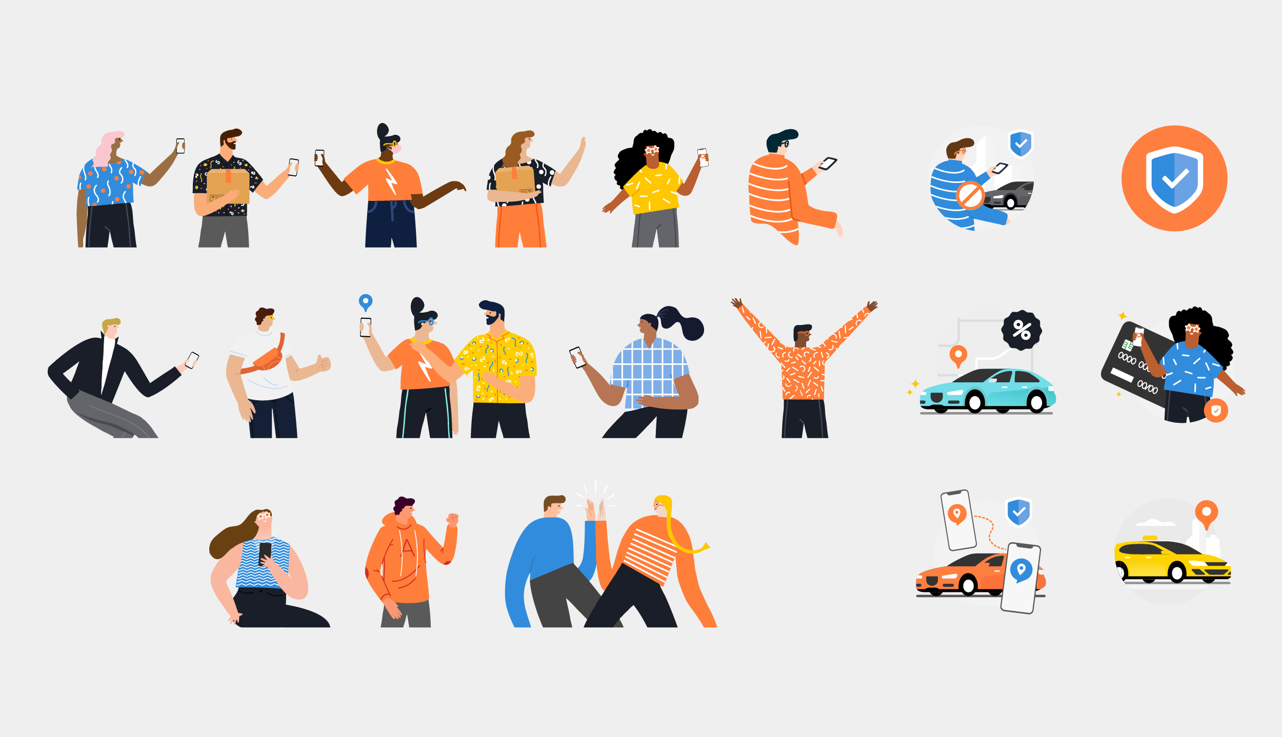
DiDi is a global company and diversity is one of its most significant values, therefore, I wanted the characters to really represent Latin America, a very heterogeneous region. I focused on three main categories: gender, race, and relationships.

Resources for designers and other teams
Designers accessed the illustration system through a centralized Illustrator file with organized artboards, allowing them to select pre-built components and combine them based on campaign needs. Non-design team members were given access to a curated Confluence page featuring PNG exports of key illustrations and character variations, enabling quick reference without requiring Adobe Creative Suite access. This dual-system approach ensured that both specialized designers and broader stakeholders could leverage the system effectively.
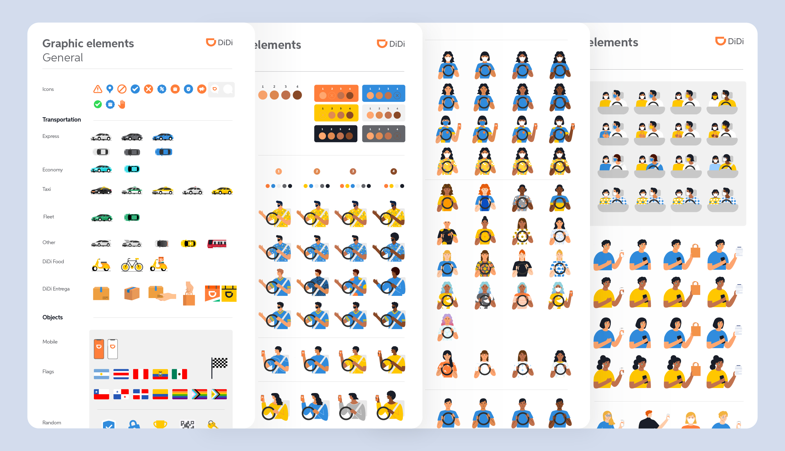
A snapshot of the Illustrator file containing the Illustration System for designers. The full file was much larger, but this provides a small preview.
I also created a Confluence page for non-design team members, featuring a curated selection of key images in PNG format.
Solution 02: Digital Communication Guidelines System
The system was designed to be modular and quickly adaptable while operating within licensing constraints. I standardized the design elements required by the team to support communication needs across different use cases. Accessibility was a core requirement that informed key design decisions throughout the system. I was responsible for design decision-making, testing, system maintenance, and delivering final assets.
Audience
DiDi digital communications were organized around two primary user groups: drivers and passengers. Each audience had its own communication ecosystem, including emails, landing pages, pop-ups, and in-app banners, all tailored to different needs and behaviors.
Drivers represented the company’s primary audience, accounting for approximately 75–80% of all communications. Their importance stemmed from the fact that driver availability directly influenced passenger wait times, overall user experience, and platform usage. As a result, a significant portion of the work focused on communicating driver promotions and incentive programs. This required developing standardized systems for promotional tables, country-specific currency formats, and step-by-step instructional guides that could scale consistently across different markets.
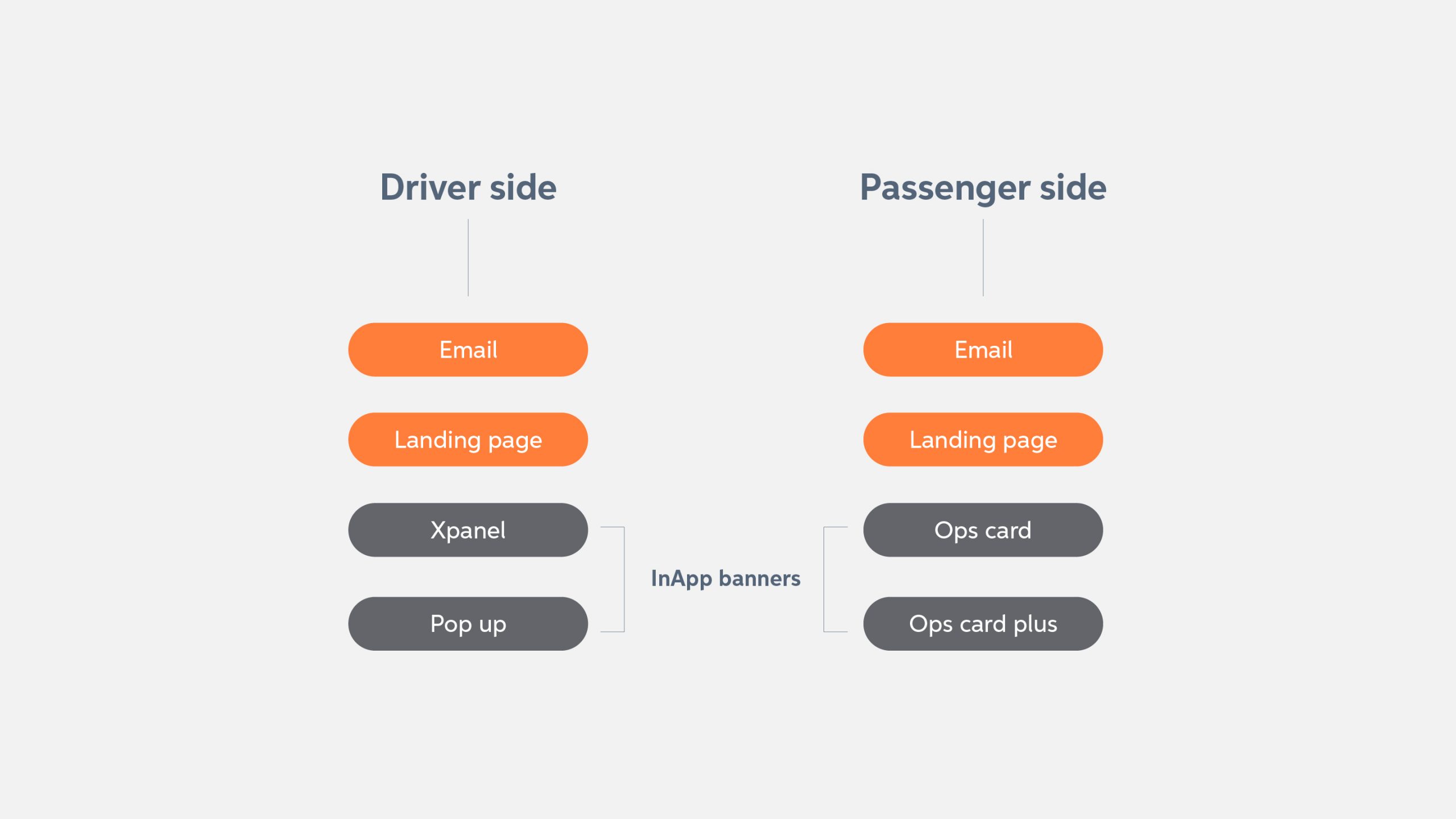
A diagram of asset types by audience.
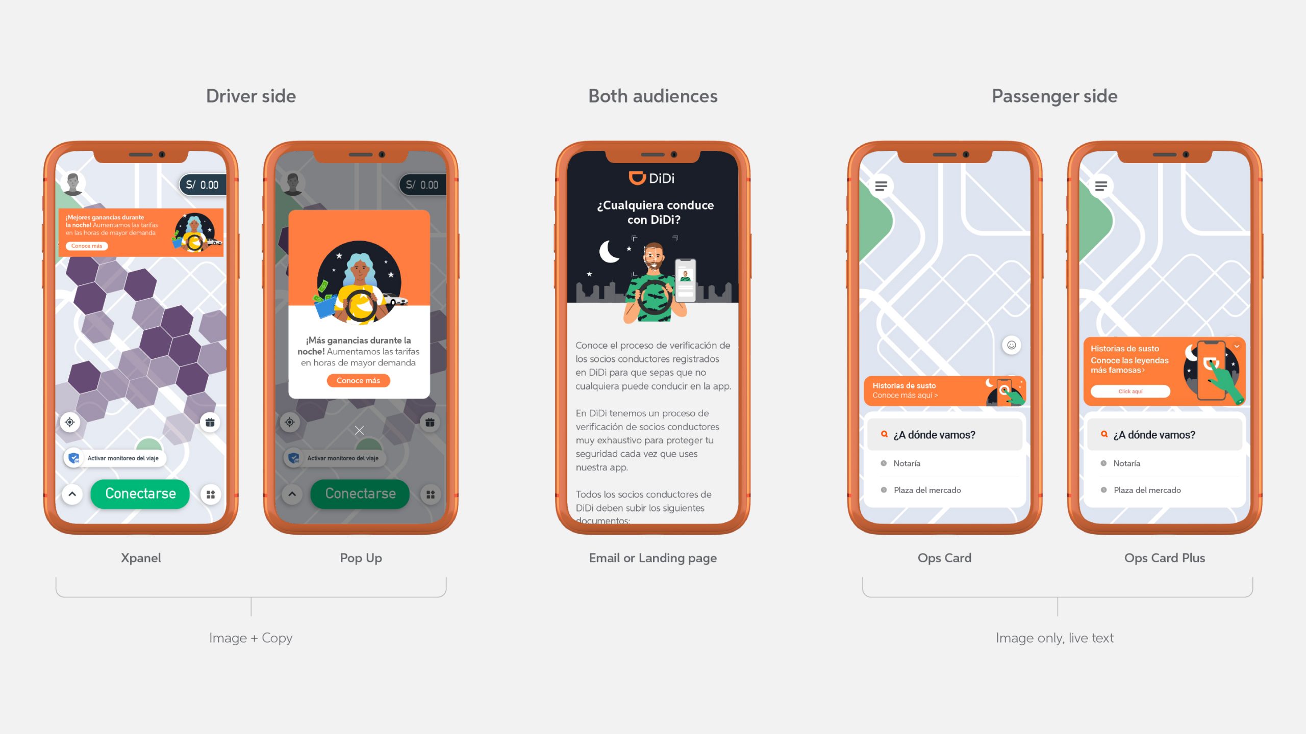
Examples showcasing each asset type.
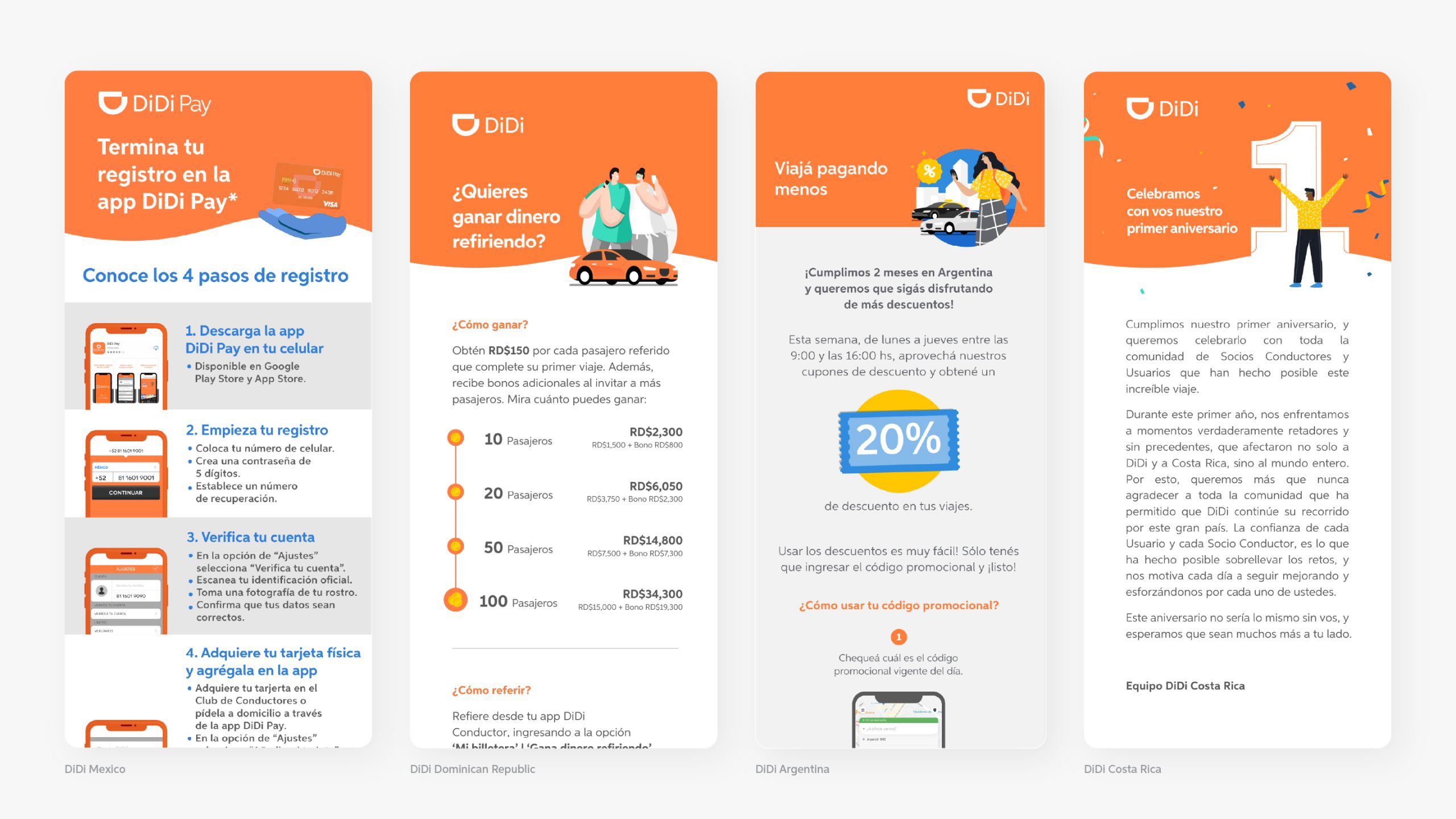
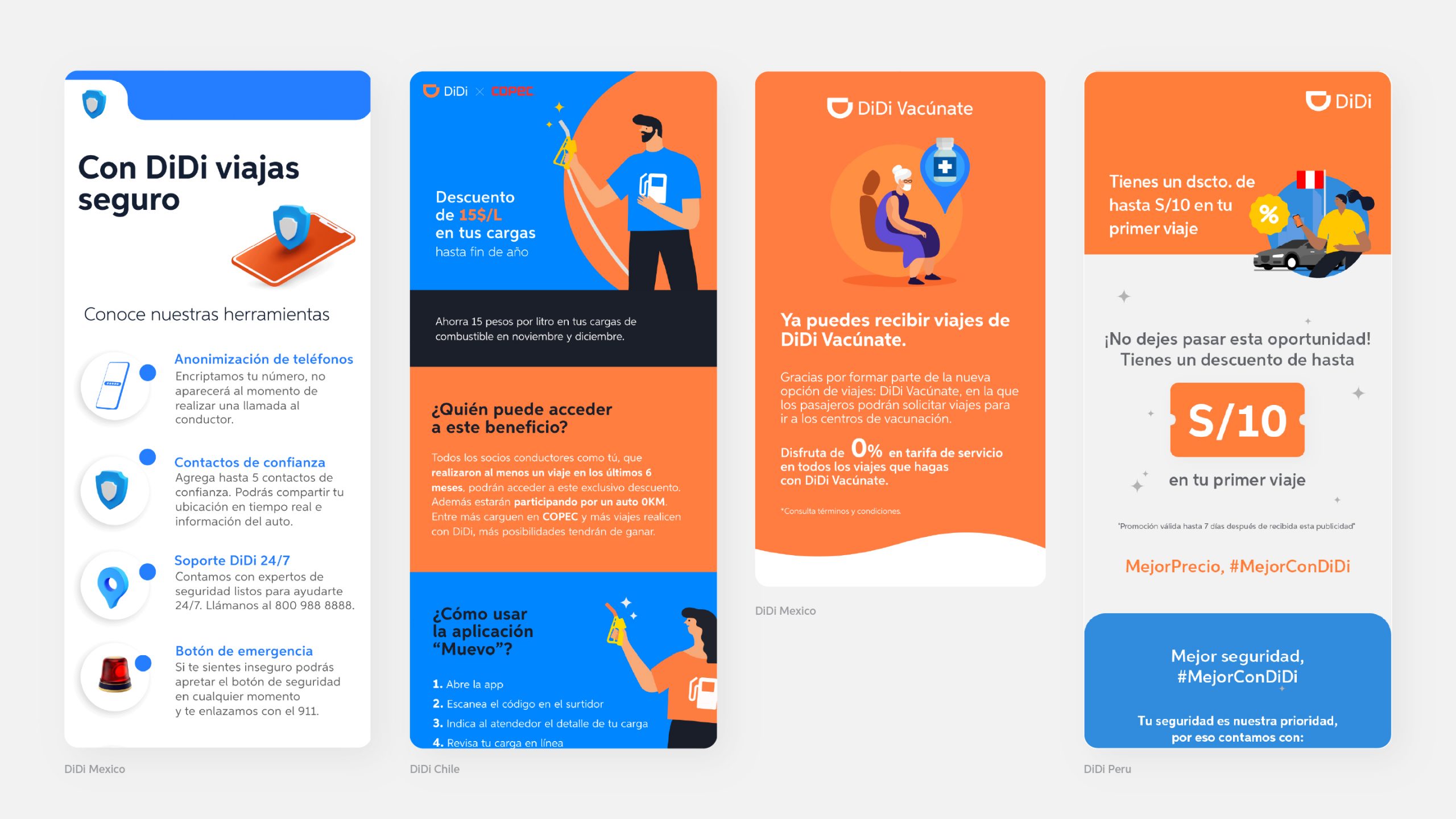
Assets across Spanish Speaking LatinAmerica
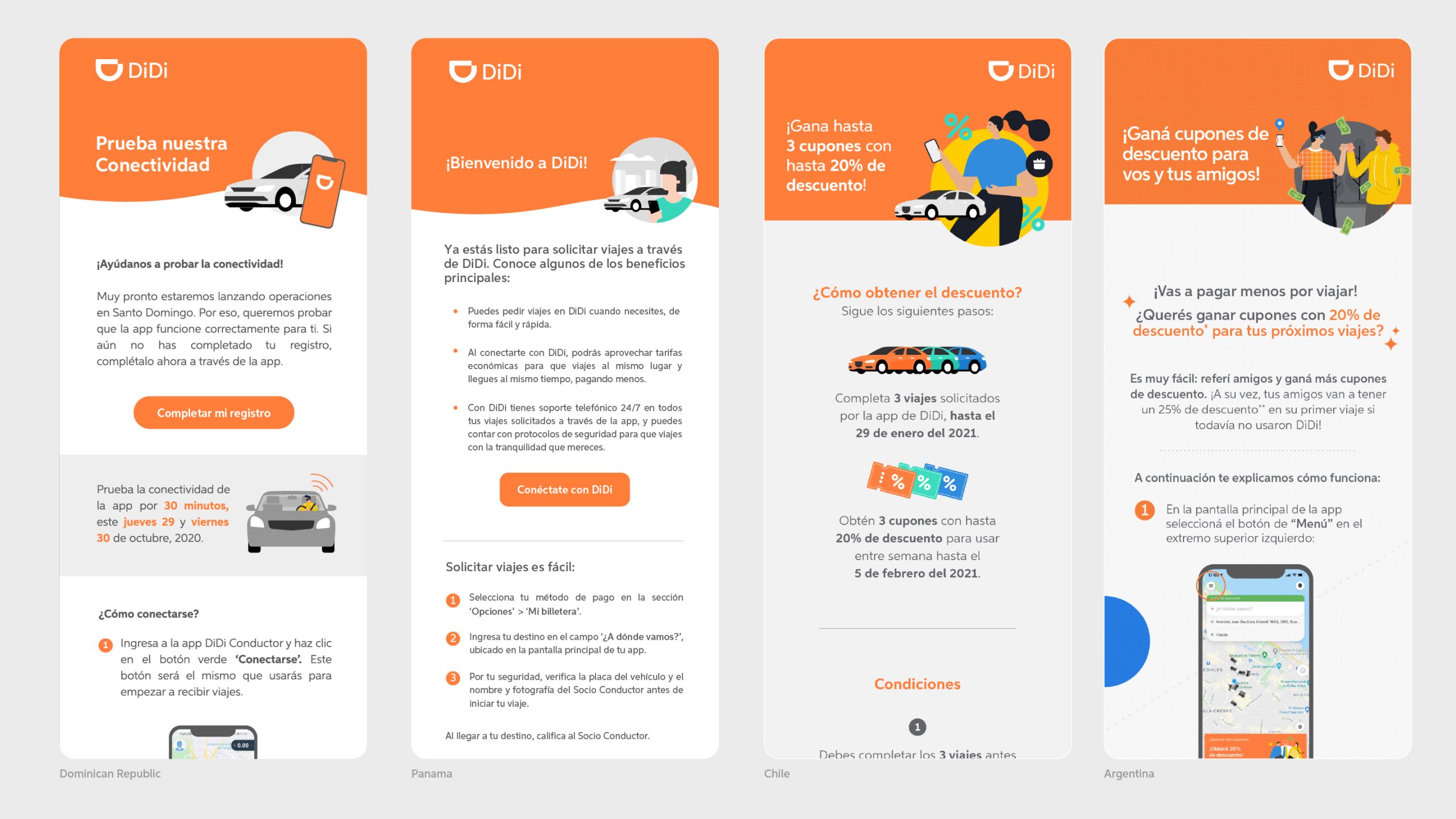
As shown in the examples below, emails from countries such as Mexico, the Dominican Republic, Argentina, and Costa Rica followed noticeably different design formats. Headers varied from one version to another, while background colors, text alignment, illustration styles, margins, and logo placement lacked consistency across markets. This fragmentation weakened the DiDi brand identity, making the communications feel inconsistent and, at times, less trustworthy.
One of the company’s key marketing objectives was to increase Top of Mind Awareness (TOMA), particularly because DiDi was still relatively new within the Latin American market. The lack of visual consistency across communications was undermining that effort rather than reinforcing a recognizable and reliable brand presence.
Brand core
As this was not a rebrand, the project followed DiDi’s existing brand guidelines in order to maintain consistency with the established identity. The goal was to create a scalable communication system that respected the original brand while differentiating it more clearly from competitors and functioning consistently across multiple countries.
The intention was to ensure that, regardless of who designed a piece or where it was produced, the brand would maintain a cohesive and recognizable visual presence.
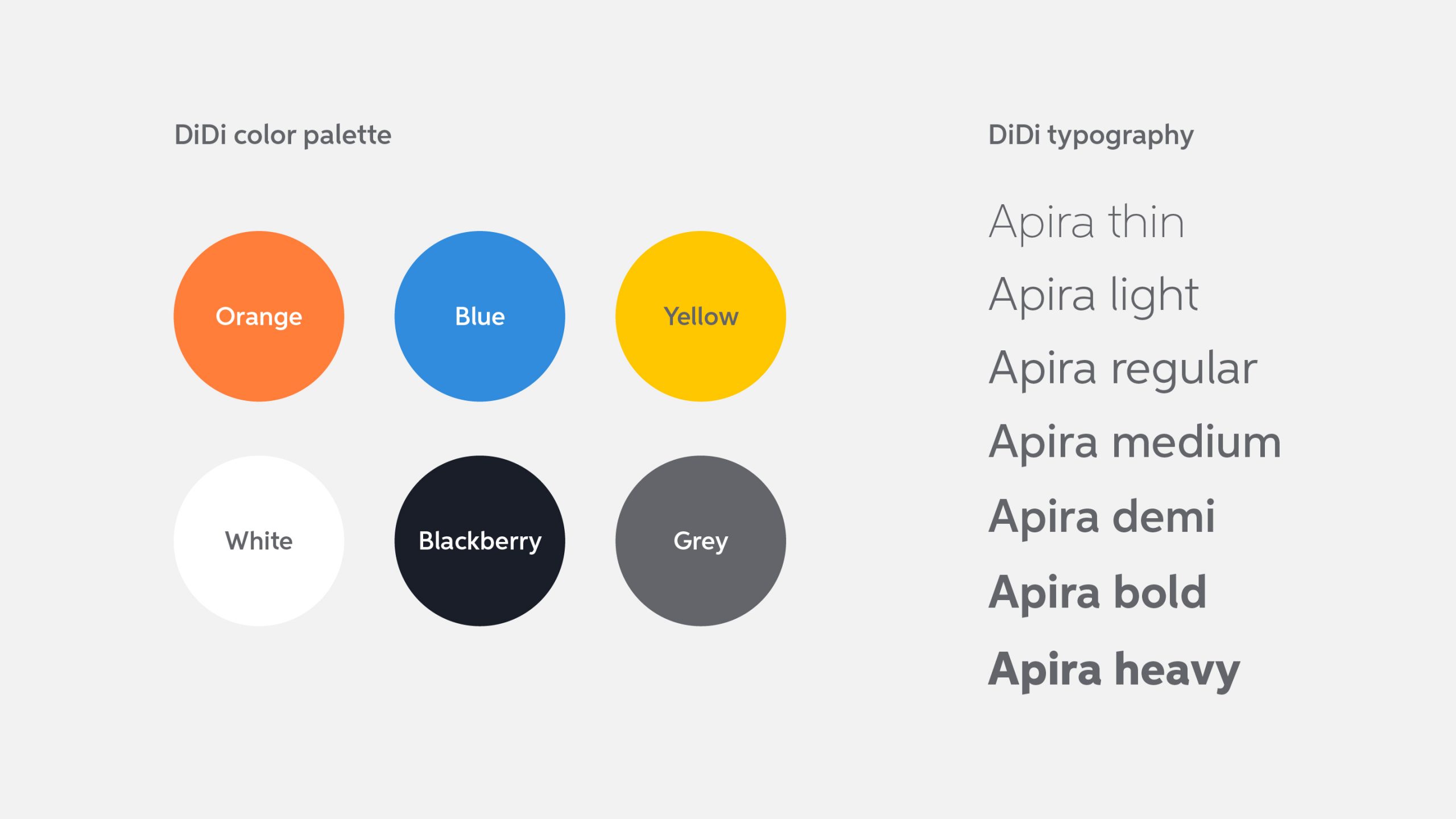
DiDi color palette and Aspira typography.
Design decisions
The first step was to identify the communication needs to determine which graphic elements required standardization. This involved reviewing previous visual materials and evaluating which approaches were effective and which were not.
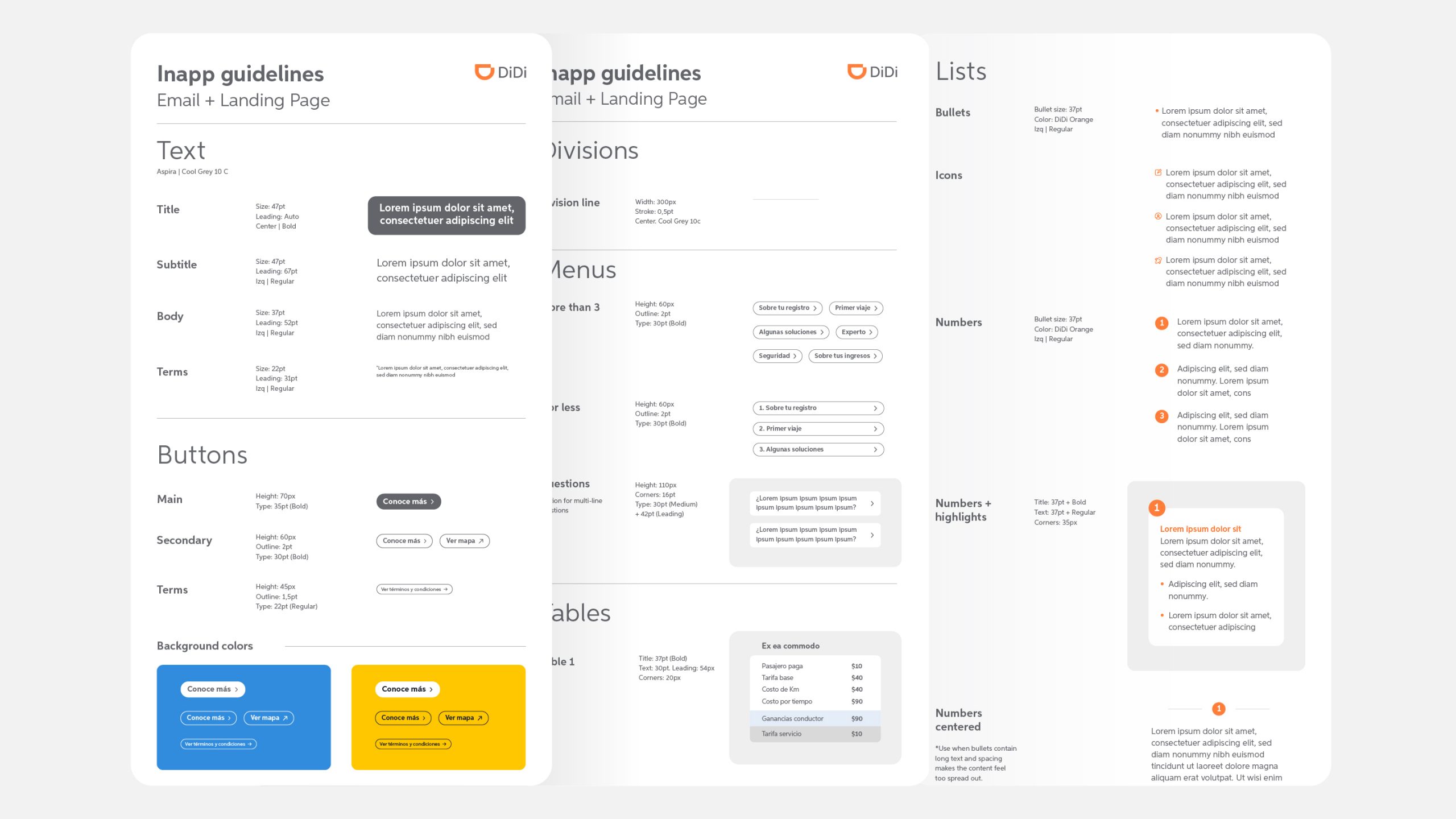
From there, I defined the core components of the system, including logo size and placement, margins, typography scale, spacing, corner radius, header proportions, phone mockup sizing, button styles, color usage, table structures, and iconography. These decisions were guided by accessibility best practices as well as the need to create a visually cohesive and harmonious system. I explored multiple iterations before arriving at the final result.
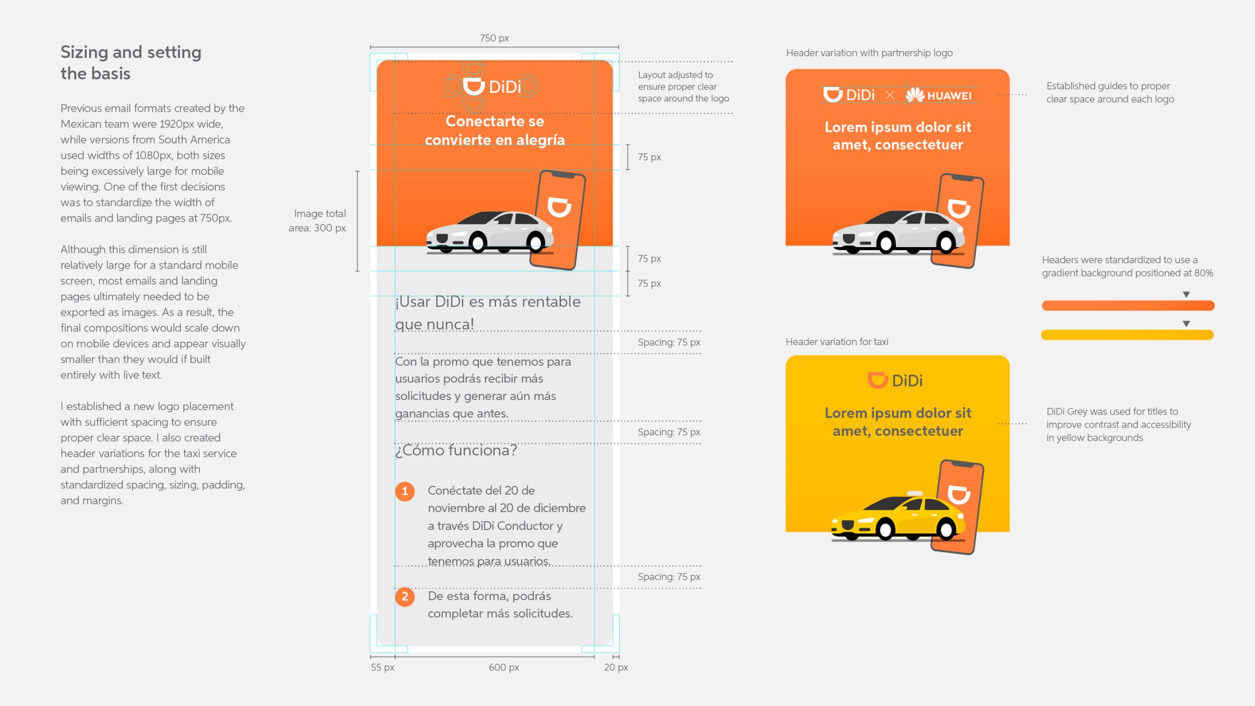
Initial design decisions focused on establishing the structure, including overall sizing, spacing, margins, and logo positioning.
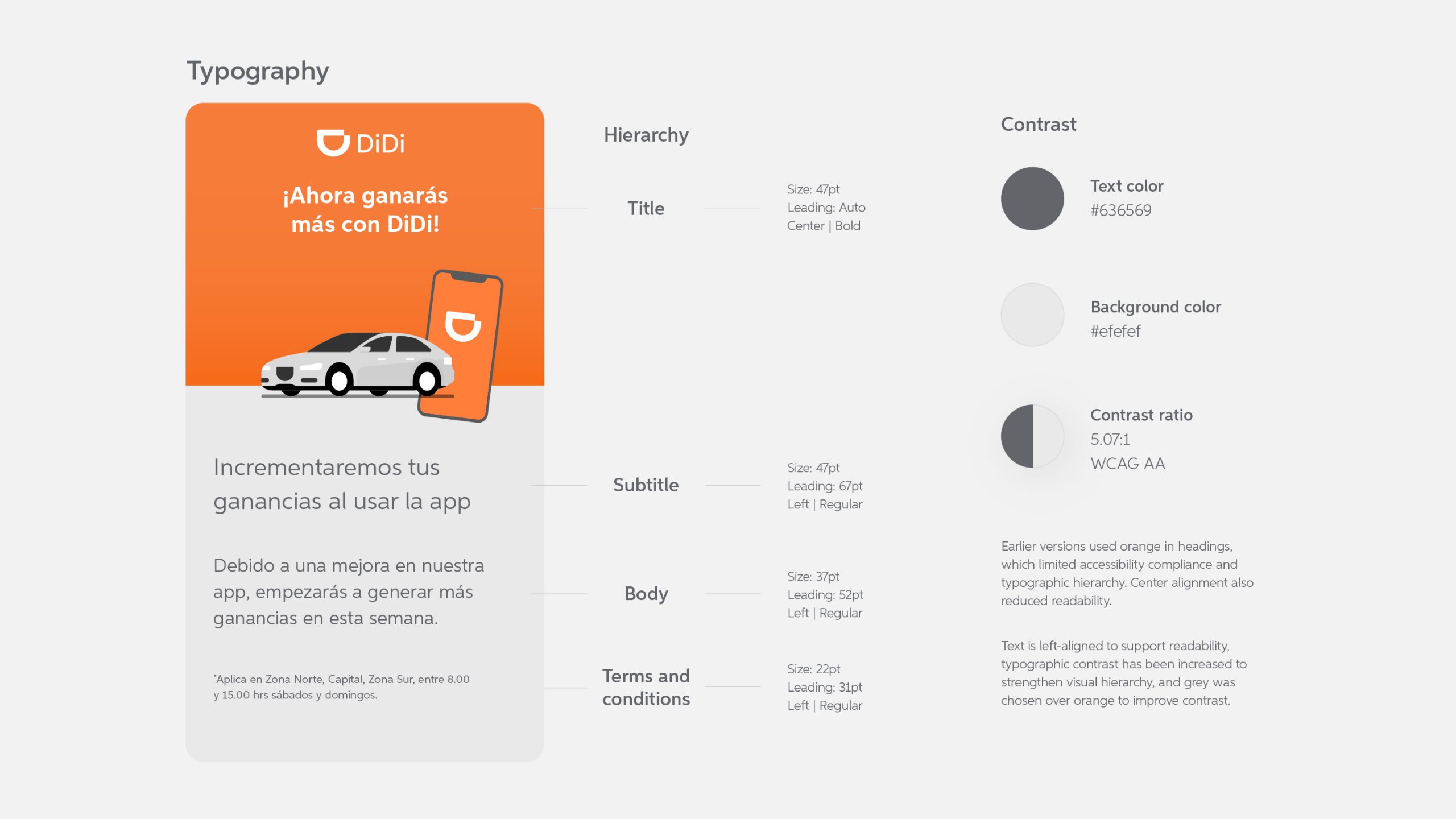
I established a clear and standardized typographic hierarchy with sufficient size contrast for readability, while also defining text alignment, color contrast, accessibility guidelines, and clear use cases.
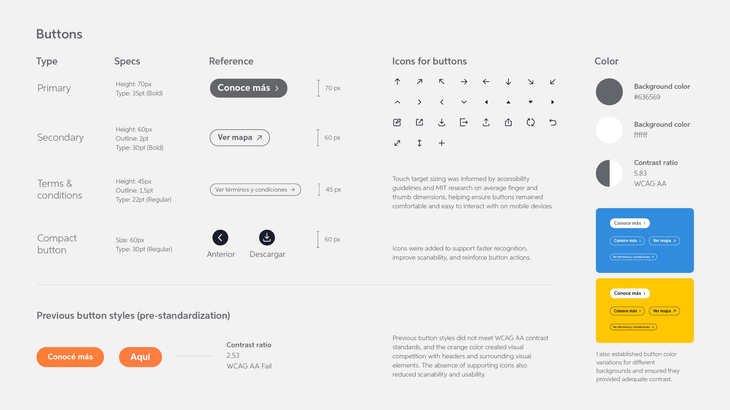
A consistent button system was defined using distinct size variations to reinforce hierarchy and improve scannability. Icons were also incorporated to support faster recognition and interaction.
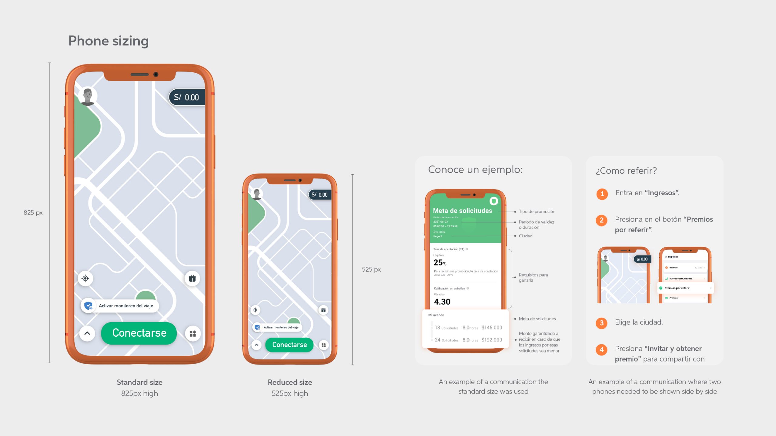
As most communications were aimed at drivers, the team needed instructional materials that clearly highlighted specific areas of the phone. Depending on the use case, either one phone or two side by side were required. I defined two size variations and tested them through a driver survey to determine appropriate scaling limits.
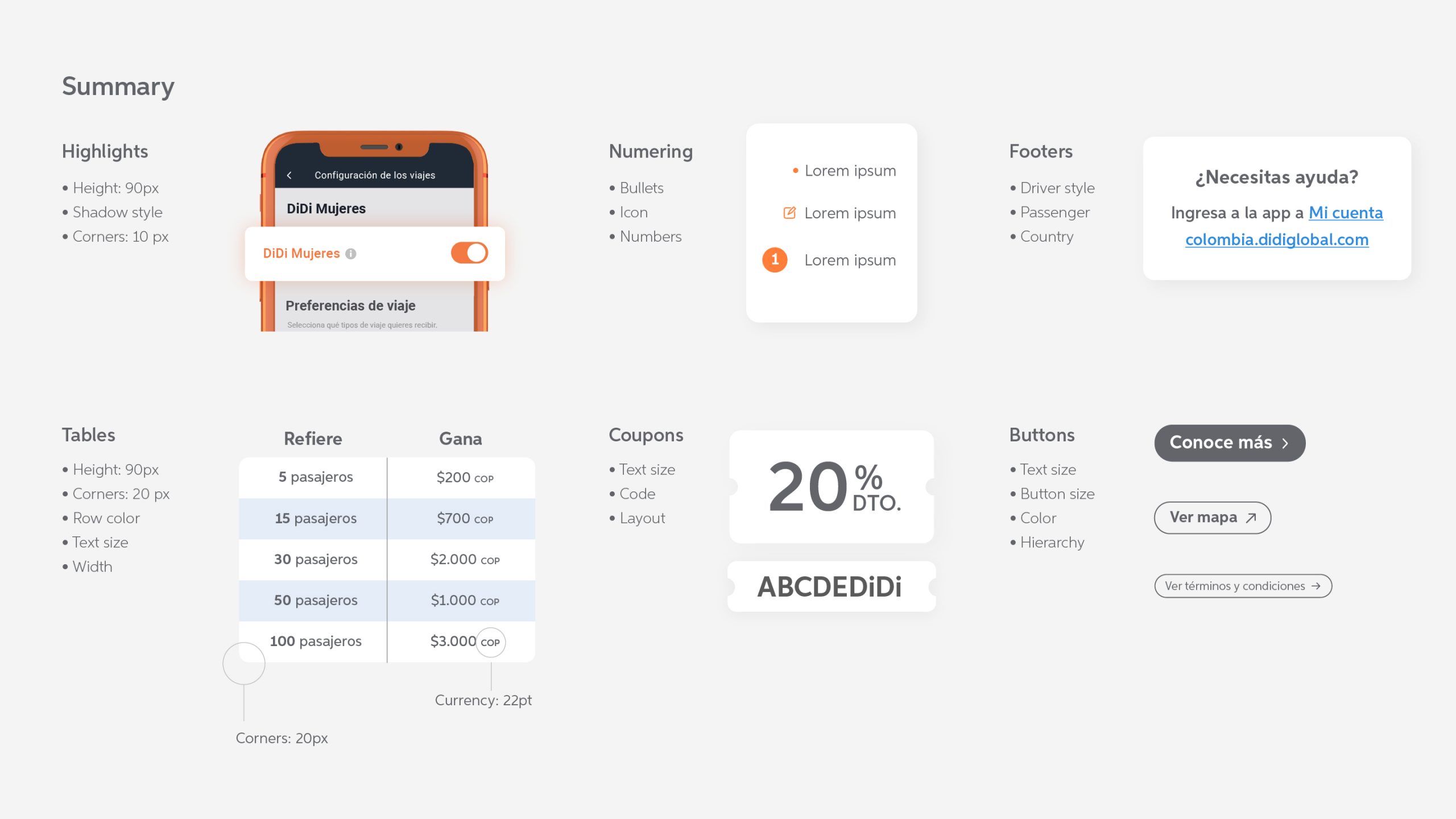
A summary of the graphic elements that were standardized.
Modularity
Since the goal was also to simplify the production of these communication assets, all visual components needed to be created at their final size, ready to use, and easy to copy and paste. Due to software constraints, licensing limitations, and budget restrictions, all components were created in Adobe Illustrator, exported as PNGs, and manually uploaded to an internal software tool.
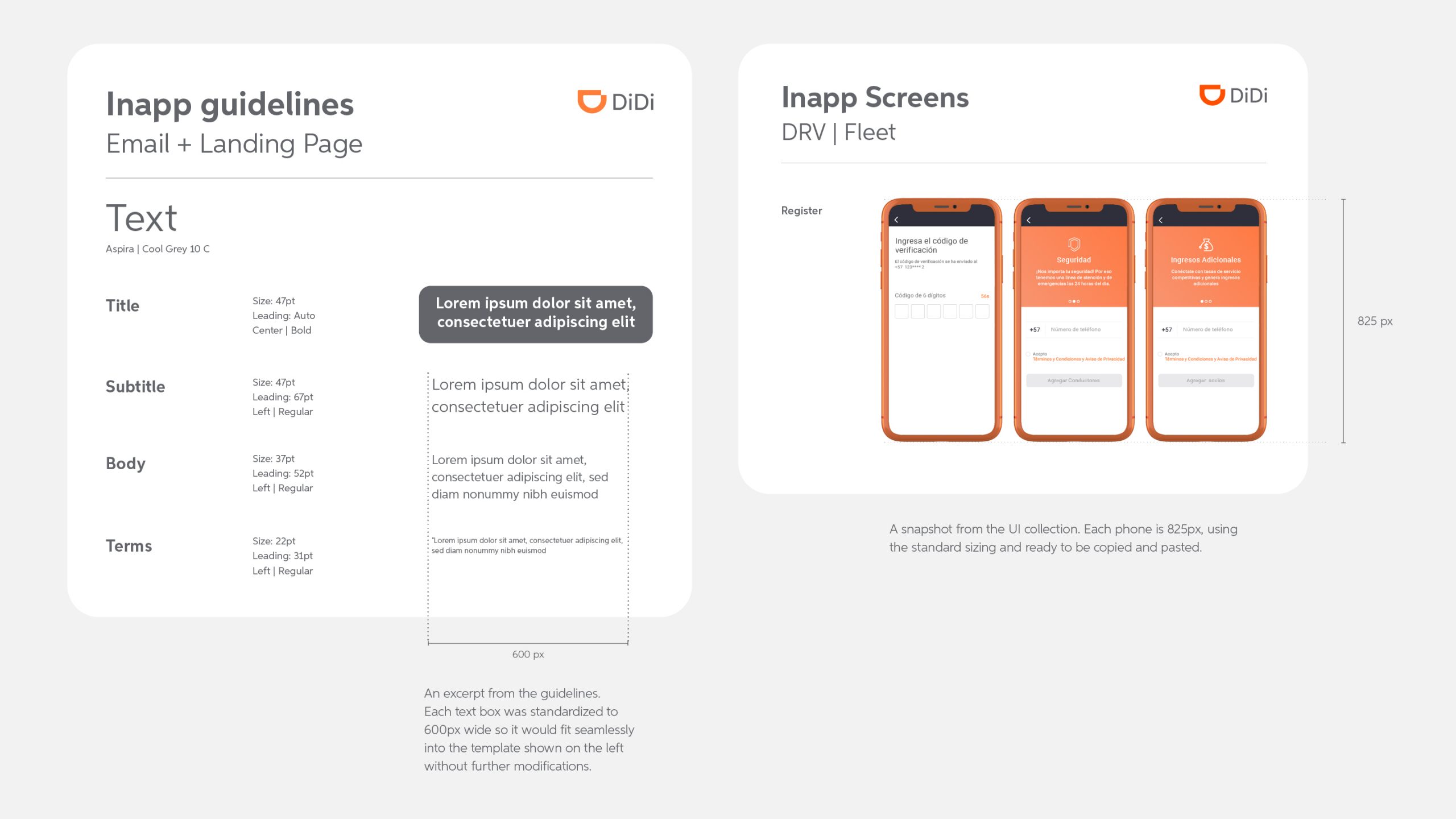
An excerpt from two different files showing that each design element was created at its final scale and ready to use. For example, text boxes were set to exactly 600px (the size defined in the template for body copy) while screens from the UI collection were already prepared at their standardized dimensions.
Resources for designers
The next step was to create scalable, ready-to-use templates and files for designers, so they would spend less time creating assets.
Another important feature was the creation of a UI gallery of the most used screens, so they could be used when explaining aspects of the app.
A section from the guidelines file showcasing the design elements.
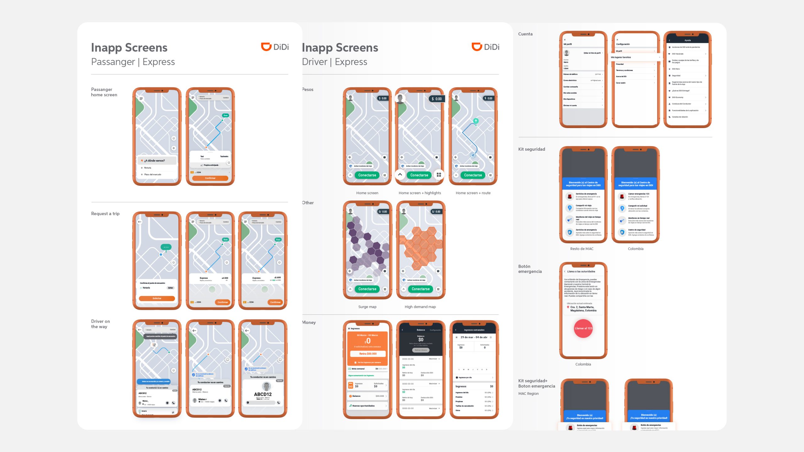
An excerpt from the UI collection featuring the most commonly used driver and passenger screens in an editable format.
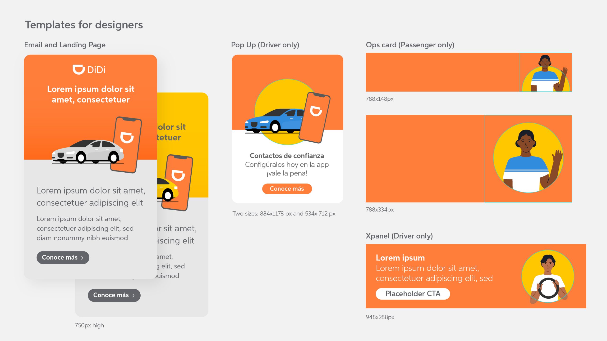
A snapshot of the templates created for designers across each communication tool.
Testing
To validate the design changes, I conducted a survey with drivers, the primary audience, with support from the Operations team. The survey was used to test key elements such as phone sizing, legibility, and overall clarity in communications. To assess usability improvements, I applied a heuristic evaluation approach. I created an Excel file based on usability best practices and assigned a score of 1 or -1 depending on whether each criterion was met. This resulted in a 20% increase in the overall user experience score.
Results
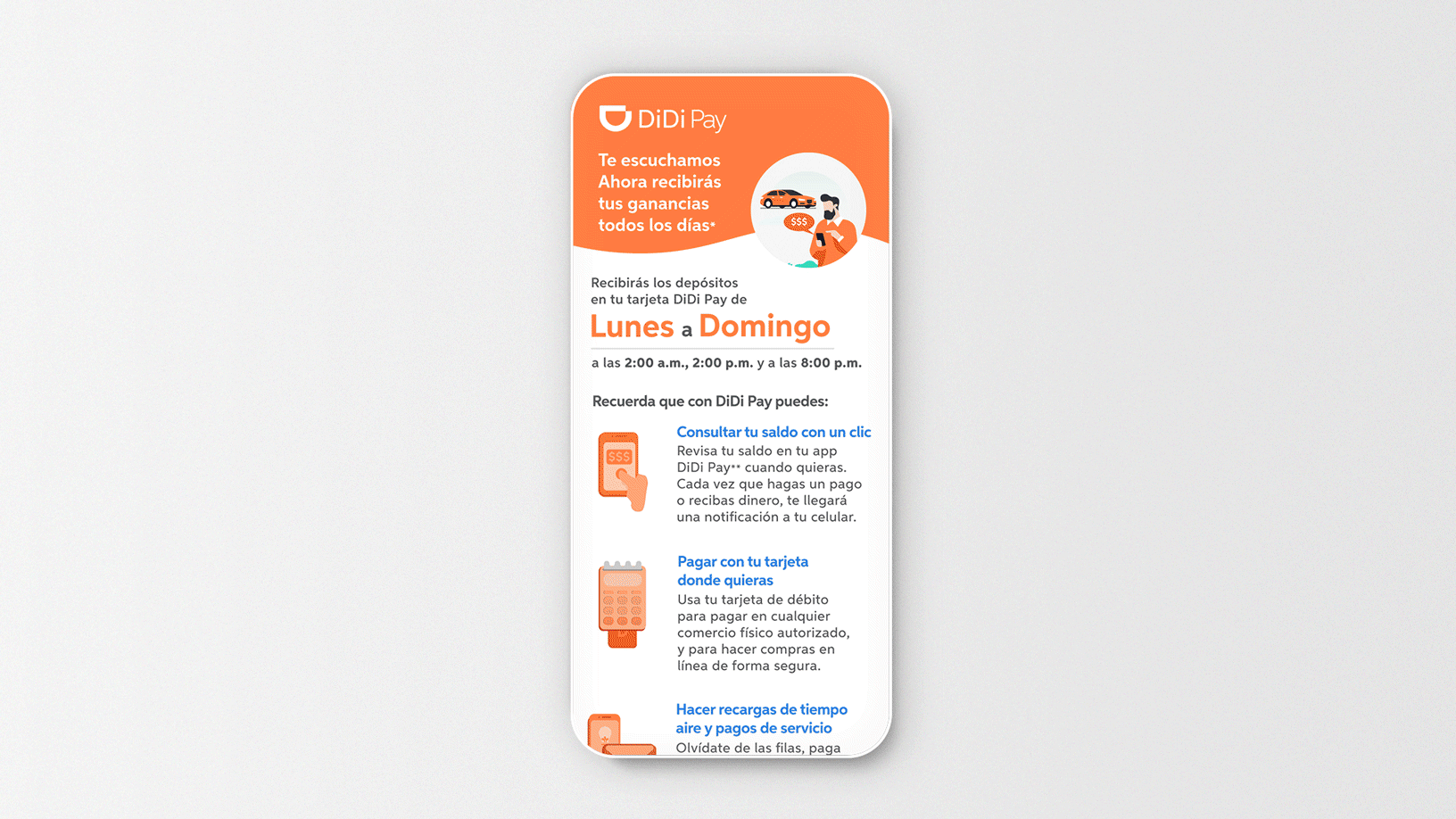
A comparison of digital communications before and after the system was implemented.
Impact
The two systems were adopted across the LATAM team in 8 countries: Dominican Republic, Panama, Costa Rica, Colombia, Ecuador, Peru, Chile, and Argentina, improving brand consistency and design efficiency while potentially reducing costs by decreasing reliance on stock assets and external production.